UX/Product Designer
Here's a sneak peak of the final product! Keep reading to see the entire design process.
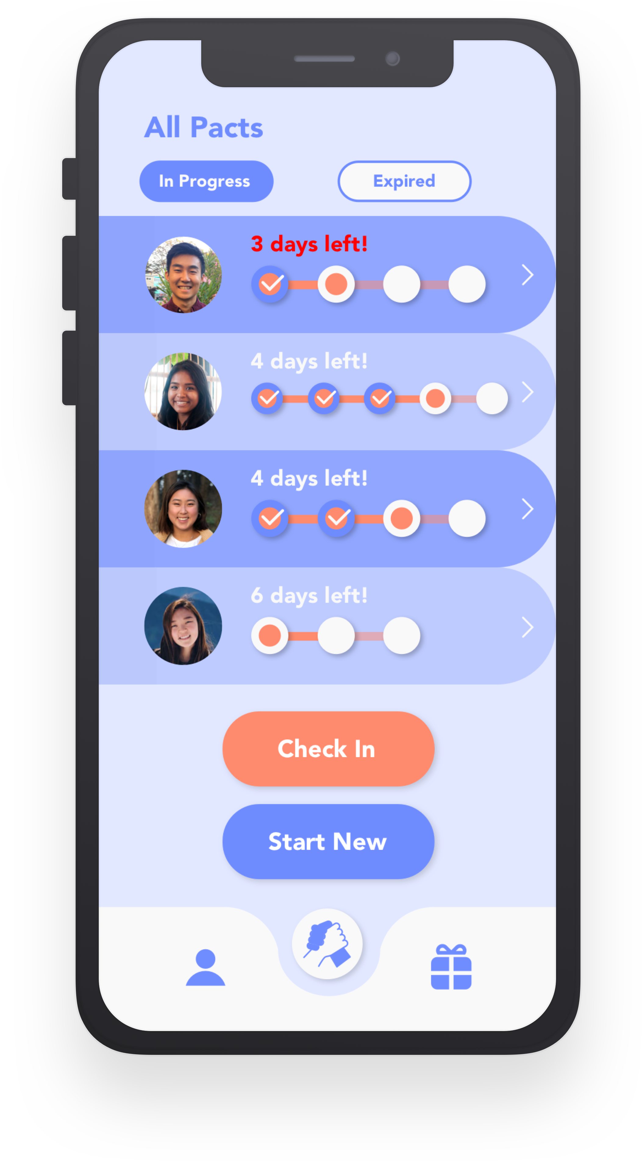
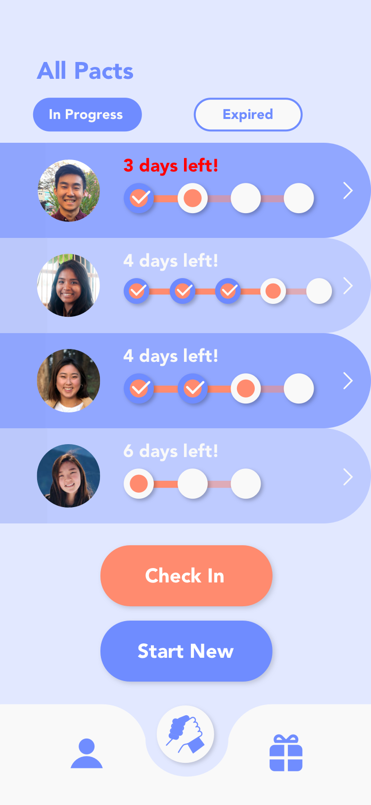
A list of pacts you are in with different users.
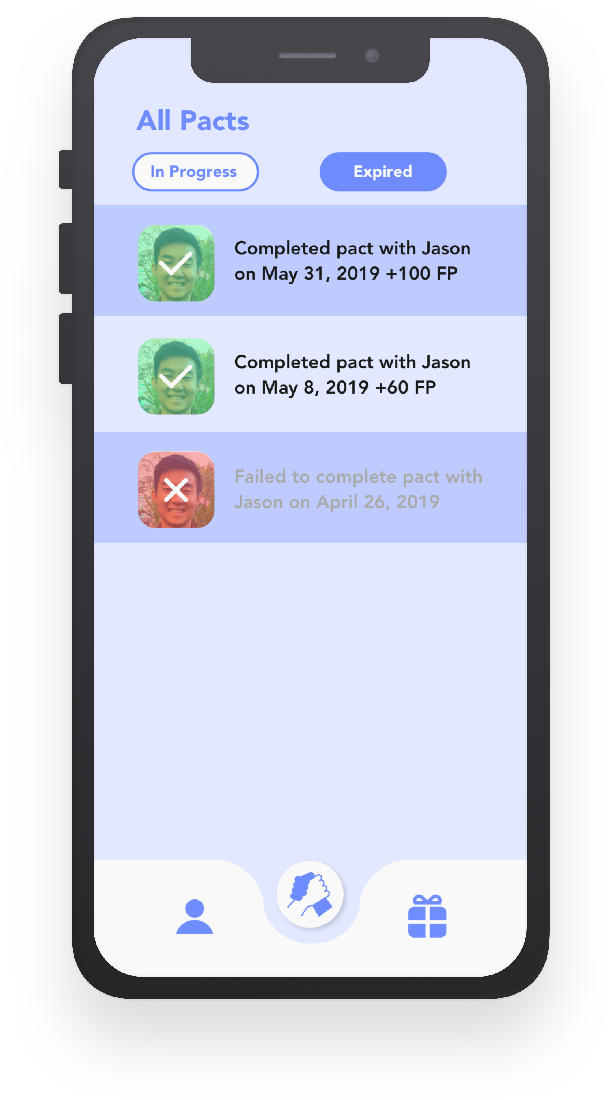
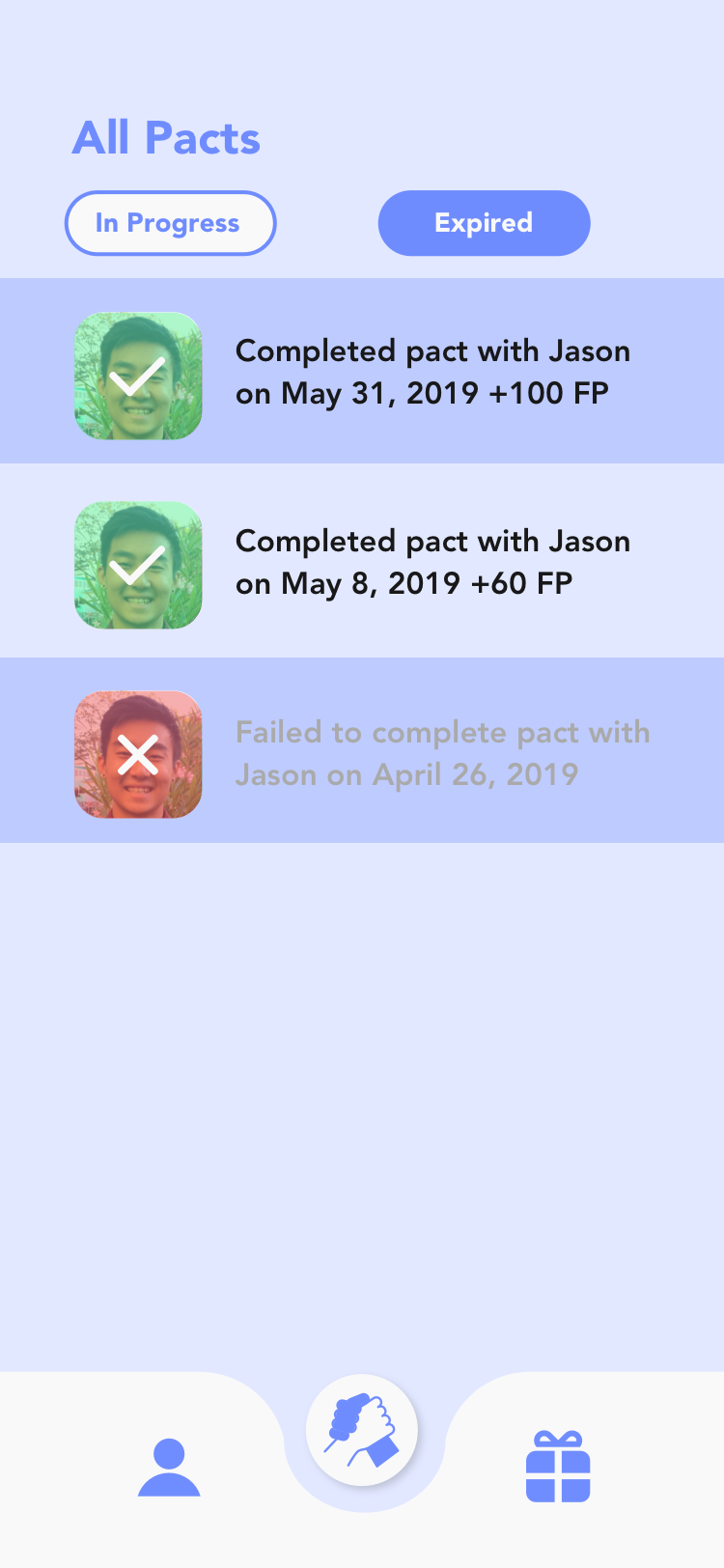
History of pacts you have participated in in the past and details about those pacts.
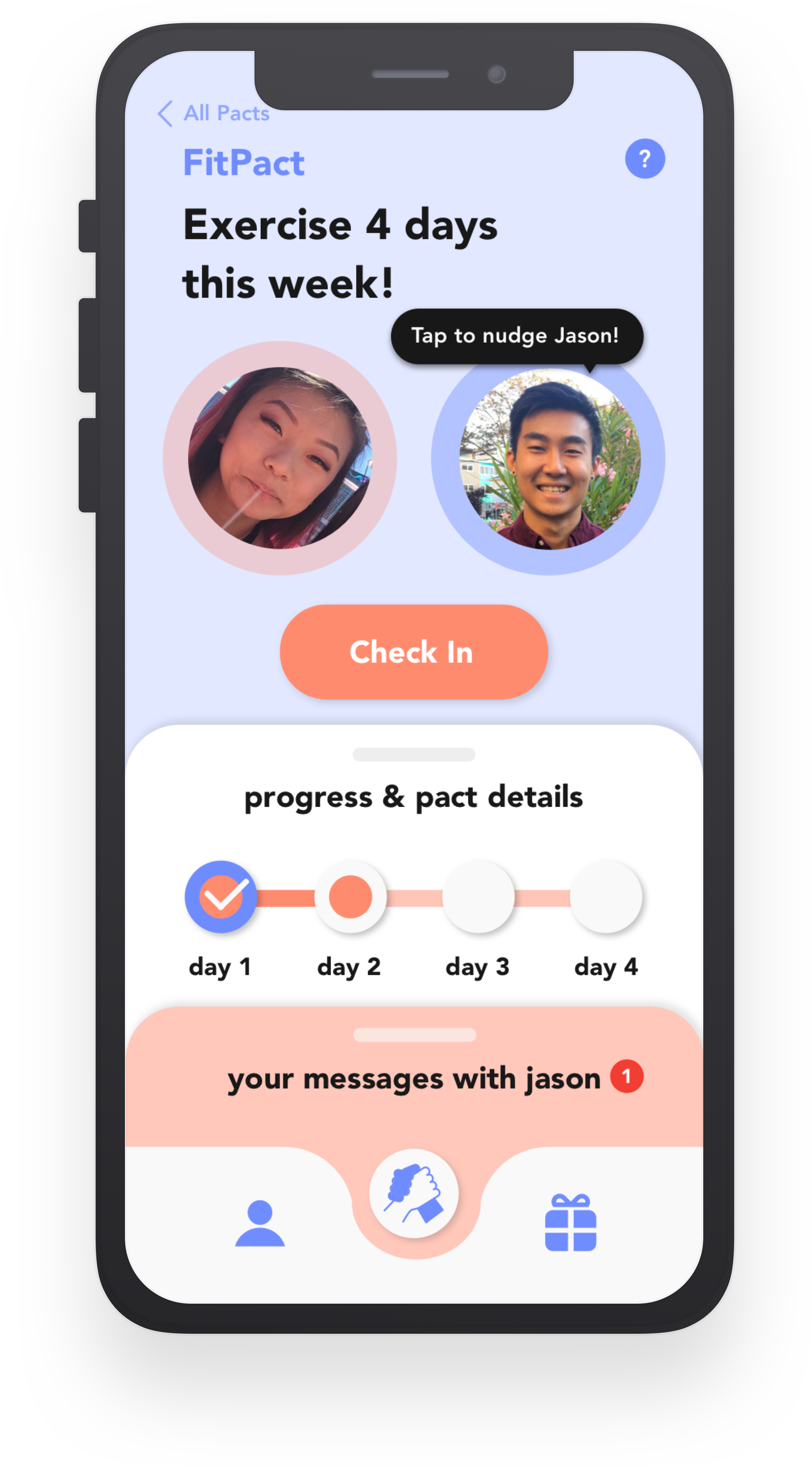
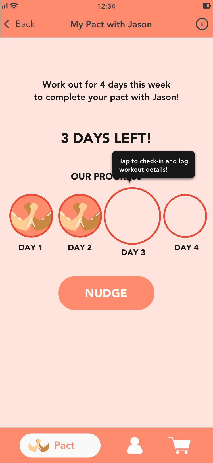
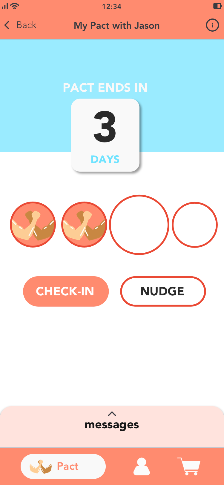
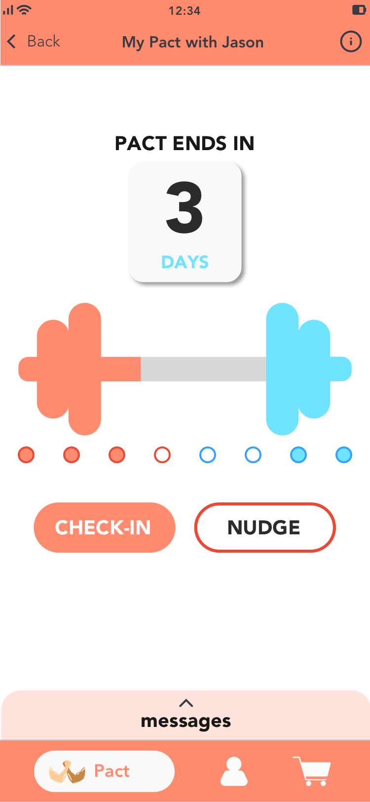
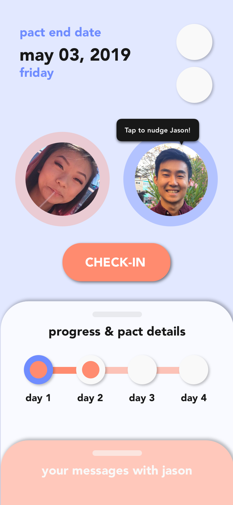
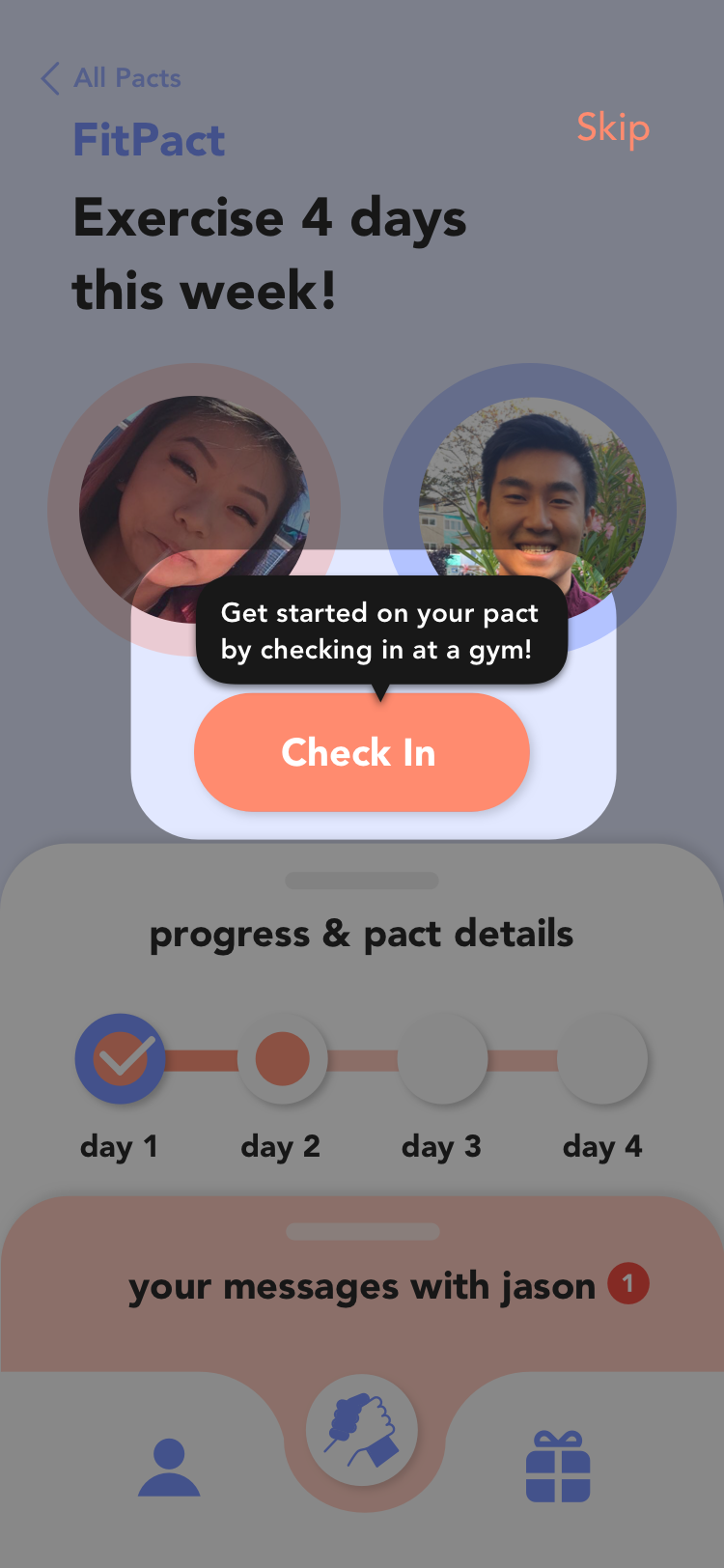
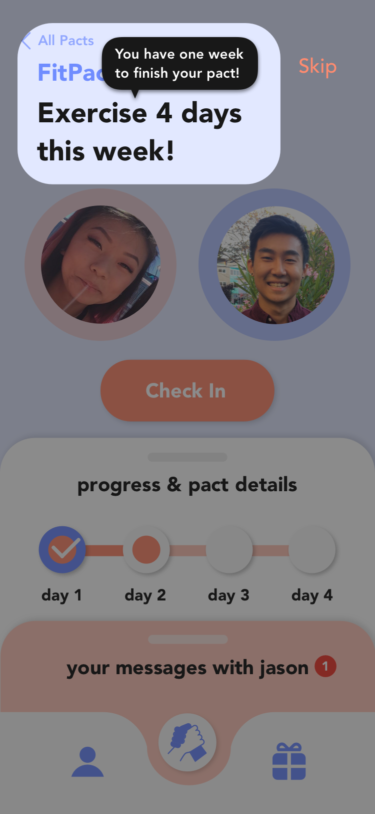
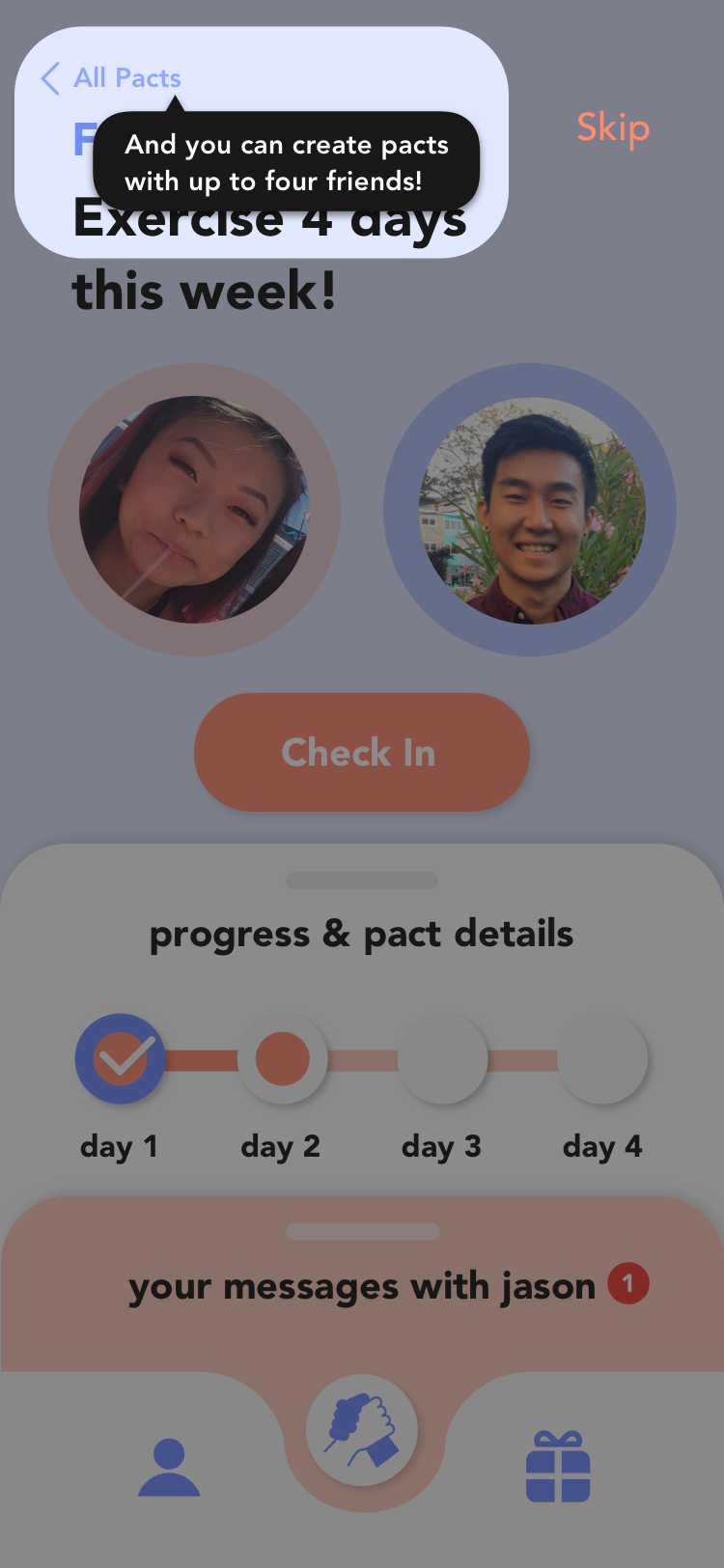
The details of an individual pact with one user. Here you can check-in to update your progress and nudge/message your friend.
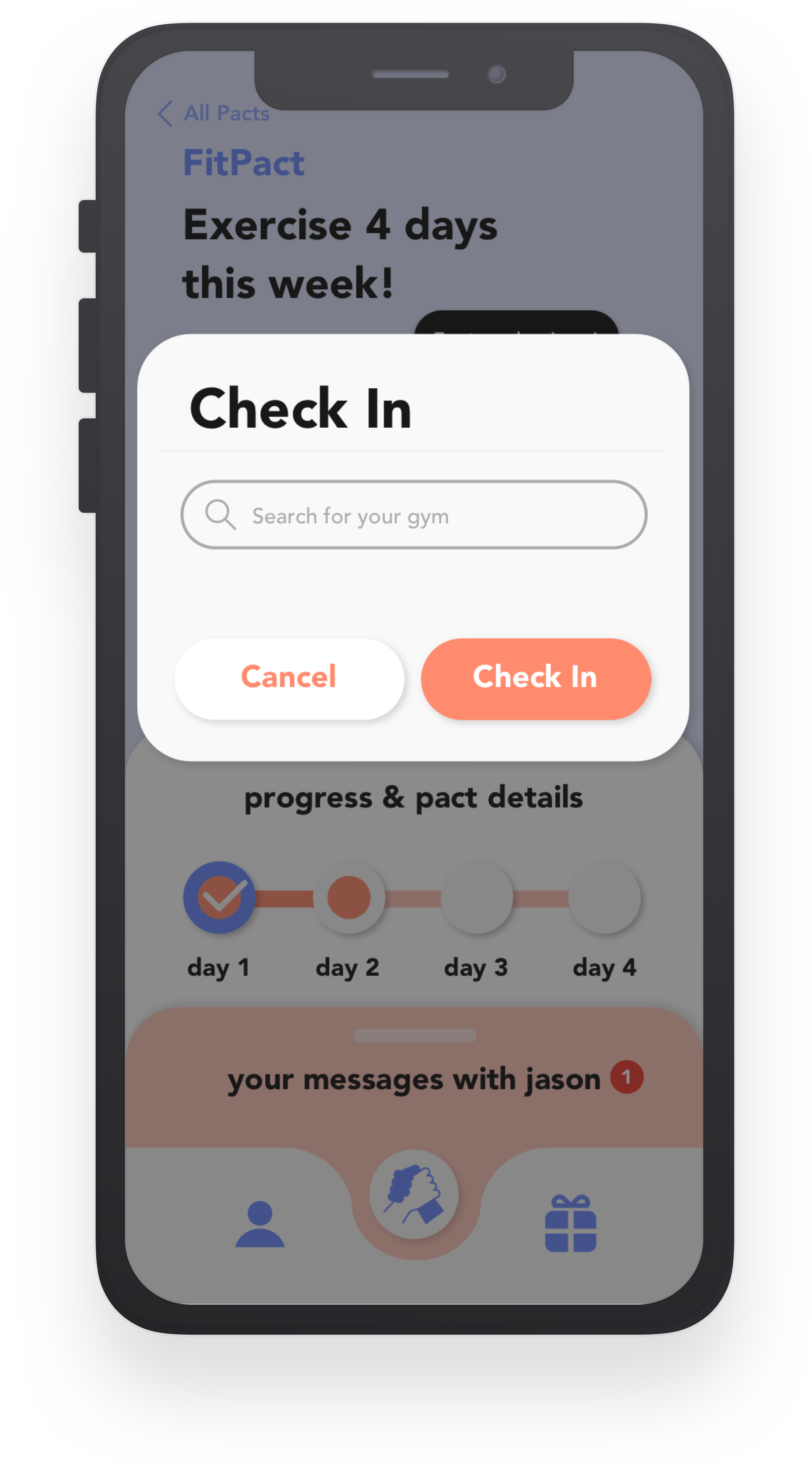
Type in the name of your local gym here to check-in.
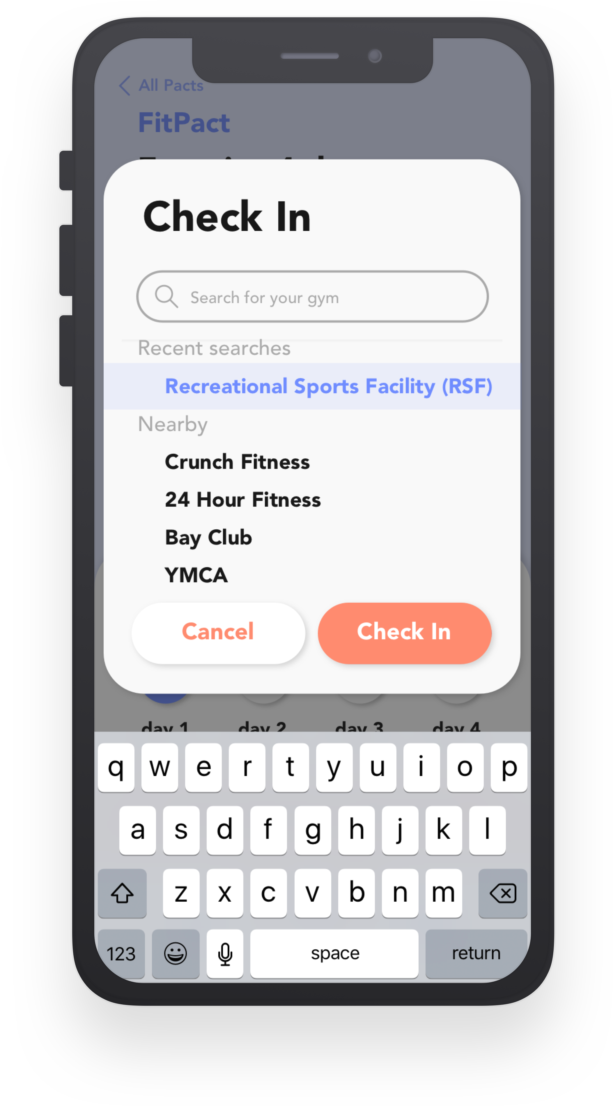
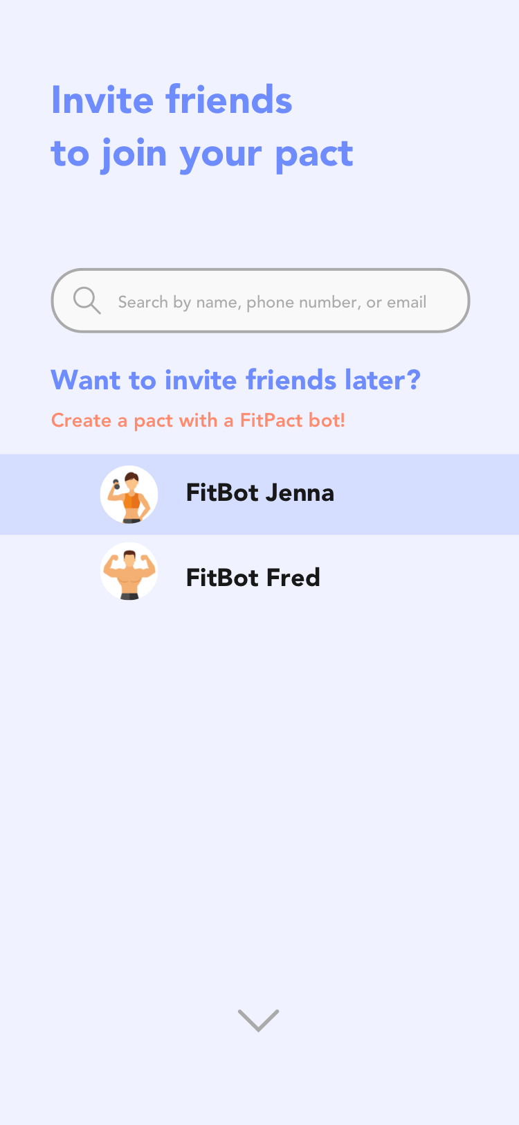
An example of a list of possible search results.
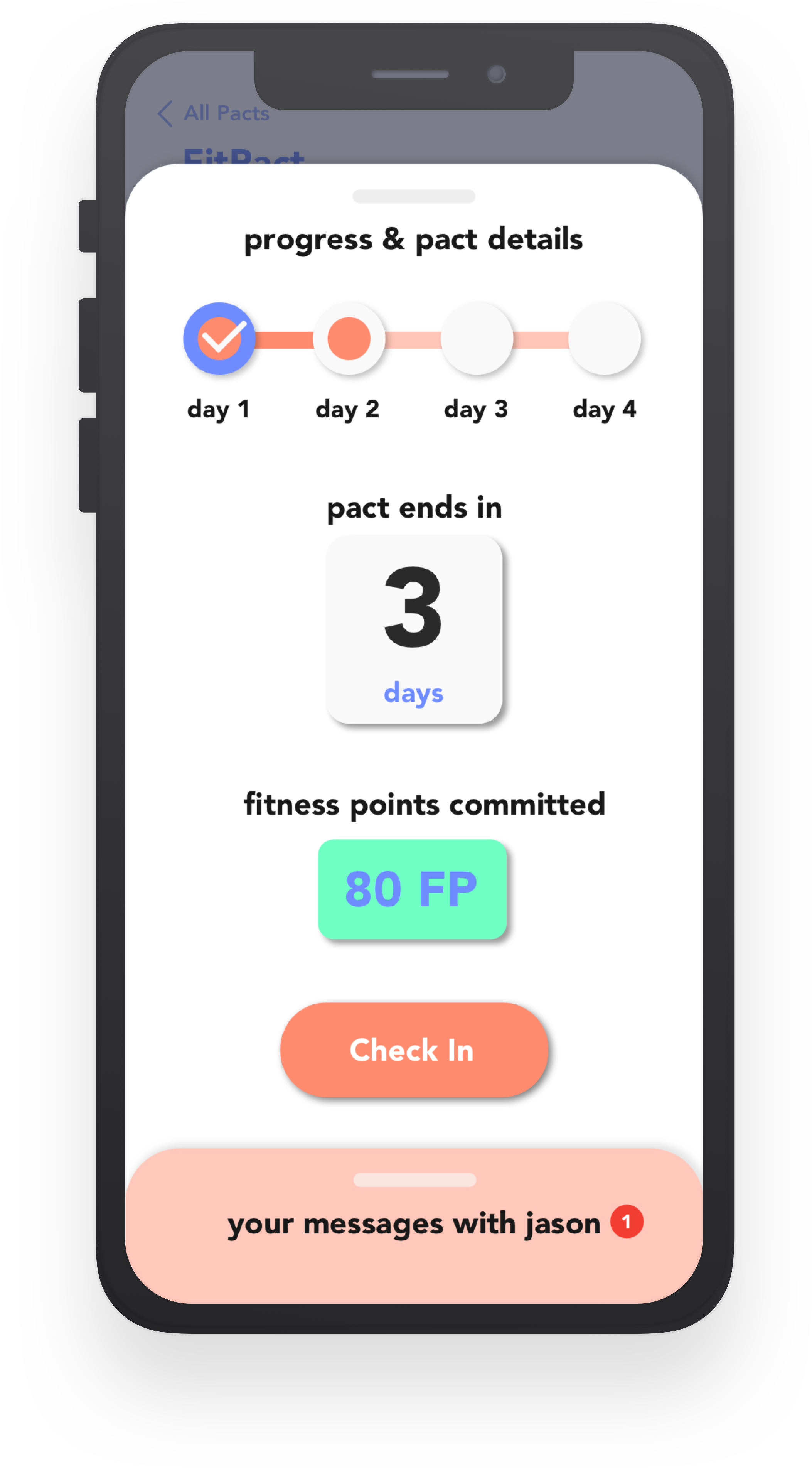
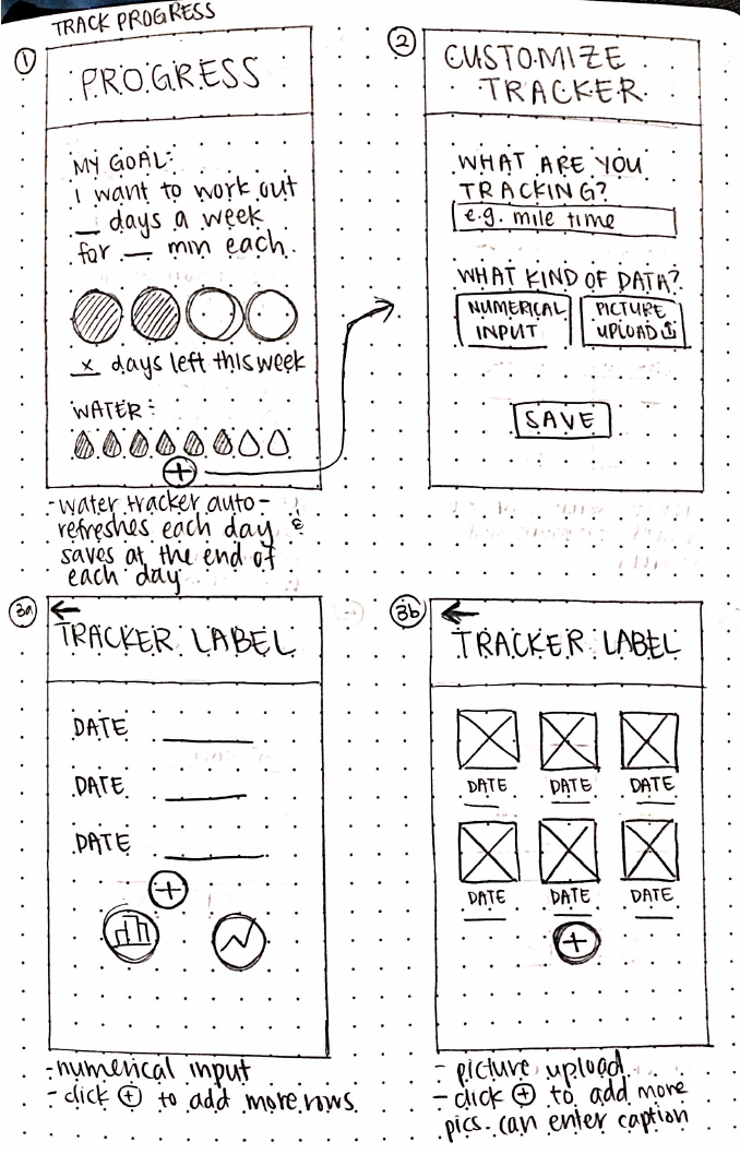
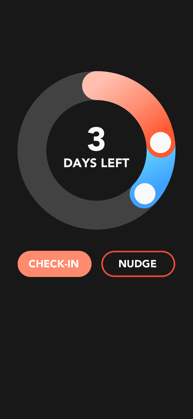
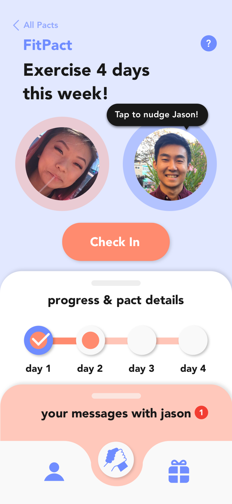
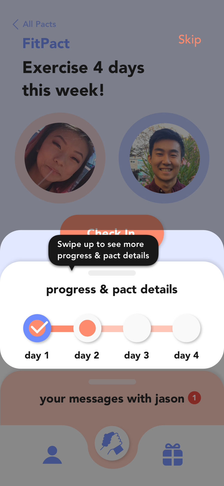
Progress and pact details card shown when swiped up. You can see you and your friend's progress, how many days are left in the pact, how many fitness points you committed to the pact, and a check-in button.
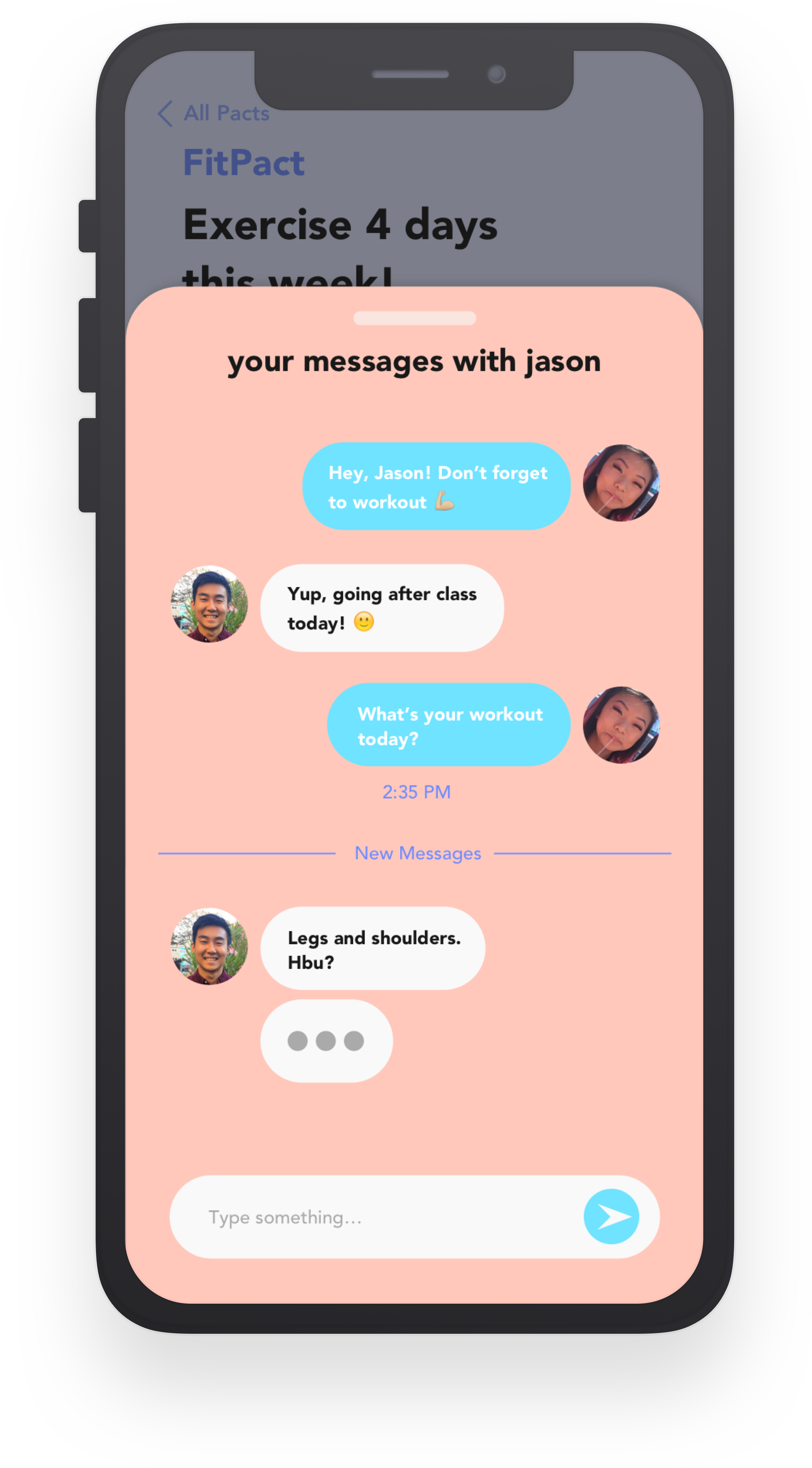
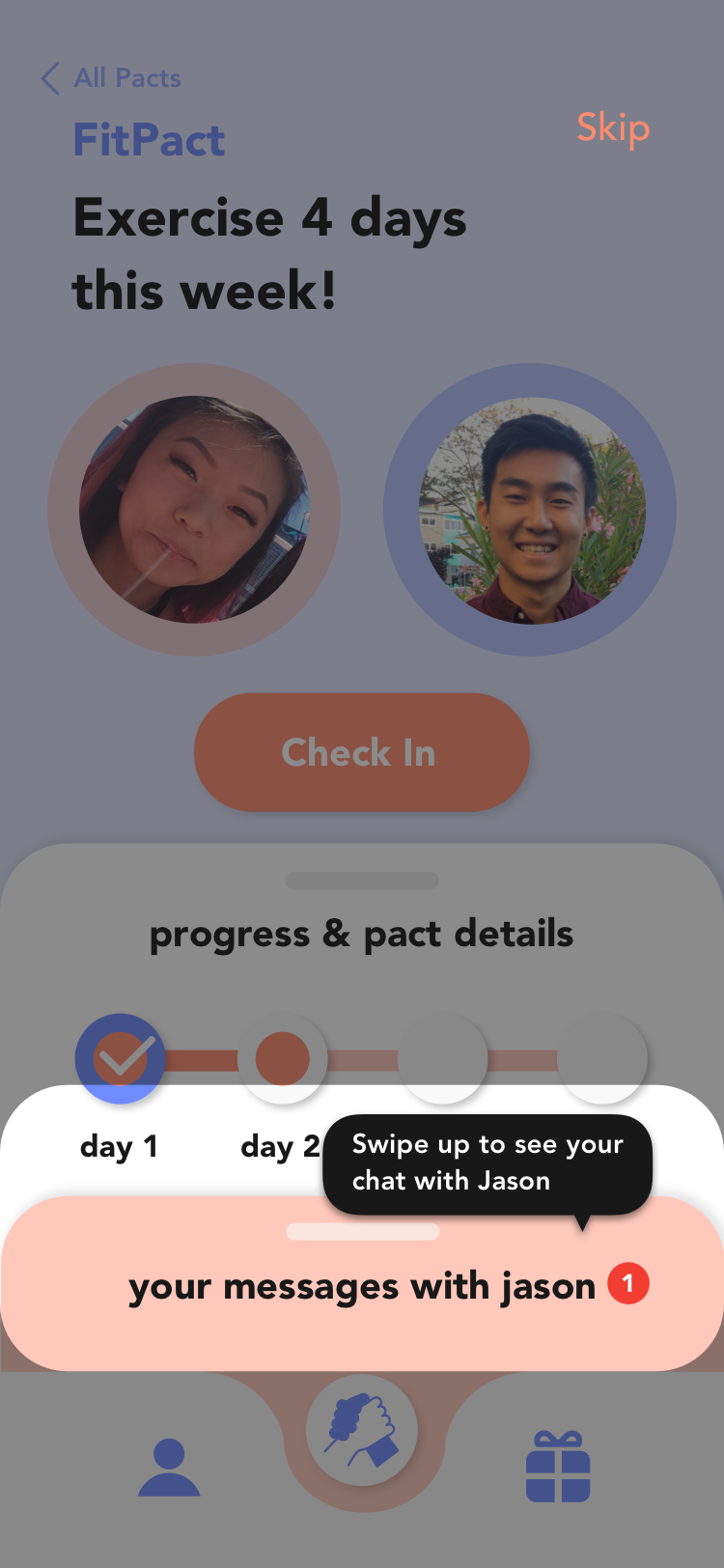
Messages card shown when swiped up that displayed your chat history.
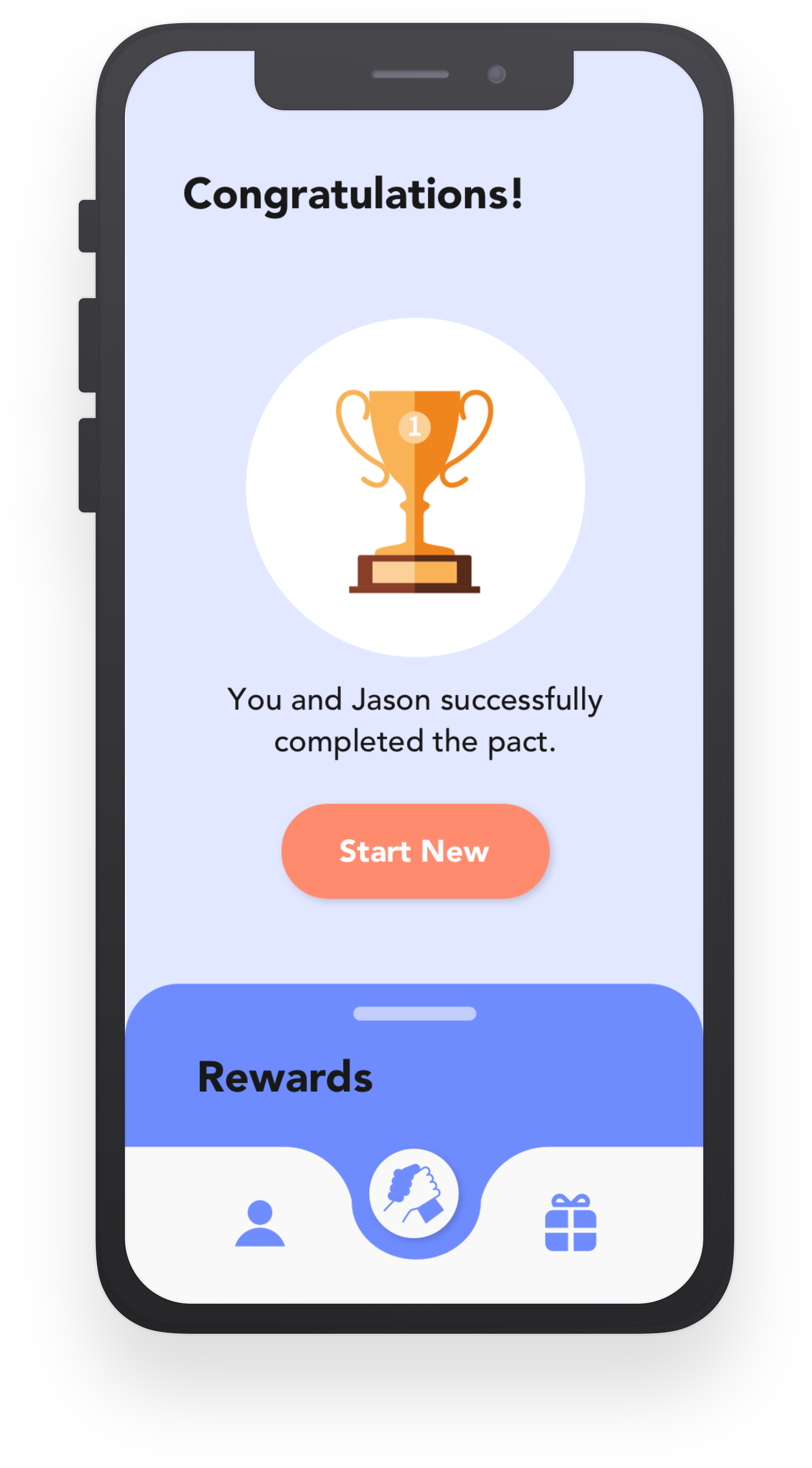
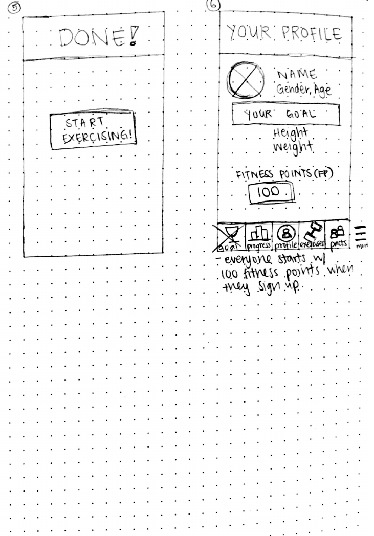
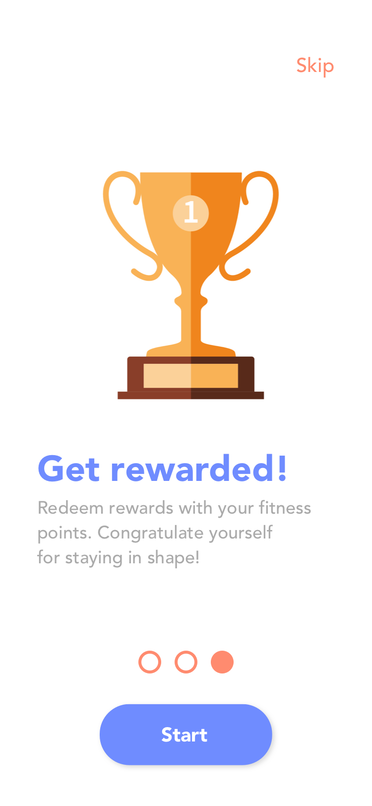
If you and your friends both successfully complete a pact, you are congratulated and prompted to start a new pact or check out the rewards page to see what items you can redeem with the fitness points you've earned.
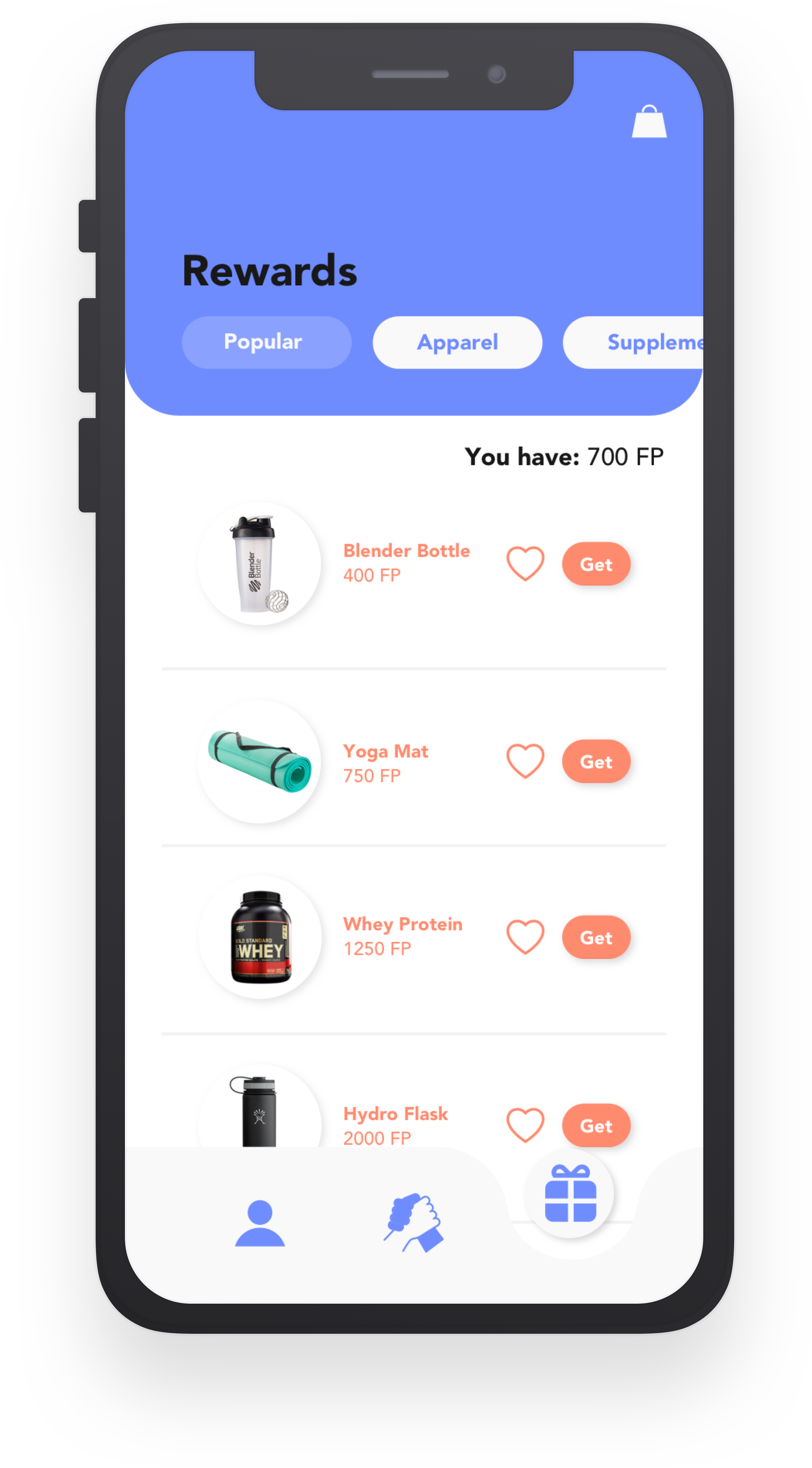
Items in the rewards page that can be sorted by category. You can favorite items or click "get" to redeem.
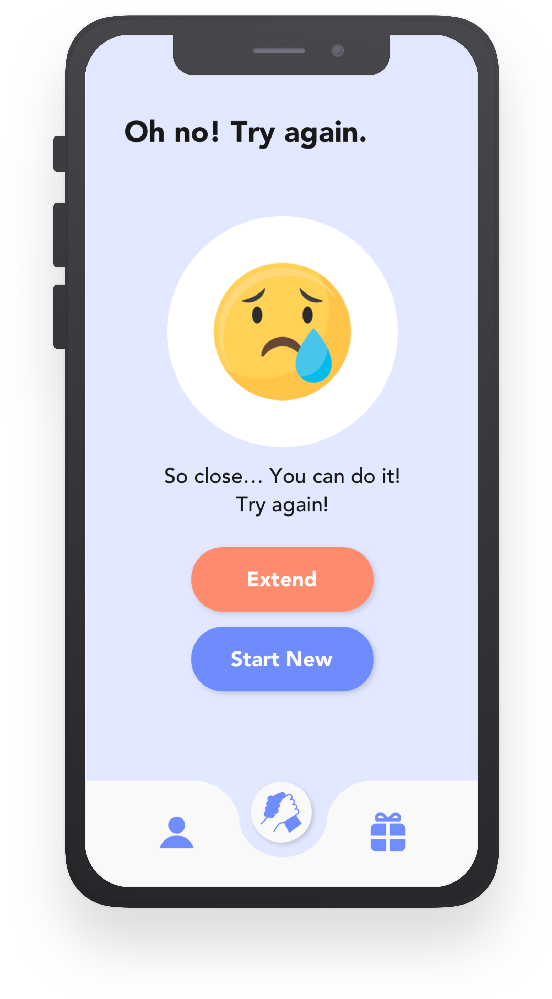
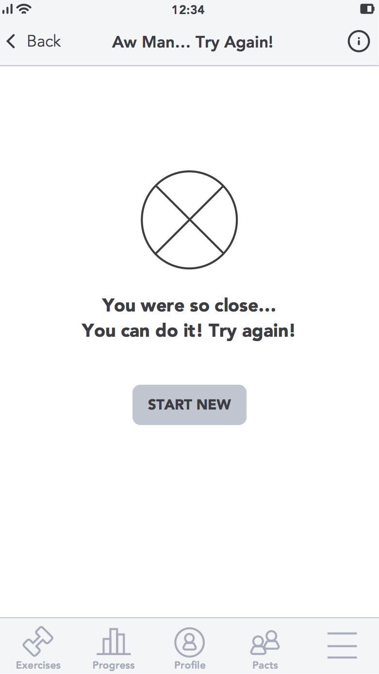
If either you or your friend fail to complete a pact, you are prompted to either extend the pact or start a new pact.
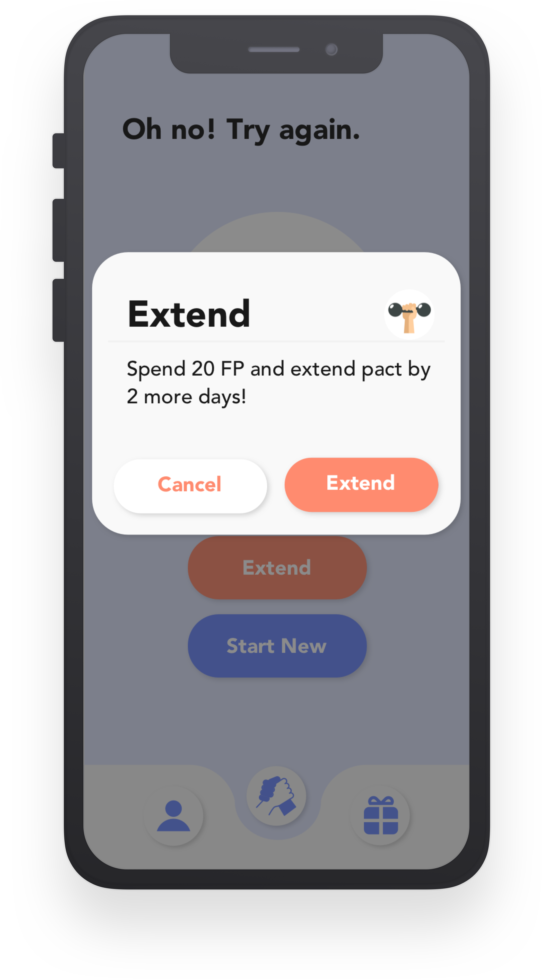
If you choose to extend the pact, you can extend by a few days by paying a certain amount of fitness points.
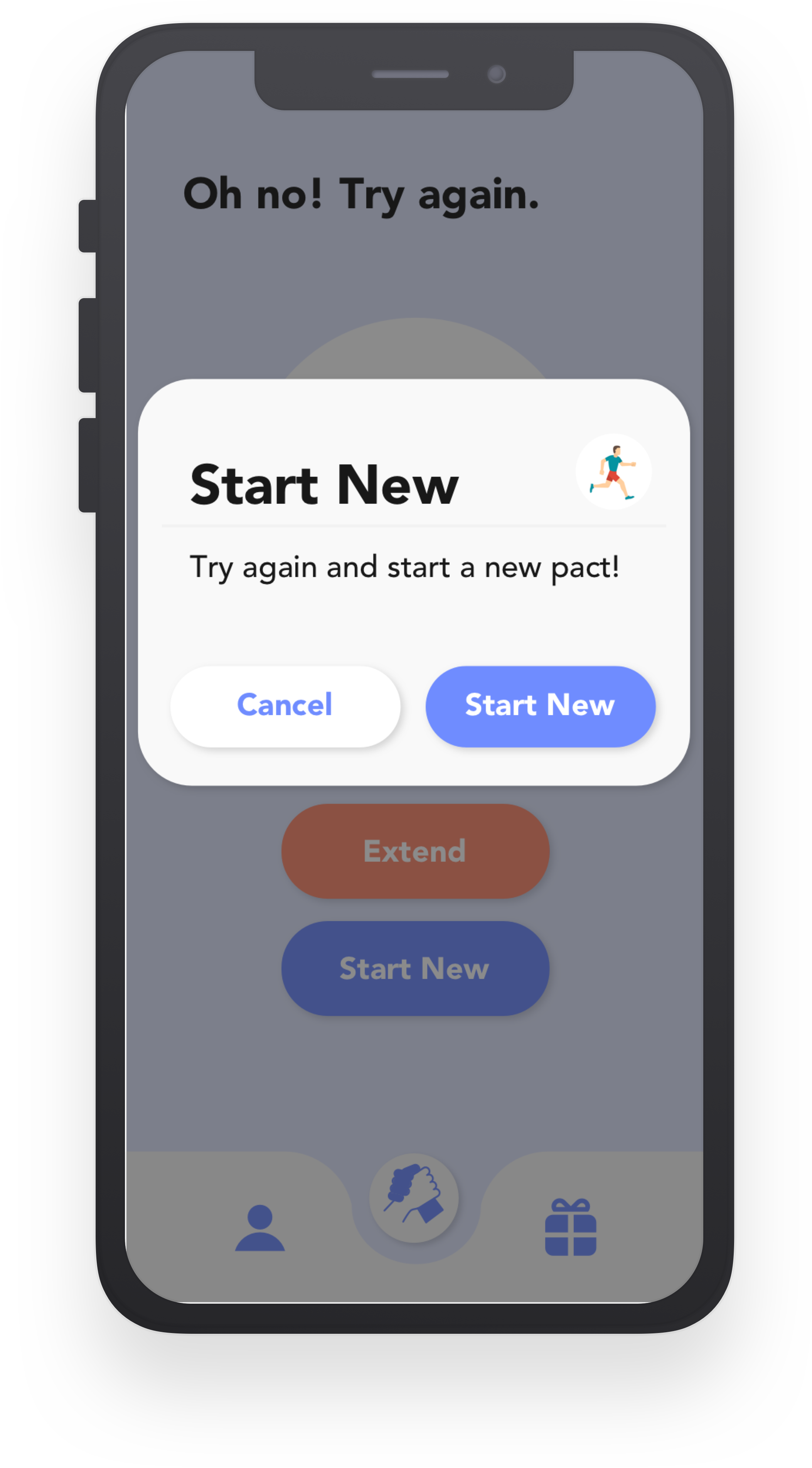
If you choose to start a new pact, you will lose the amount of fitness points you committed to the pact you failed to complete and will be redirected to create a new pact with a friend.
I just want my friends and family to be as excited about fitness as I am...
Fitness apps have become increasingly popular among smartphone users, however, they lack an aspect of accountability that would help users to stay motivated to continue exercising consistently every week. FitPact is an app that takes advantage of human nature's natural tendencies toward social interaction, competition, and rewards in order to encourage, motivate, and incentivize users to stay active one week at a time and maintain a healthy lifestyle. My biggest design challenge was to structure fitness pacts in a way that was not too complicated but still fun to participate in.
I conducted surveys and research to generate affinity and empathy maps and created personas in order to get some initial direction for the project. I then cycled through design and testing iterations to constantly receive feedback and iterate and improve on the app design.

First, let's understand the user!
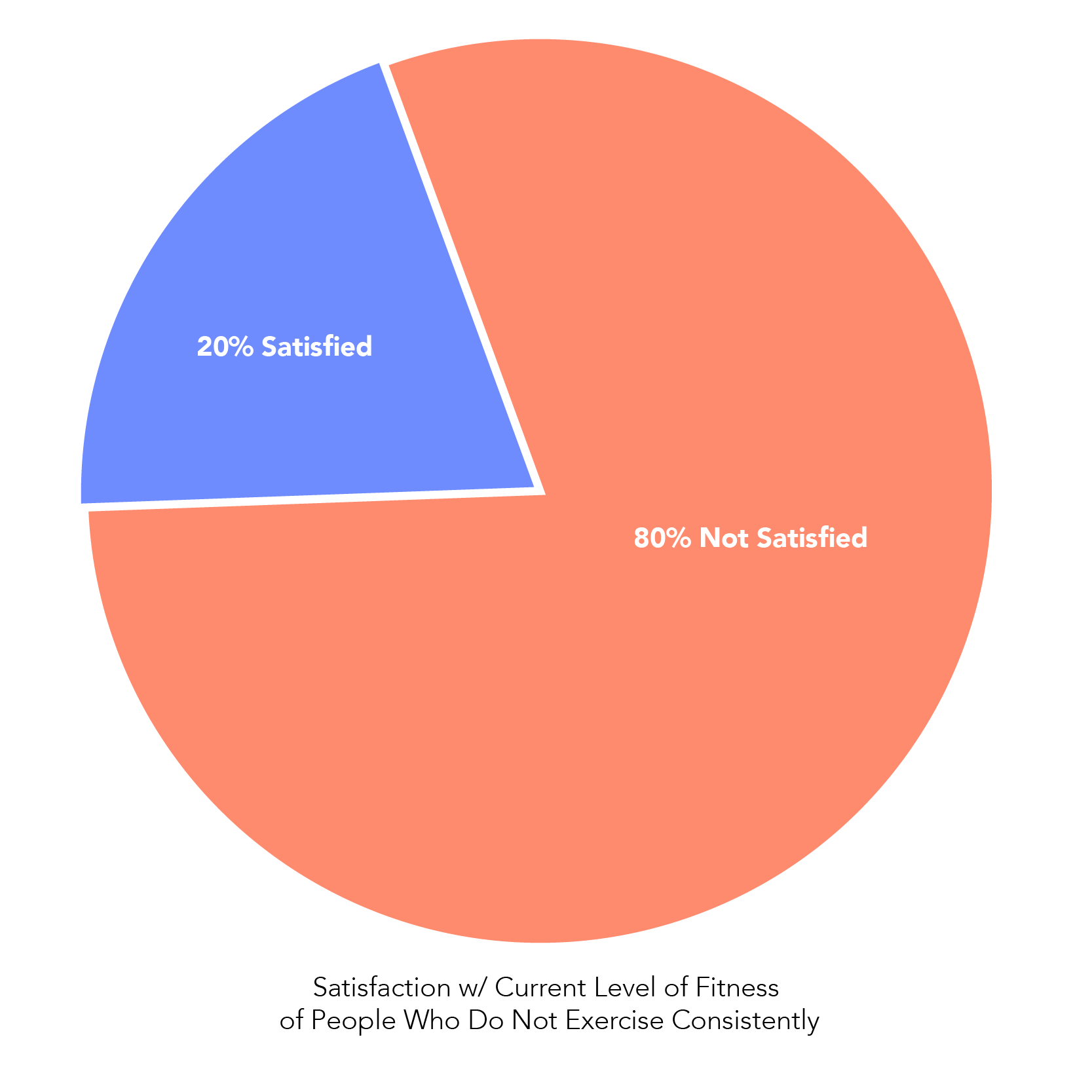
After conducting some secondary research, I found that the problem a lot of people have is that they tend to make long-term big picture resolutions rather than actionable goals. While it’s good to know what you want as an end result, if you don’t see immediate results, it’s very easy to lose motivation. According to an article I read, more than 75% of people give up on their New Year’s resolutions within the first month!
I also sent out a screener survey to determine what motivates people to exercise. “Seeing results” was stated as the main motivator with “competition” and “rewards” as close seconds. However, because seeing results takes time and consistent dedication, we run into the problem found from my secondary research where people lose motivation because they don’t see immediate results.
So, I decided to focus on “competition” and “rewards” as the main motivators when brainstorming solutions to the problem.
To determine possible user types, I conducted some interviews and organized my interview notes into affinity and empathy maps and then into personas.
The affinity map was organized into 7 different clusters: excuses, motivations, counting calories, schedule/routine, social/competition, time, and types of exercise.
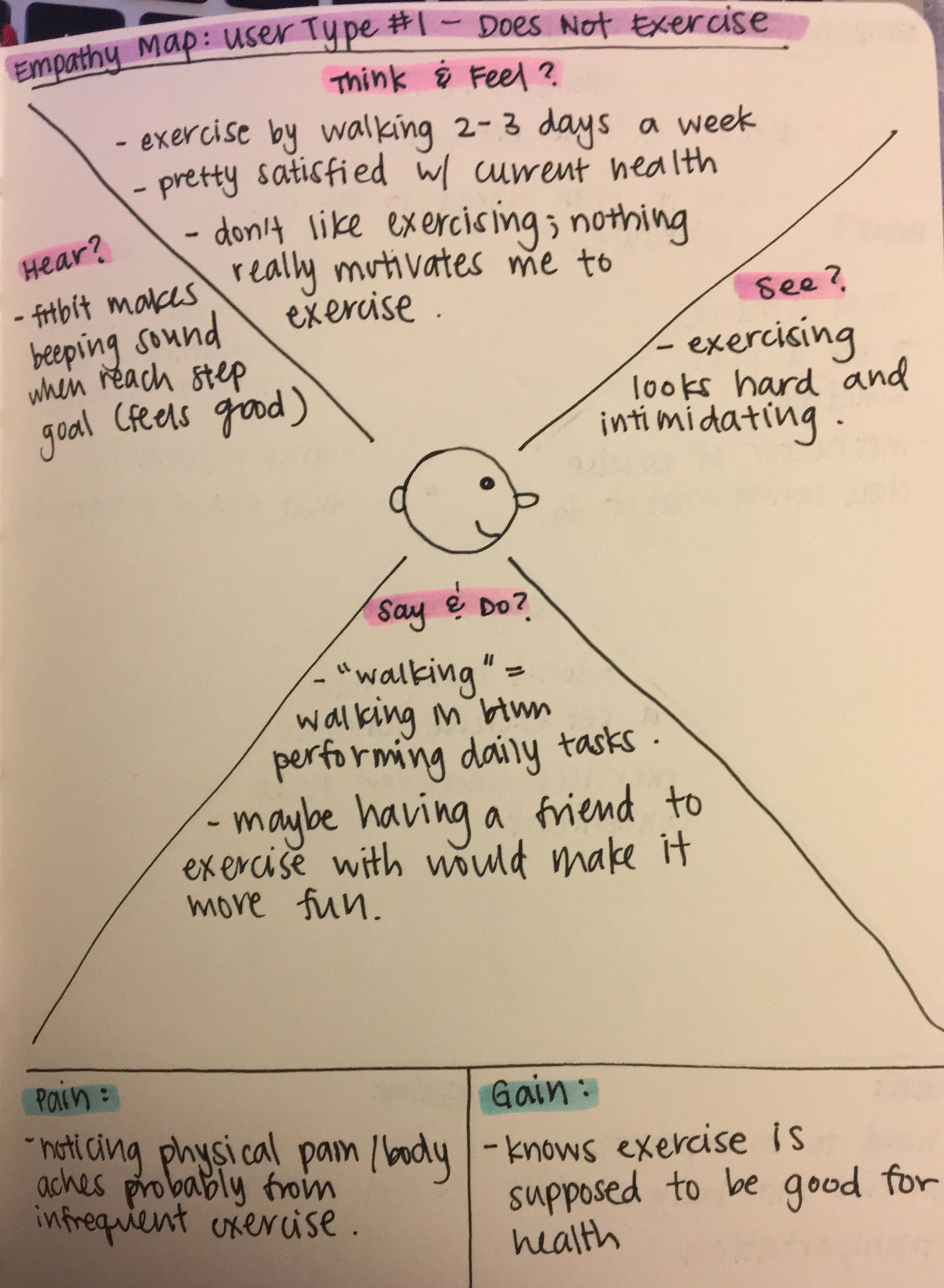
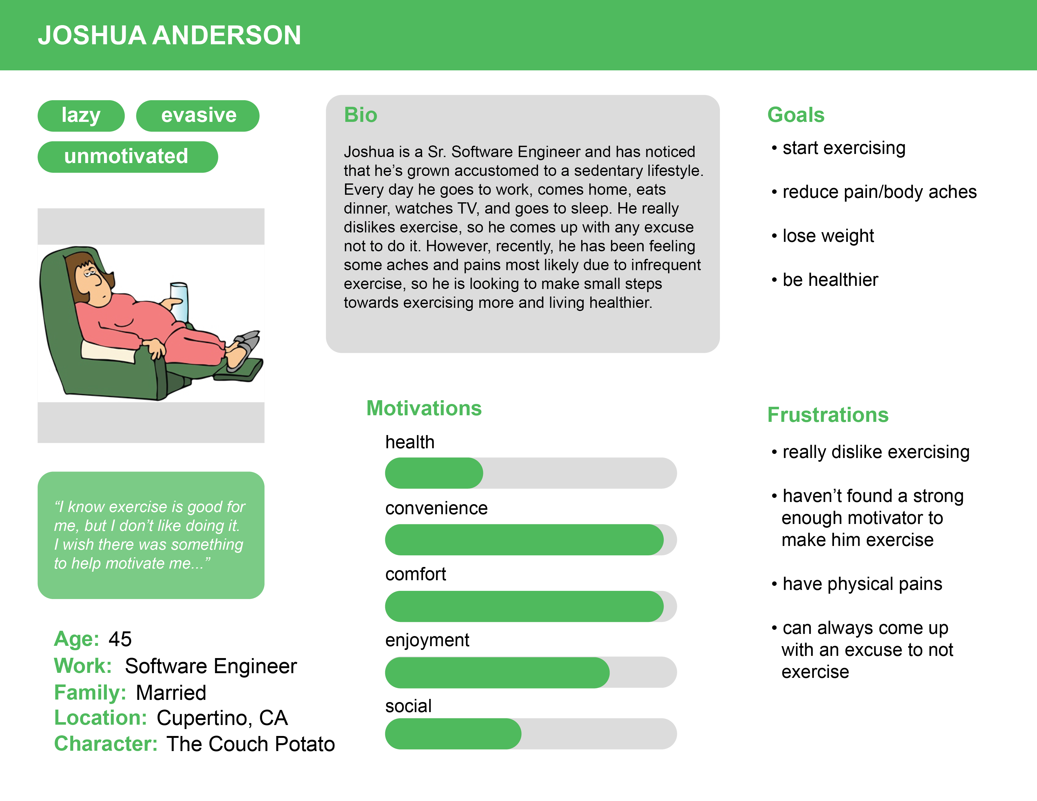
The first user type is someone who rarely to never exercises. This user knows the benefits of exercise but somehow always comes up with an excuse not to. The barrier to entry seems to be that exercising looks difficult and intimidating, and when this user exerts more energy than usual, they notice physical pain or discomfort most likely due to infrequent exercise. Maybe having a companion to exercise with would make exercising less intimidating and more enjoyable.
From this first user type, I created a persona I called “The Couch Potato”. “The Couch Potato” is lazy, evasive, and unmotivated, and generally prioritizes convenience, comfort, and enjoyment.
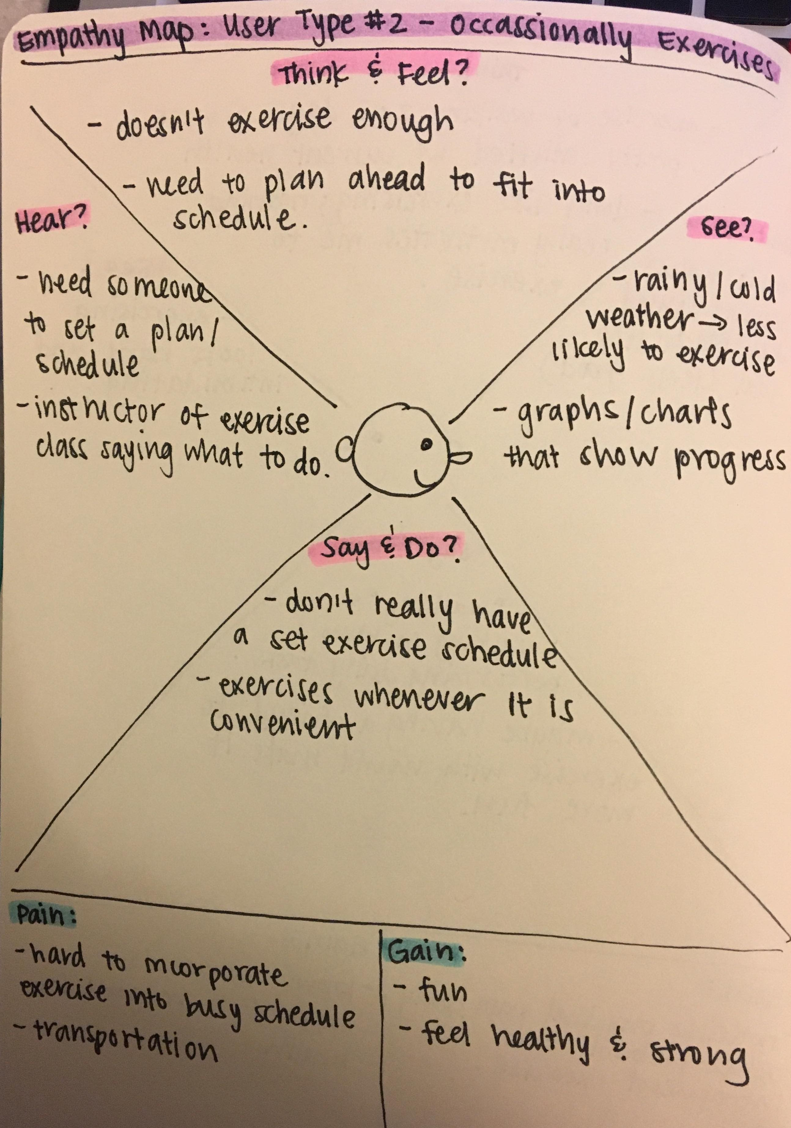
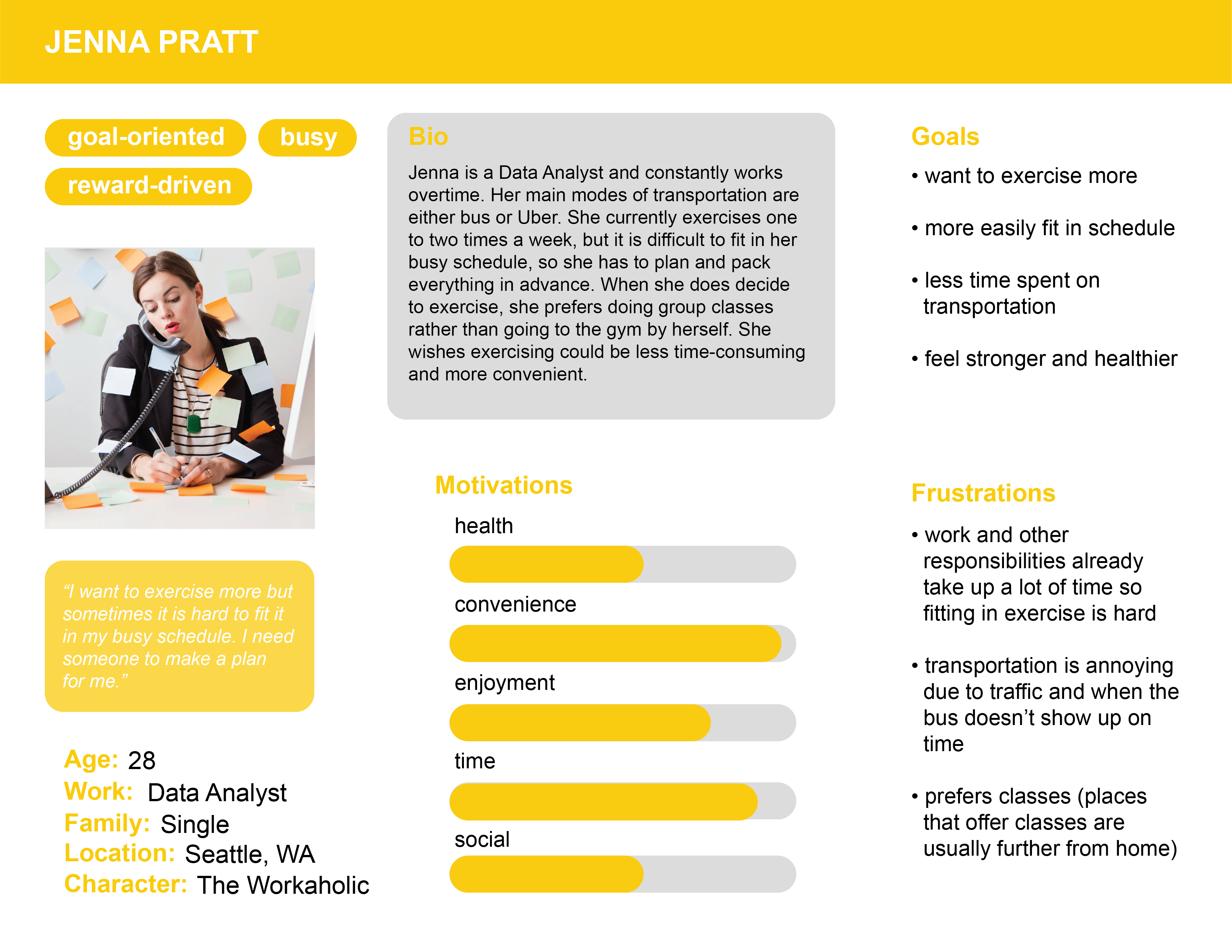
The second user type occasionally exercises. Without a set schedule, this user only exercises whenever it is convenient. Because they have a lot of other things going on in their lives, it would help if someone could help them set a schedule and send reminders. But once a goal is set, they will most likely meet it, and it helps when there are visual signs of progress.
I call this persona “The Workaholic”. They are goal-oriented, busy, and reward-driven and prioritize convenience, time, and enjoyment.
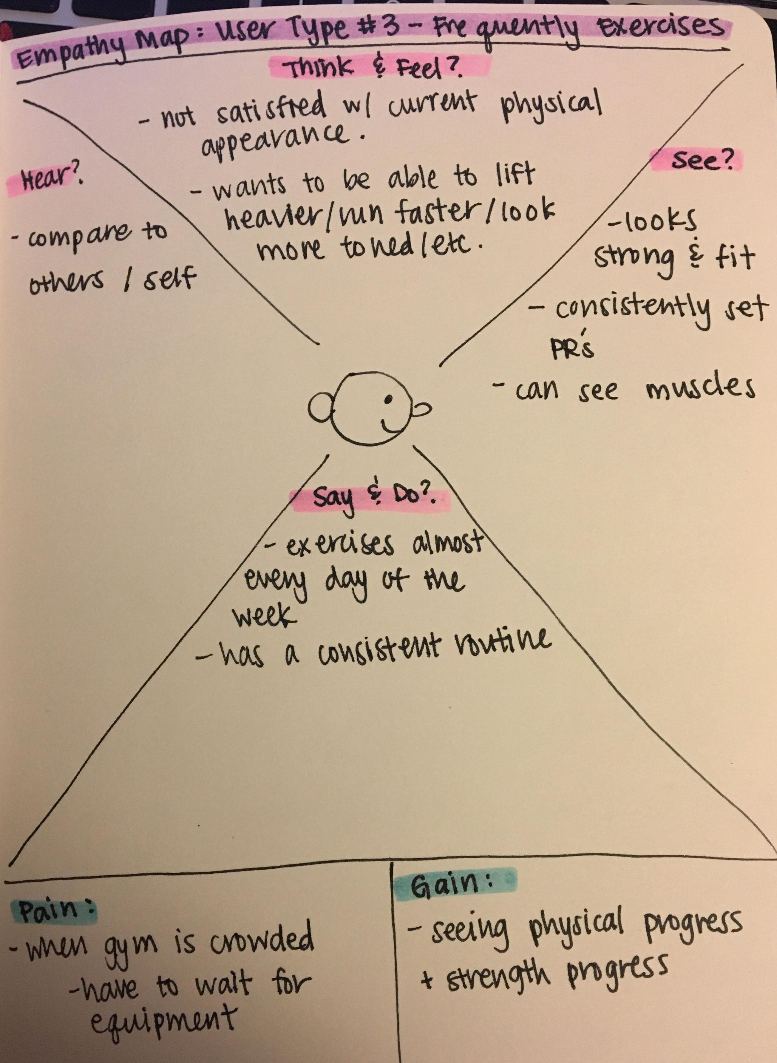
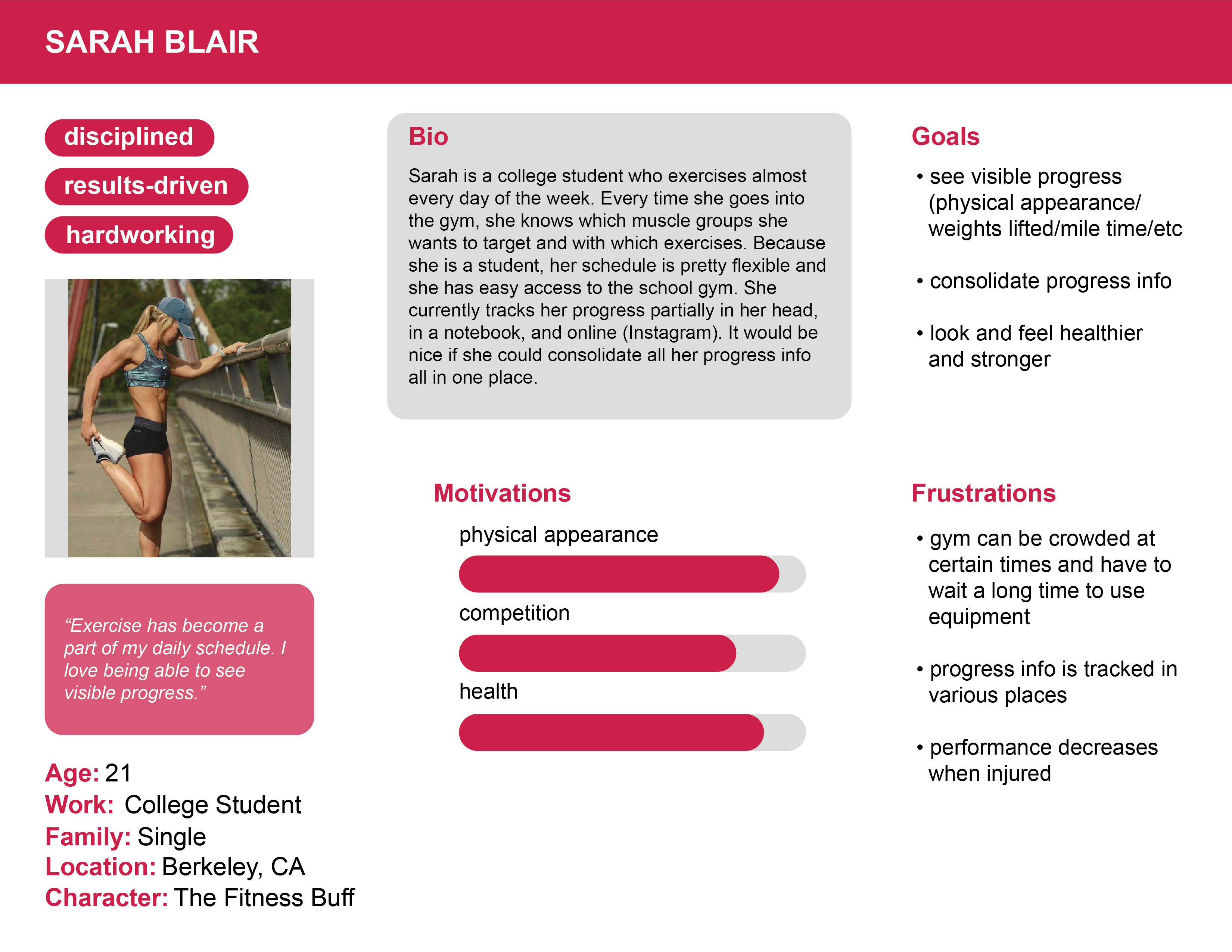
The third user type is someone who already regularly exercises. This user already has a consistent routine and is constantly comparing with themselves and others. This user has been consistently exercising for a while and has already achieved the reward of seeing results in their physical appearance and level of fitness and is motivated to do even better, for example, run a faster mile time, lift heavier weights, become more flexible, etc.
This persona is called “The Fitness Buff”. They are disciplined, results-driven, and hardworking, and are mainly motivated by bettering their physical appearance and health as well as competition.
After creating the three personas, I started brainstorming and sketching with these features in mind: set goal (to make becoming healthier more actionable), create pact (to address user’s desire to exercise with a friend and to create some friendly competition), rewards (w/ fitness points), track progress, exercises database (by providing tutorials on different exercises sorted by muscle groups and type in order to make it less intimidating).
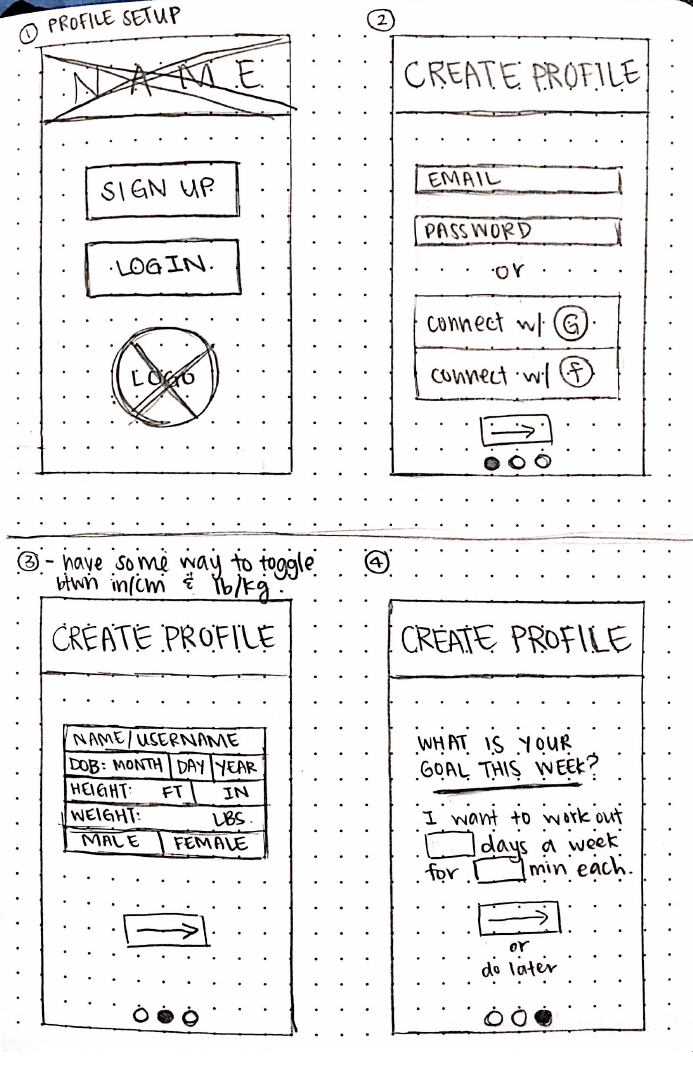
The feedback I got for these initial designs were that there are too many features, which makes it feel very cluttered, which in turn makes it seem complicated and difficult to use causing a barrier to entry.
While the features included in my initial designs tried to address all the wants and needs of all three personas and encompassed everything I ever wanted in a fitness app, I had to remind myself that I am designing an intuitive solution for my target audience and not for myself.
So I reworked the app so that it was simple and straightforward. It focused on one main feature which was creating weekly pacts with friends.
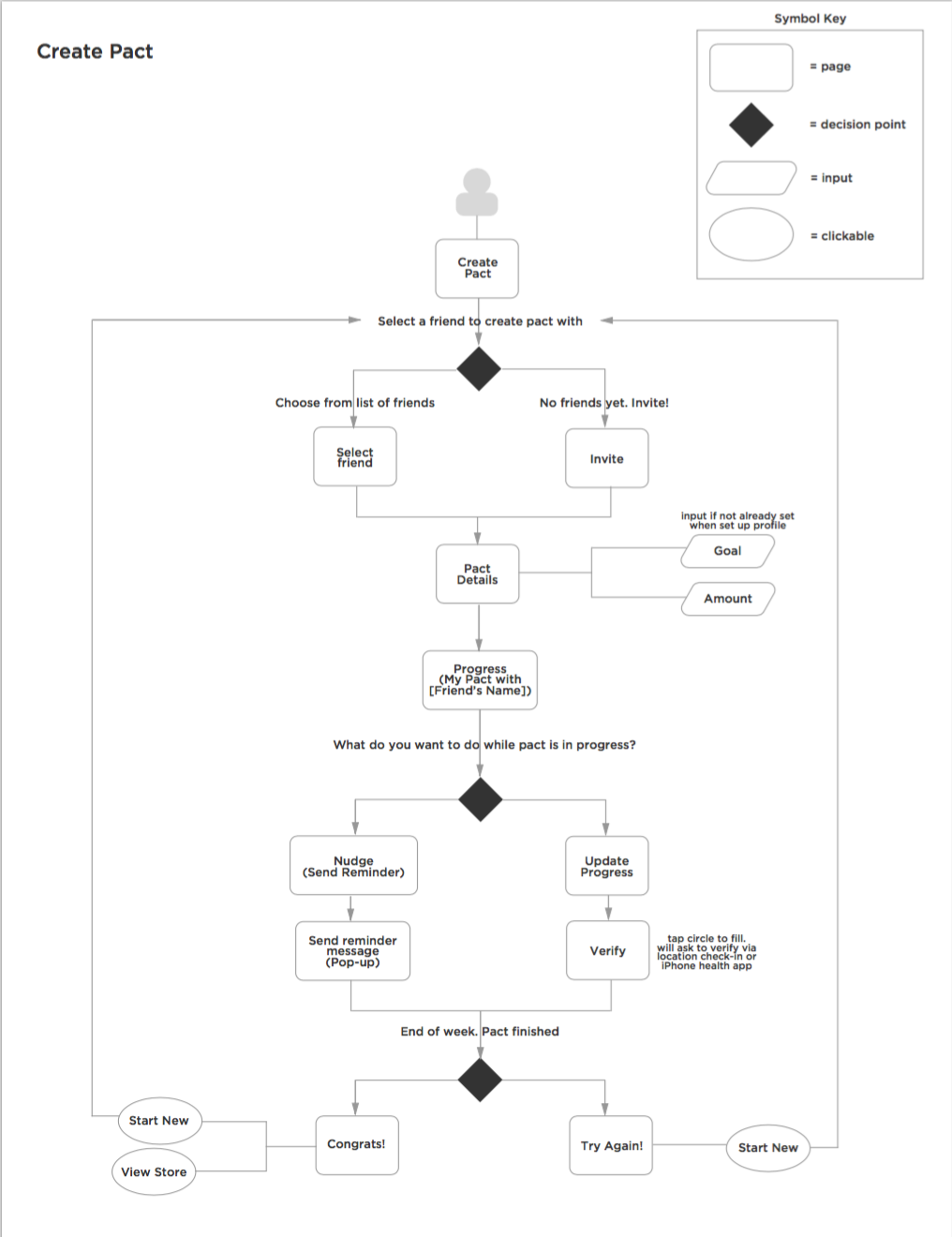
Since creating and participating in a pact was now the main feature, I created a user flow that mapped out the path a user would follow in order to complete this task.
Even though the app now only focused on pacts, it still targeted three of the original clusters from the affinity map: social/competition, schedule/routine, and motivations.
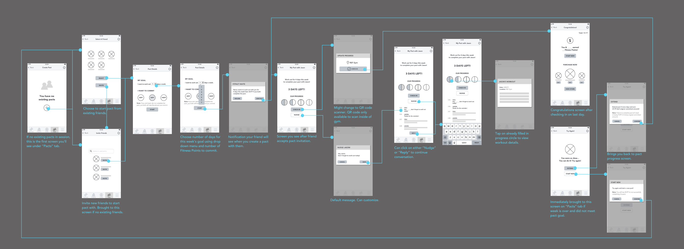
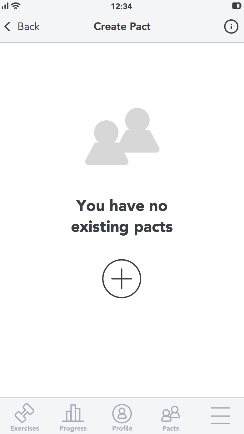
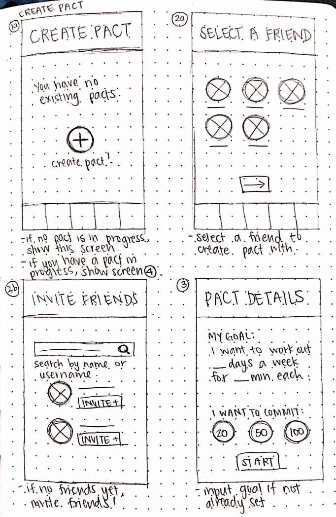
If you currently have no existing pacts, invite friends to start a pact with you by clicking on the "plus" button.
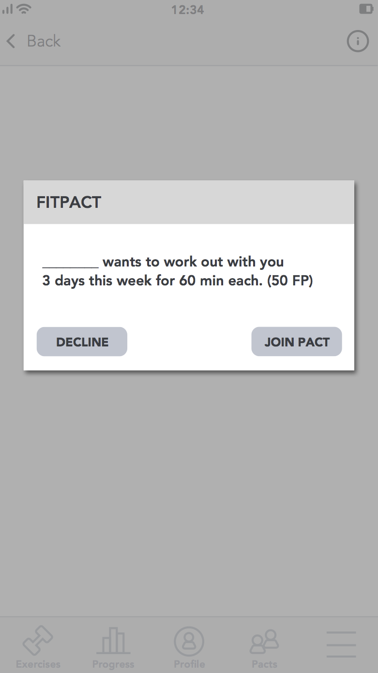
Your friend will receive this app notification when you send the pact invite.
This screen shows the message history between you and your friend underneath your pact progress.
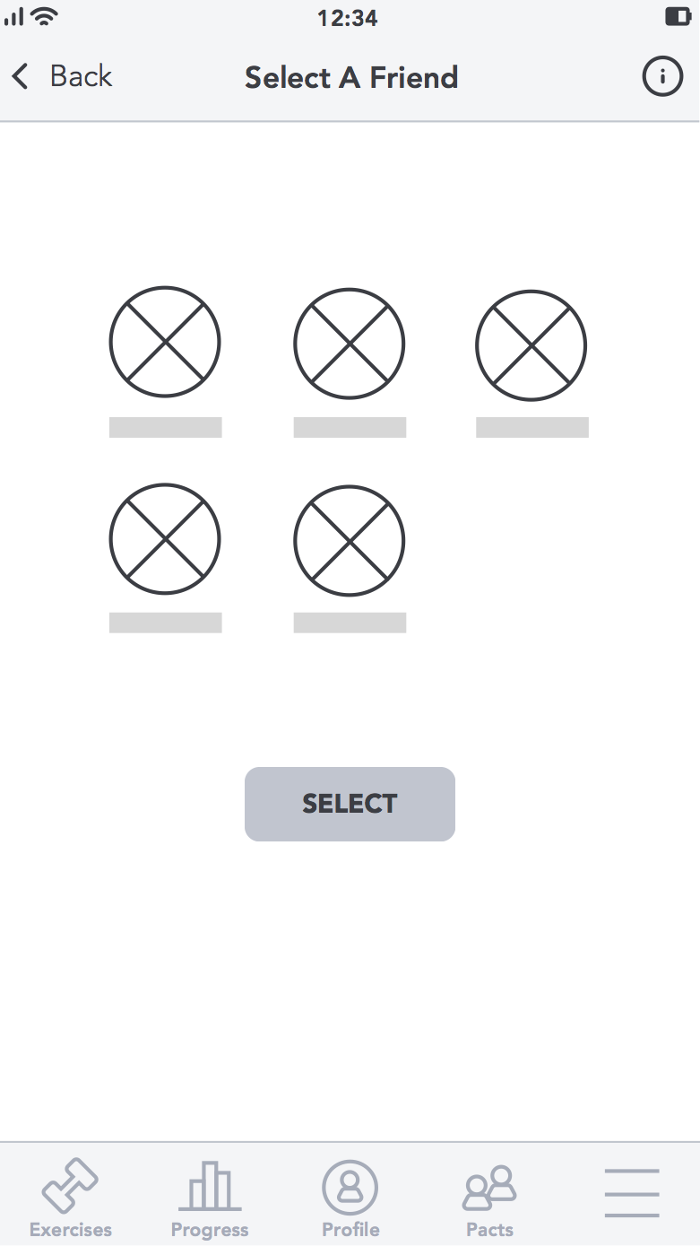
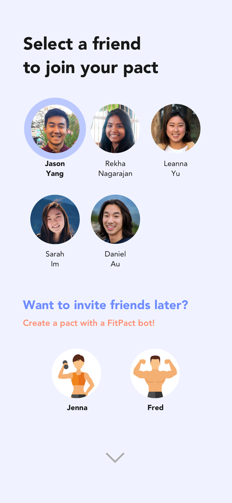
You can select a user you are already friends with to start a pact with you by tapping on their profile picture.
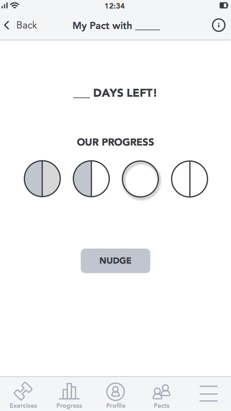
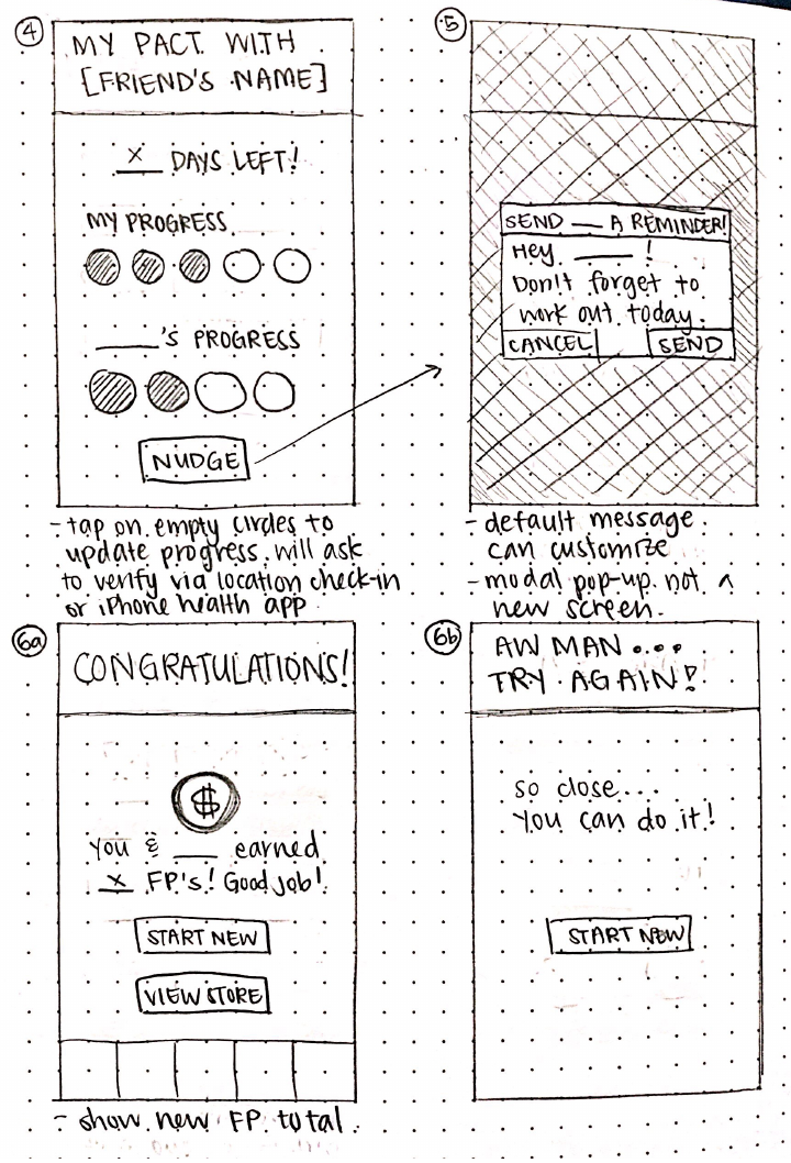
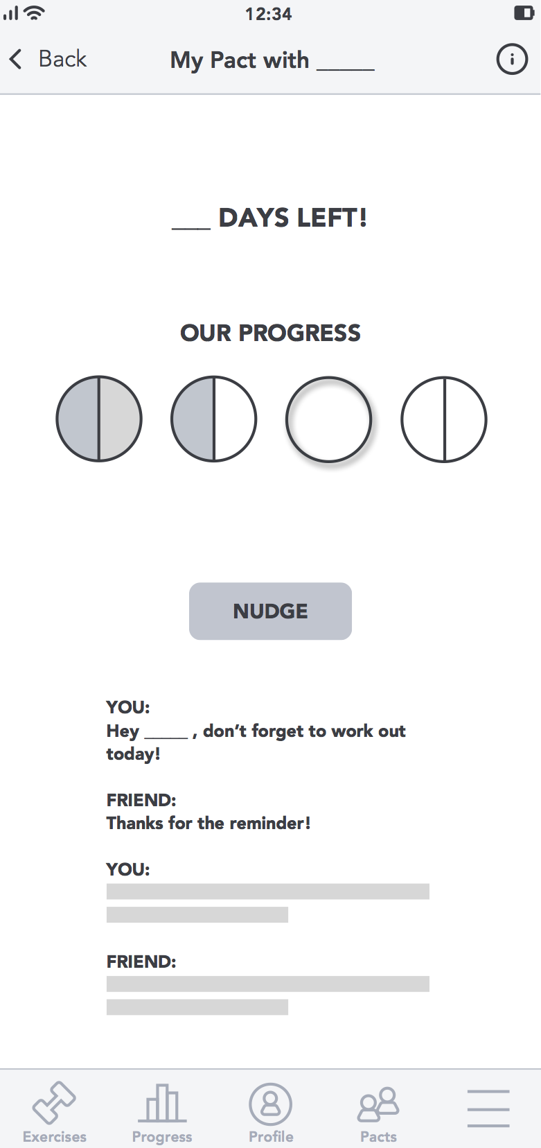
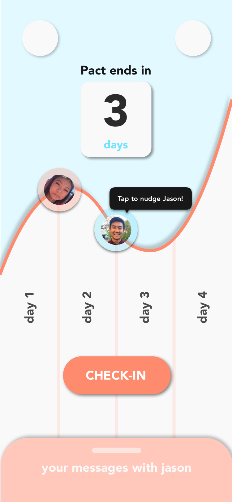
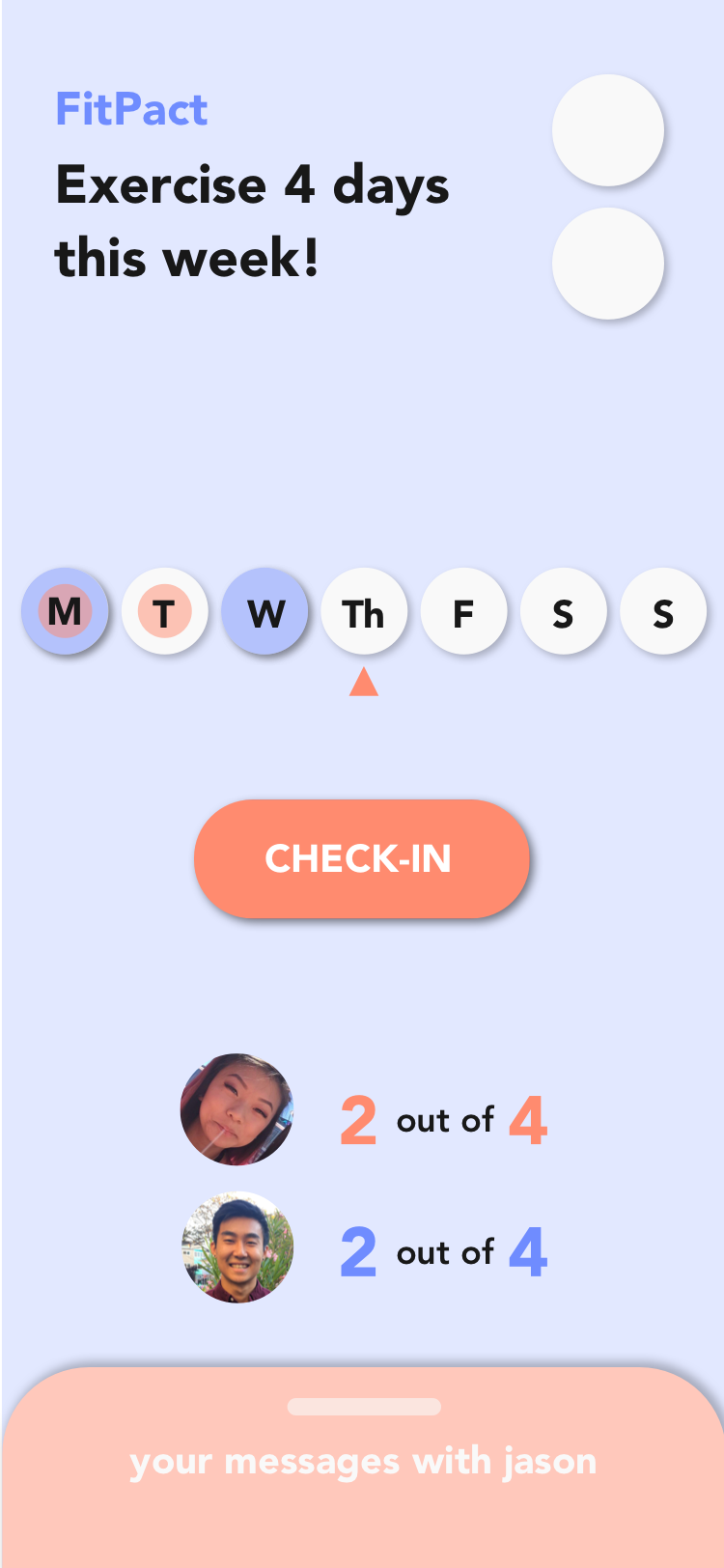
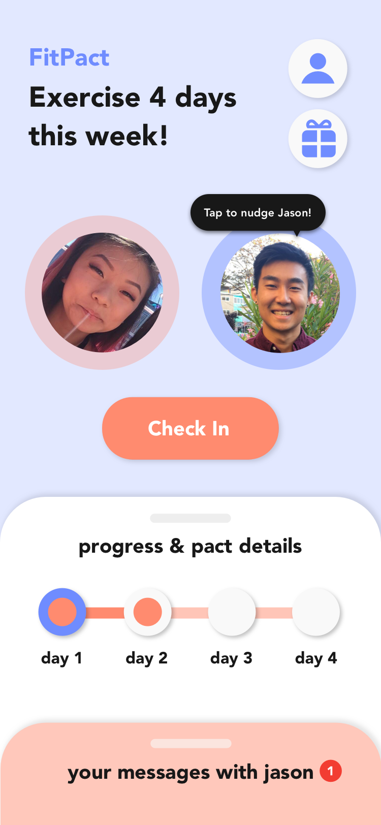
This screen shows your pact's progress. The "nudge" button lets you remind your friend to workout with one click.
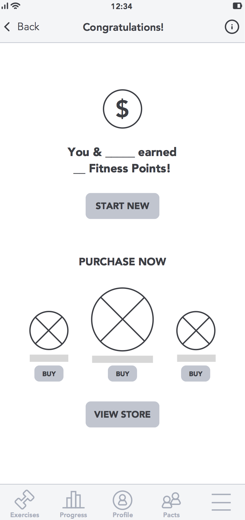
If you and your friend both successfully complete the pact, you are shown this screen where you are prompted to start a new pact or view what items you can redeem with the fitness points you have earned.
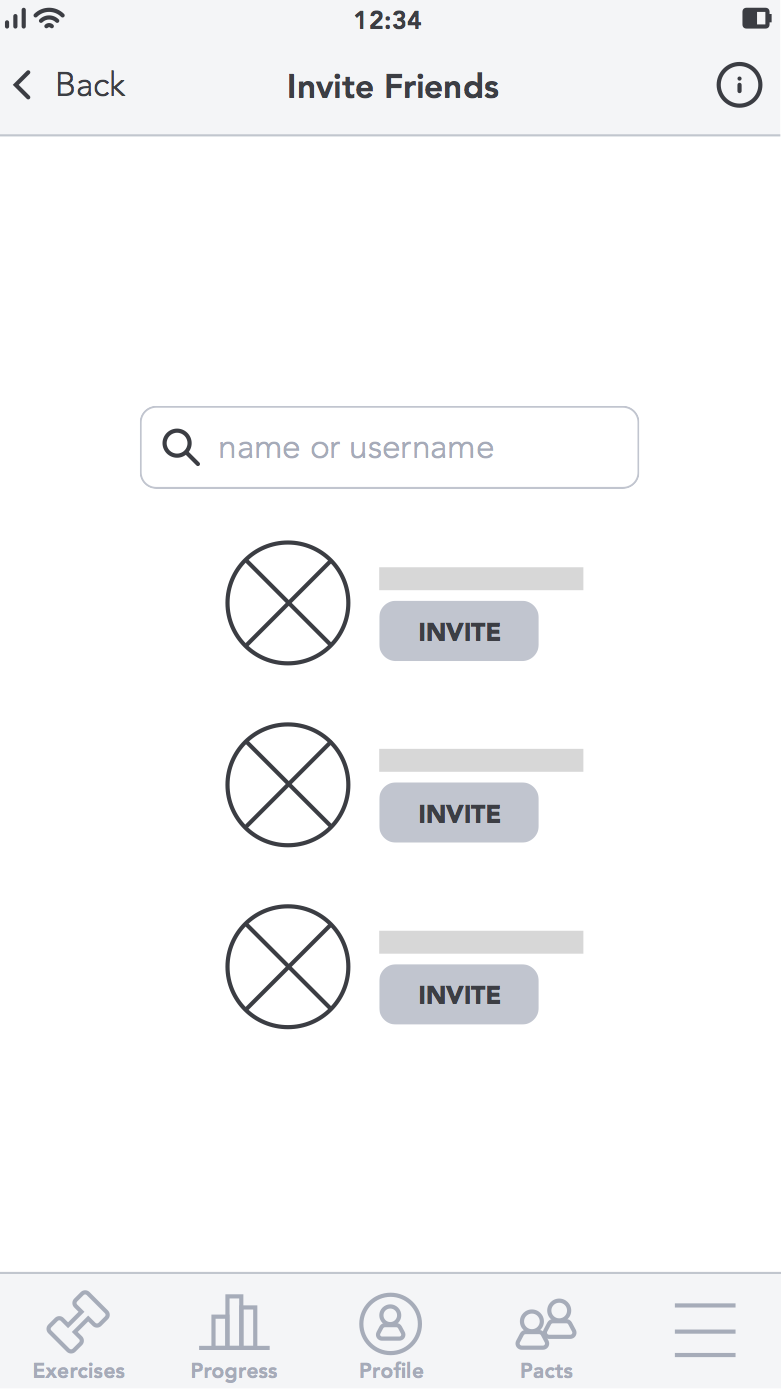
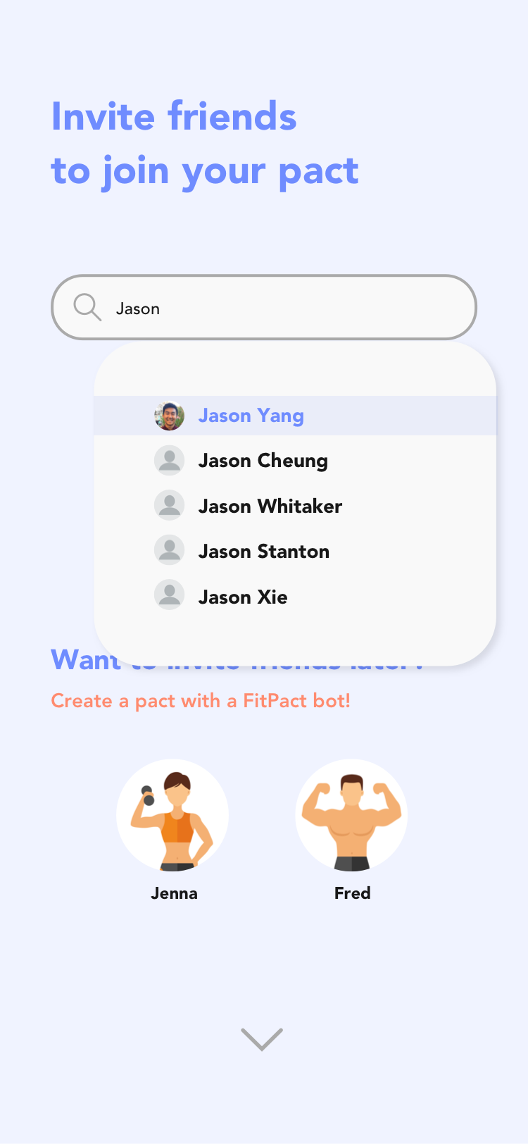
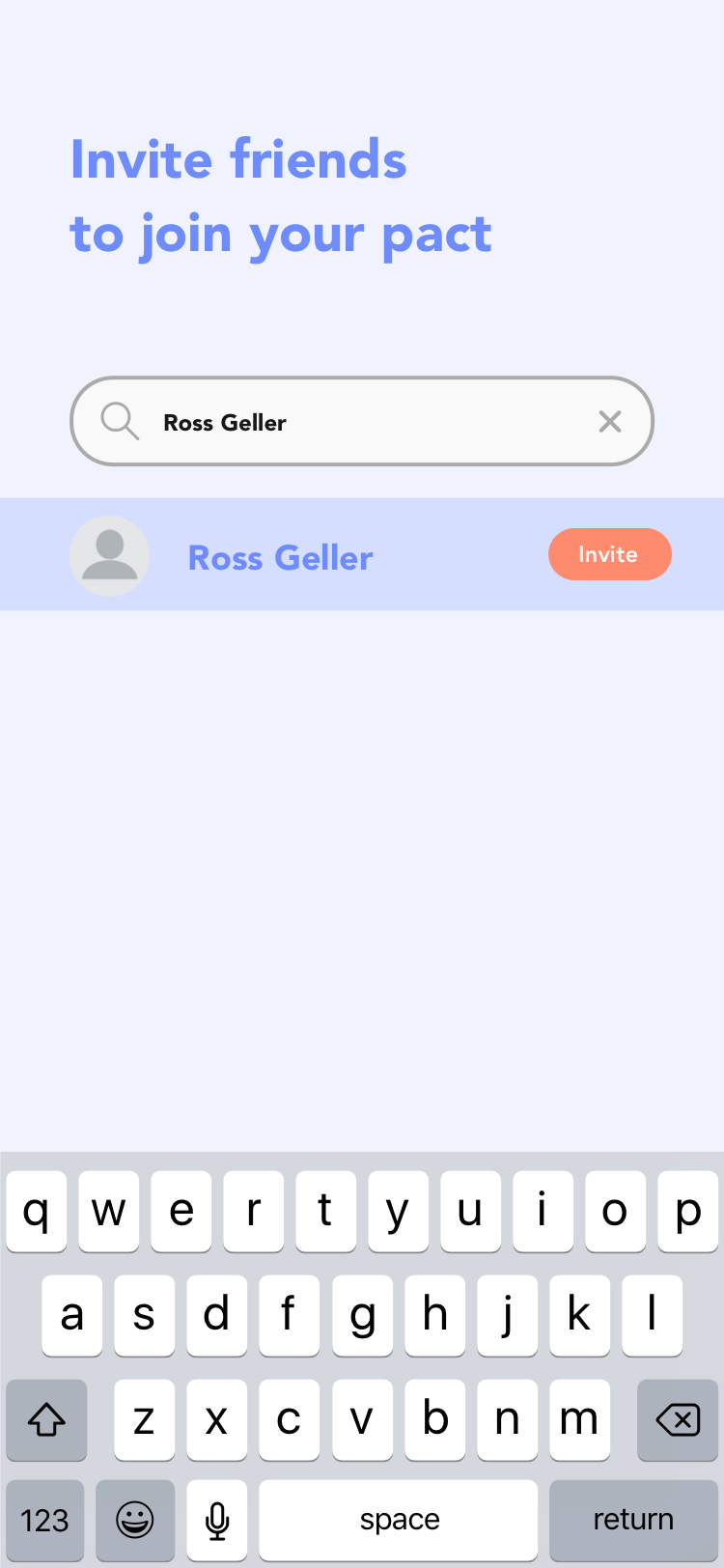
Invite a user you're not friends with yet or someone who doesn't have the app to join a pact with you.
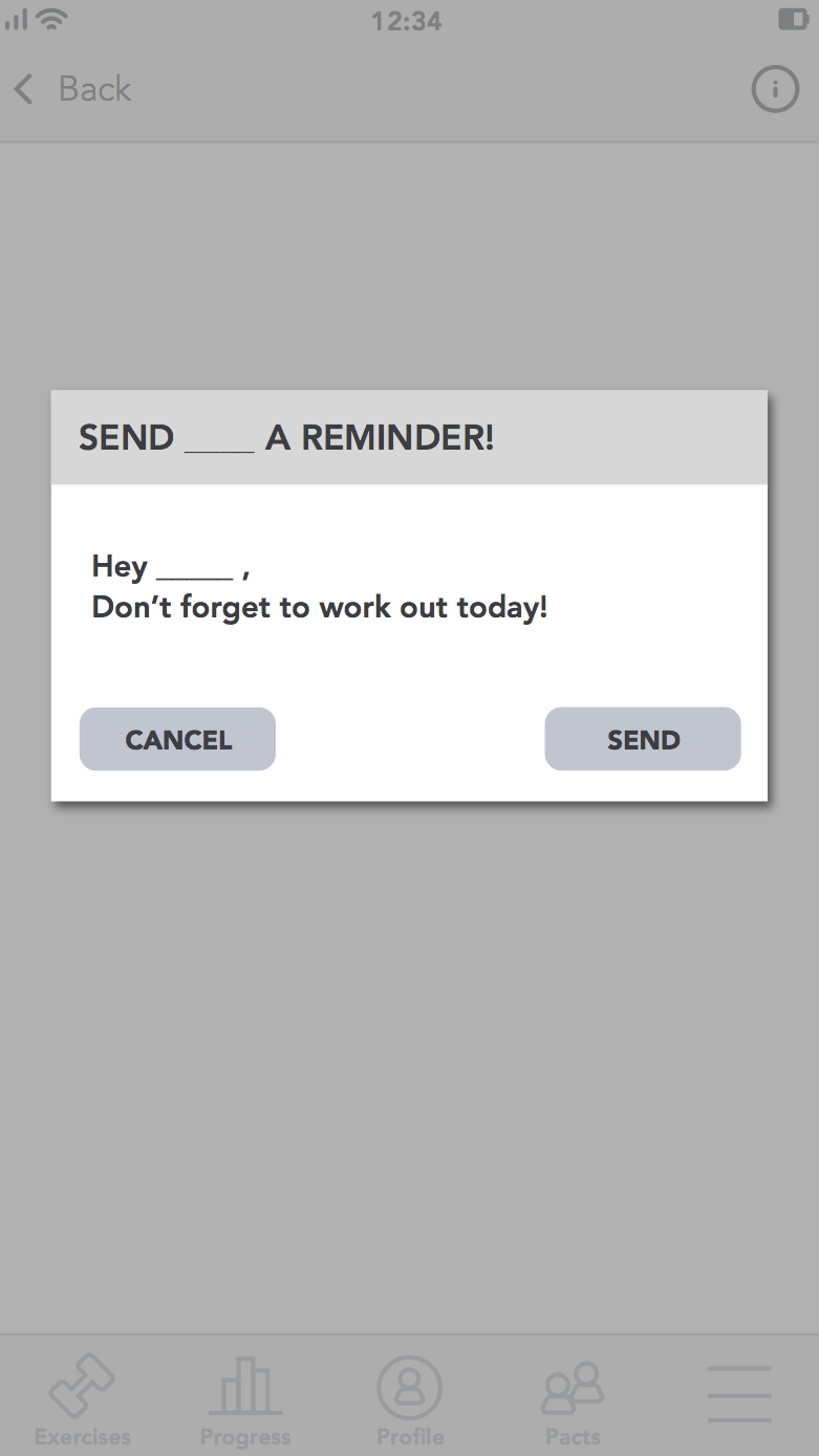
This is the reminder notification your friend receives when you click the "nudge" button.
If either you or your friend fail to complete the pact, you are shown this screen encouraging you to try again and start a new pact.
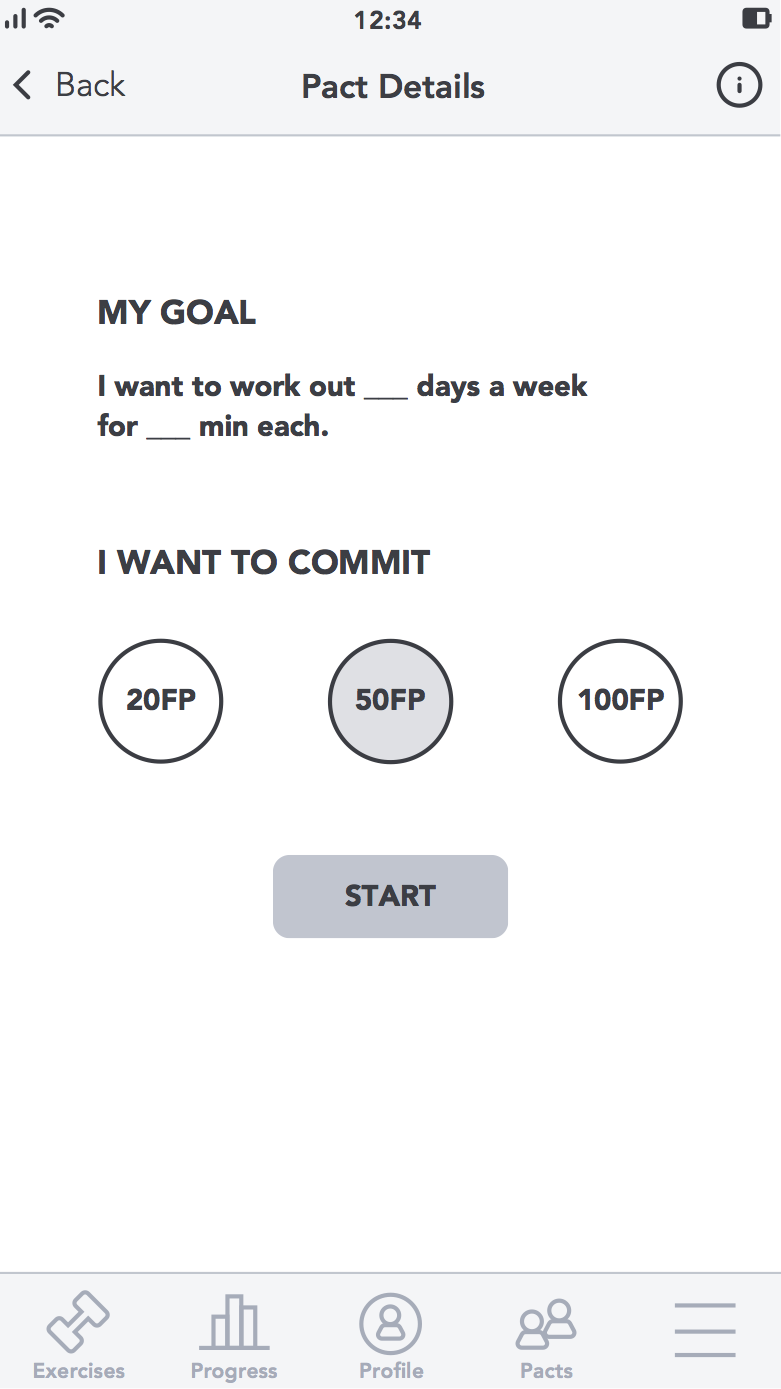
Set your goal for the week and choose how many fitness points you want to commit to the pact.
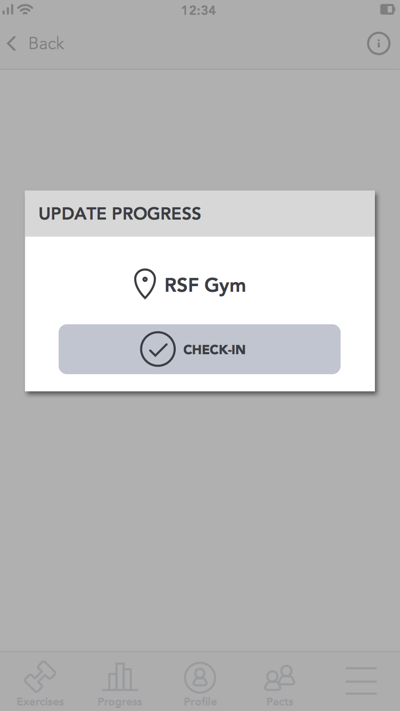
This modal pops up when you tap on one of the progress circles to check-in to your gym before your workout.
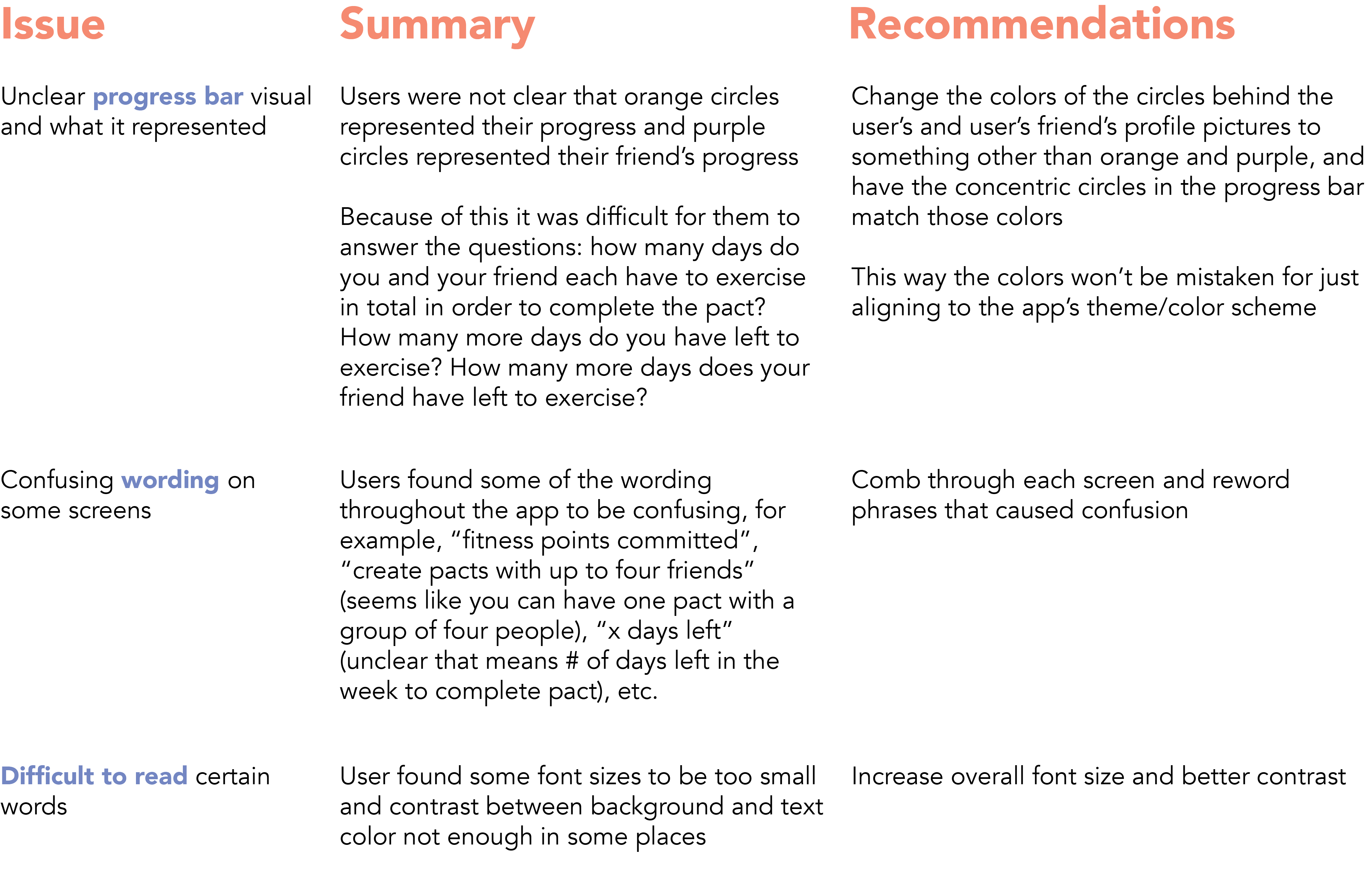
Some self-critique: The top screen title header plus bottom navbar sandwiched the designs and made the available space for content and features very limited and felt squished. This design didn’t have the modern and fun aesthetic I envisioned a motivating fitness app should have. And the visual representing the user’s progress was not satisfying.
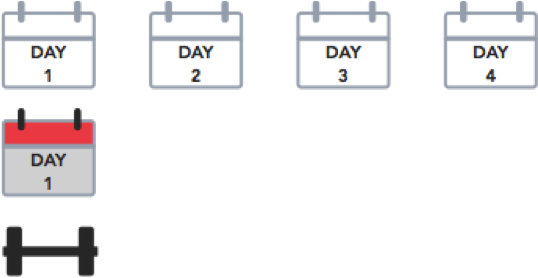
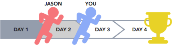
In an effort to make the progress bar visual more satisfying to look at as each day of exercise was completed, I came up with three designs (arm wrestling, calendar, race) and surveyed a handful of people to see which one they liked the most. The arm wrestling design was the most popular, however, it posed the problem of not being all-inclusive because of the use of only two skin tones.
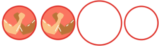
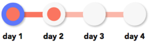
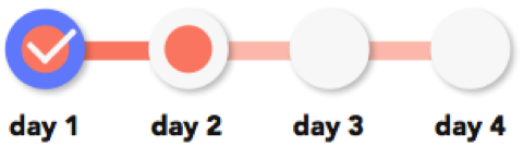
So, I went back to the drawing board and came up with a new, more minimal design to match the aesthetic of the rest of the app using concentric circles that fills with color as each day of exercise is completed with each color representing the user and their friend. After receiving more feedback, I added in the checkmark to imitate a stamp card making it look and feel more complete.
I also polled potential users for their opinions on the different variations of design for an individual pact. I weighed in their opinions and considered the uniqueness and feel of the design and prioritized features to see what was most important to emphasize.


The icons in the navigation bar of the first couple of designs did not feel cohesive. Also, having the buttons for navigation at the top right of the screen took up to much space both vertically and horizontally. Having navigation at the top right also made it not easily accesible as this app is designed to be used on a mobile device. I eventually settled for a navigation bar placed at the bottom of the screen, which makes it easily accessible when using a mobile device with one hand, and the design is very rounded which matches the friendly and inviting theme of the overall design.
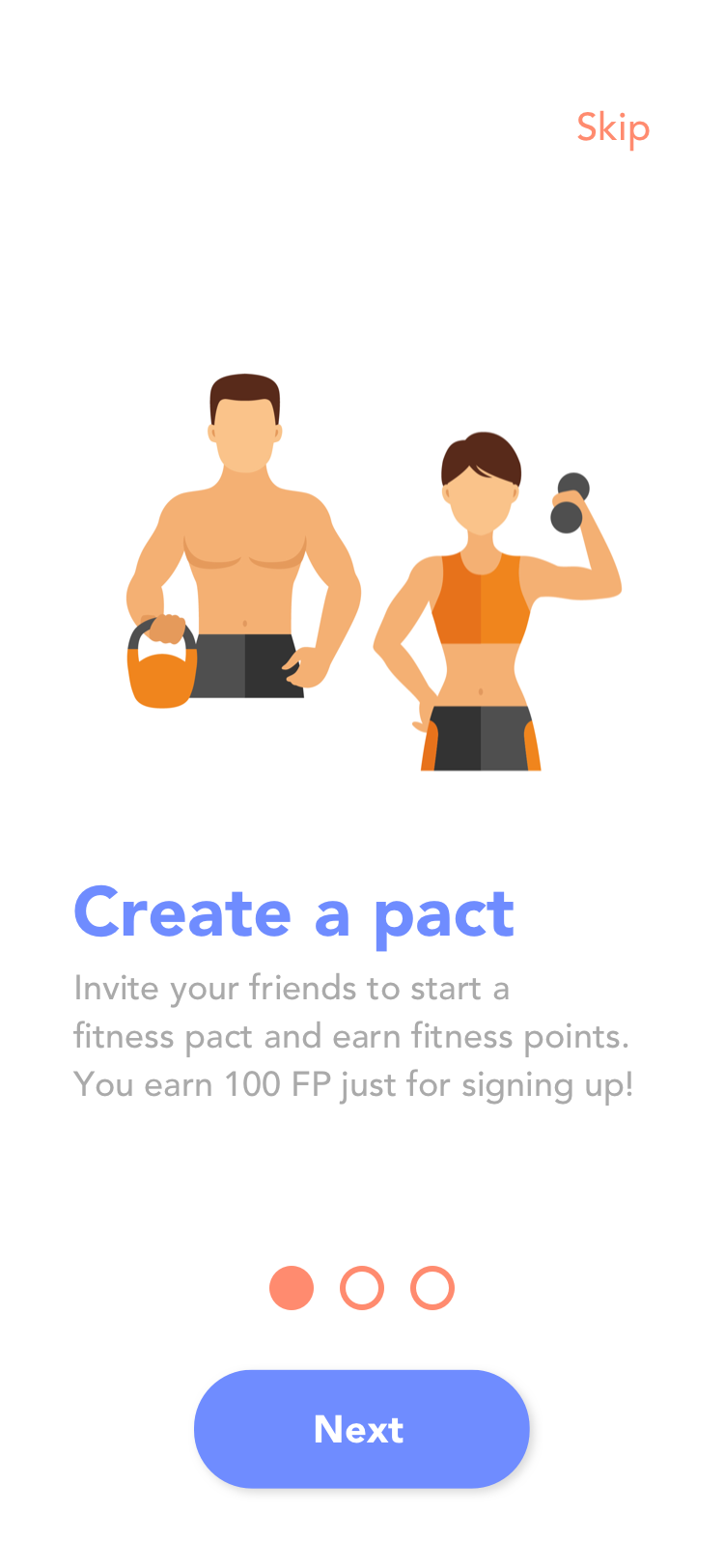
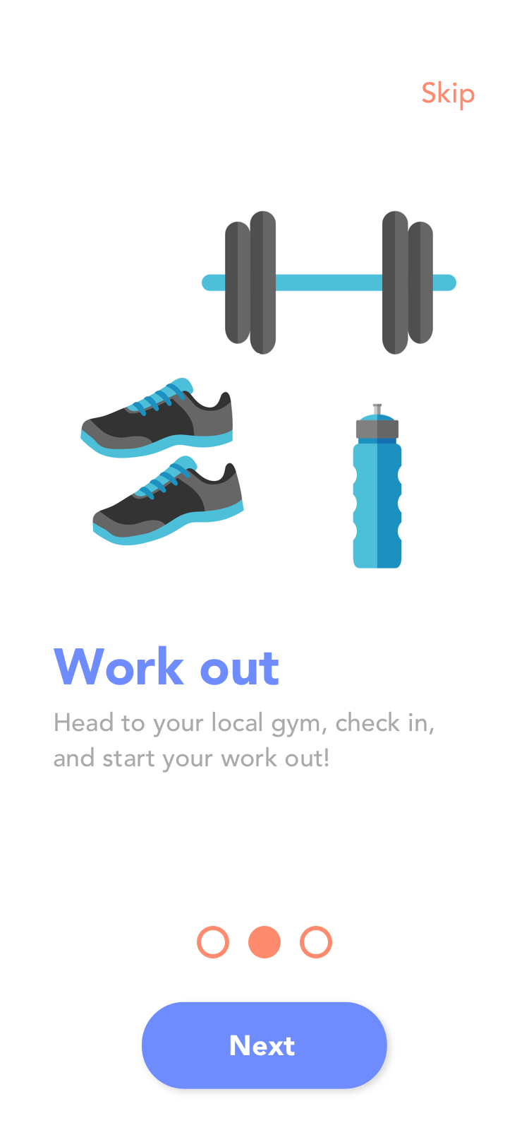
The initial design did not include onboarding, and after conducting some user tests, I noticed that some people had to ask me to remind them how the pacts worked. I didn't want to attack users with a request to sign up when they first open the app. I wanted to first explain how everything works so users would feel more inclined to sign up afterwards. So I have onboarding at the beginning when a user opens the app for the first time, which gives a general overview of the benefits of using the app. Then, after signing up and setting the parameters of your first pact, there is a walkthrough of the different features on the pact screen, which you can exit out of and come back to at any time.
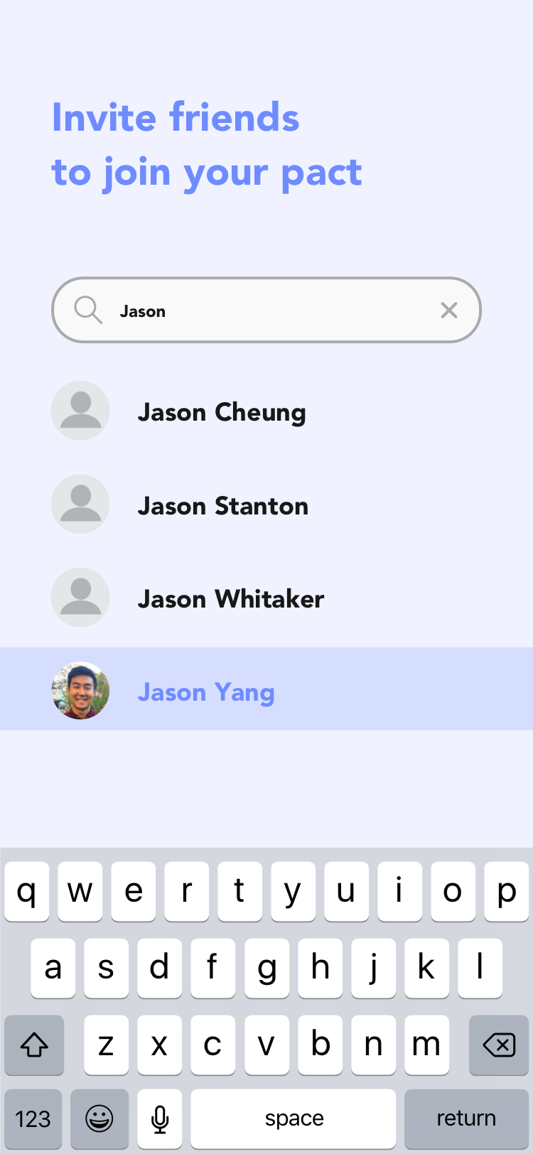
For the list of search results that appears, people seemed to prefer a list view similar to how iPhone contacts are displayed because it is more familiar. A drop down menu seemed more suitable for web rather than mobile. And I remembered to order the search results alphabetically because that makes the most logical sense.


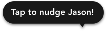
Checking in is supposed to be the main call to action not nudging, so some of my options were to make it a smaller button, an icon, or some different type of interaction. I chose to make it a tooltip similar to the ones that pop up throughout the walkthrough.
I was initially worried about people gaming the system by creating an unlimited number of pacts and gaining a multiplied amount of fitness points by exercising the same amount they would have by only doing one pact. However, after receiving feedback from my usability tests, I realized that allowing multiple pacts is beneficial to the app because people would be excited to invite multiple friends to join them in pacts. A potential solution to moderate the business side of things is to limit the number of simultaneous pacts per person. In the future, I would need to conduct further tests to figure out a good balance between how many pacts a user would want to be in at the same time as well as how many pacts a user can be in at the same time without the business losing money by giving away too many fitness points, and therefore, too many free rewards.
I did a second round of usability testing with five test participants to gain new insight on my latest iteration of designs. Two user tests were conducted in-person and three were remote via Skype or Google Hangouts. The purpose of this test was to discover aspects of the app design that are unclear or confusing and how the overall aesthetic made the user feel.
These were my findings and recommendations:
For my first UX project, I learned a lot...