People who live in cities want to be able to find a dog to adopt that fits their specific lifestyles in terms of living environment and daily routines. Some common frustrations noted from the research were that there was not enough logistical information about the dogs, for example, how much attention, space, and exercise they need, and oftentimes there is a lack of consistent information on how to contact the animal shelters. Overall, the descriptions on each dog’s profile on adoption sites are too general and aren’t helpful in helping people find the perfect dog for them to adopt.

My role in this design sprint was to organize research, brainstorm solutions, storyboard, prototype, and user test.
Q: What do you consider when looking for a dog to adopt?
A:
Persona: Elli, 27yo, lives alone in a studio in New York City
Frustrations:
Goals:
I created a user flow that outlined from beginning to end how a user might navigate from the homepage of CityPups to deciding on the perfect dog to adopt.
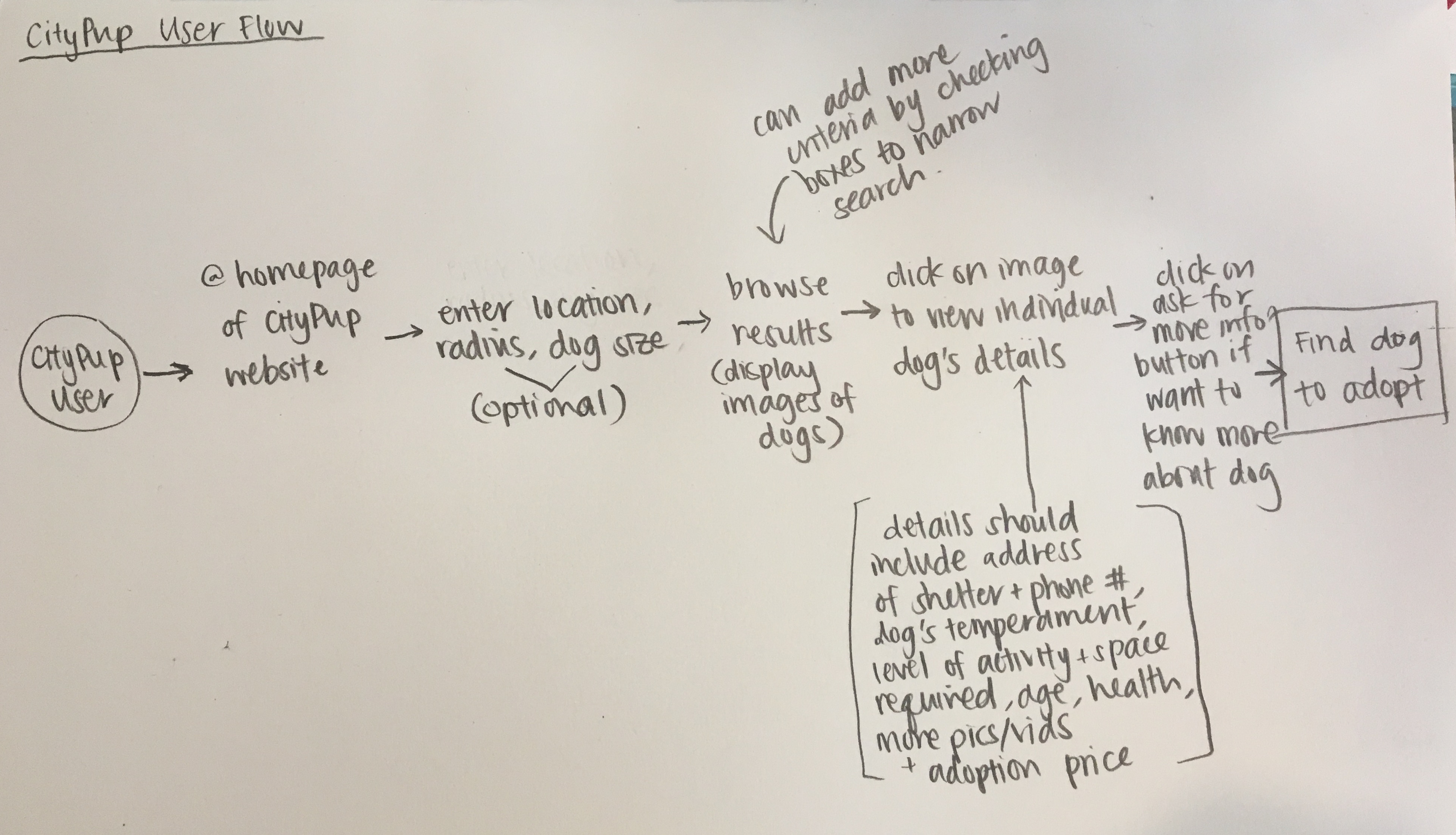
start: future dog owner > go on website > enter location, dog size, breed, activity level, good with other animals/kids (only location required; all else optional for filtering) > browse dogs that fit criteria > can add more criteria to narrow down search > click on dog to view profile/more info (pics, story, bio, health history) > after finding dog to adopt, click contact adoption agency (direct to necessary steps in order to adopt from that particular adoption agency) > finish: find perfect dog to adopt
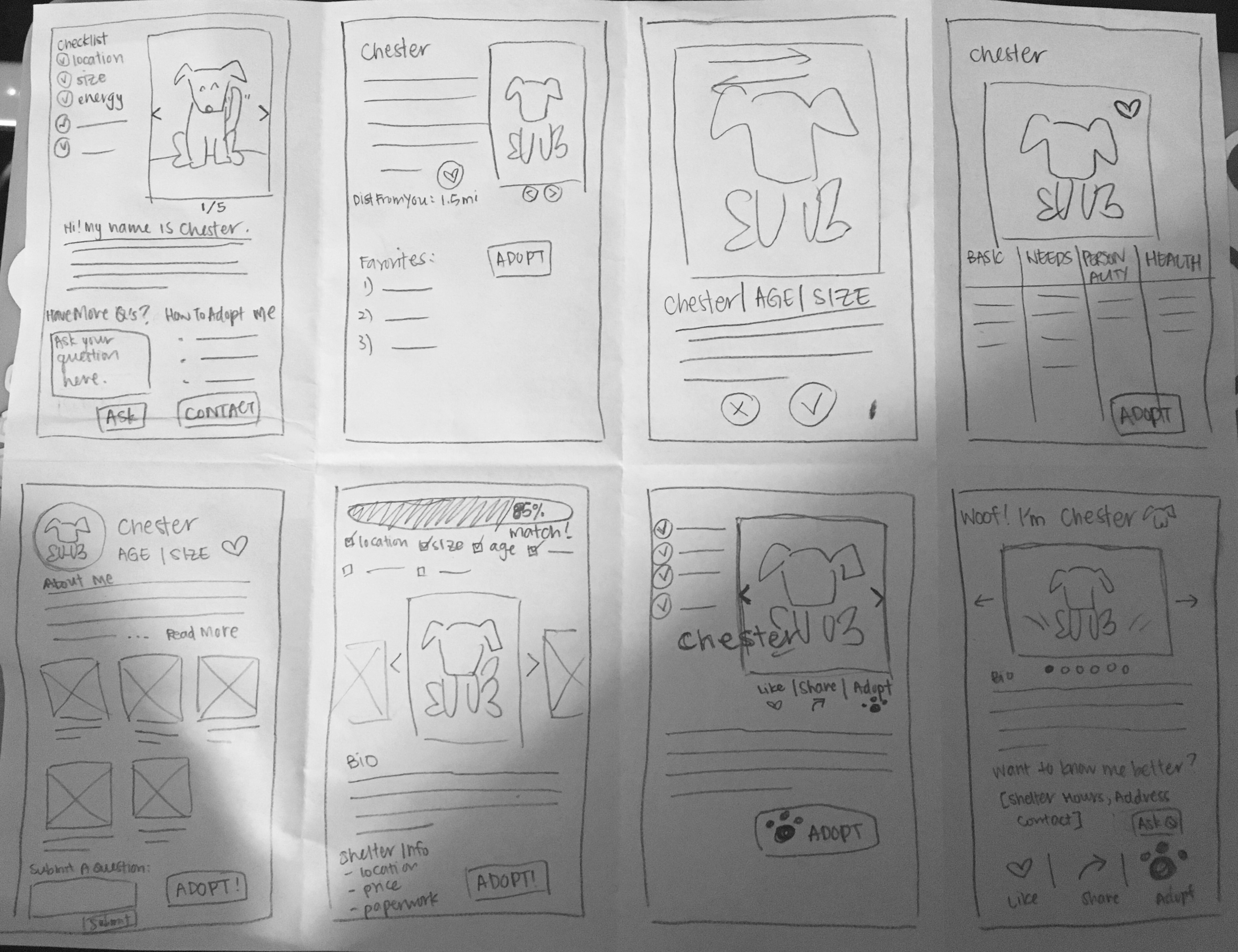
On the second day of the design sprint, I spent about 8 minutes doing an activity called "Crazy 8's", where I came up with eight unique sketches of the critical screen. I determined the critical screen of CityPups to be the profile of an individual dog that is up for adoption because the dog's profile is ultimately what convinces the user whether or not that dog is the perfect dog for them or not.
After making some mental critiques on each sketch from the Crazy 8's activity,
I chose a design to move forward with that addressed the frustrations and goals
mentioned in the user research. Using the critical screen I chose, I came up with
a solution sketch that includes, on the left, the screen that comes before, and
on the right, the screen that comes after.
For the screen that comes before, I wanted the layout to be similar to the layout
of most online shopping sites with filters on the side that the user can use to
refine their search as they browse through the results.
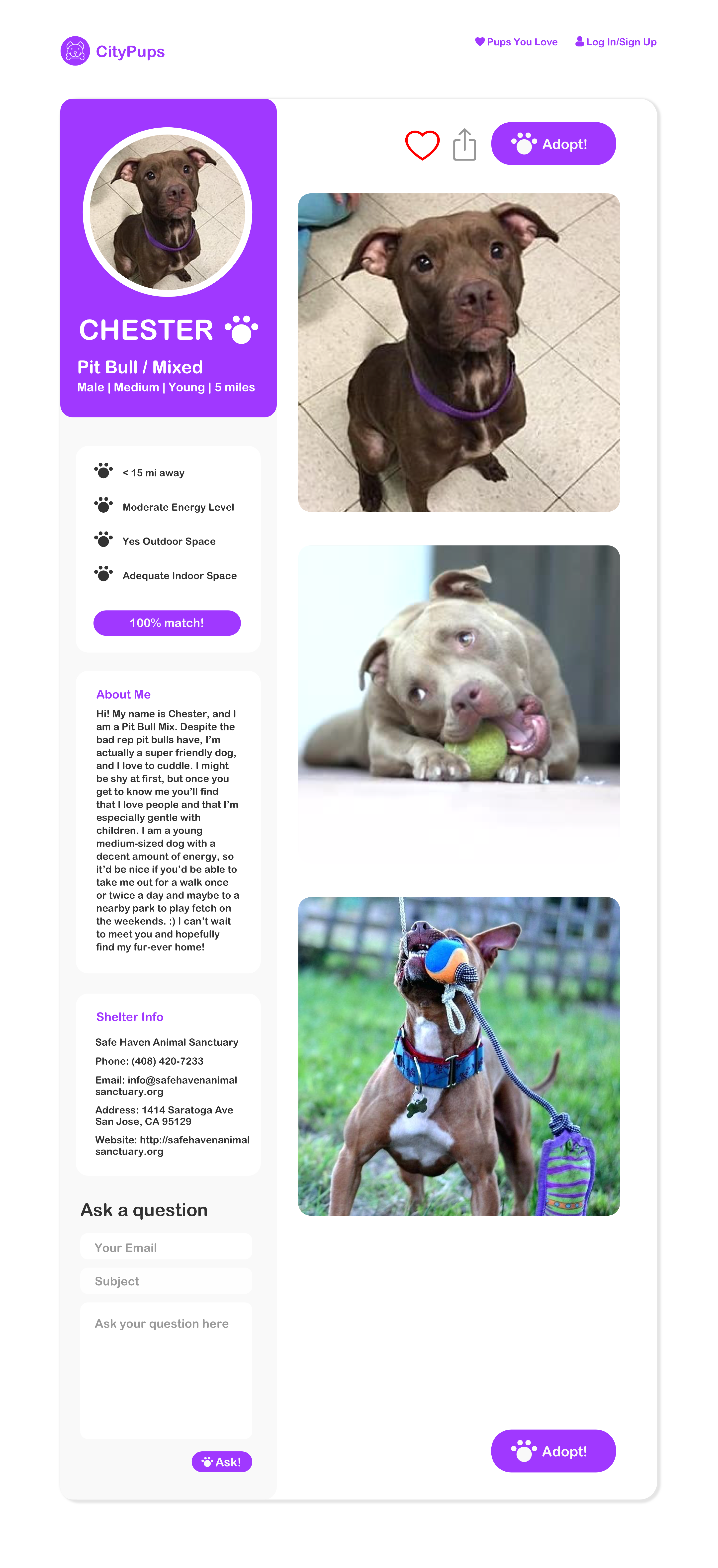
For the critical screen, I included a checklist of all the criteria that are met
from the filter options the user selected, pictures of the dog that take up more
than half the width of the screen because users mentioned that pictures are what
grab their attention first, the dog's bio to provide more background and personality,
shelter information, a question form that allows the user to ask the shelter more
questions about the dog or adoption process if that information isn't clearly provided
on the site, a "like" button that allows the user to save the dog's profile so they
can come back to it later as they look at more potential dogs to adopt, and a "share"
button if they feel like this dog could be the perfect dog for a friend of theirs to
adopt.
Lastly, the screen that comes after is what the user would see after they click the
"adopt" button. Here they would be given very clear and straightforward instructions
on what they need to do in order to adopt the dog.
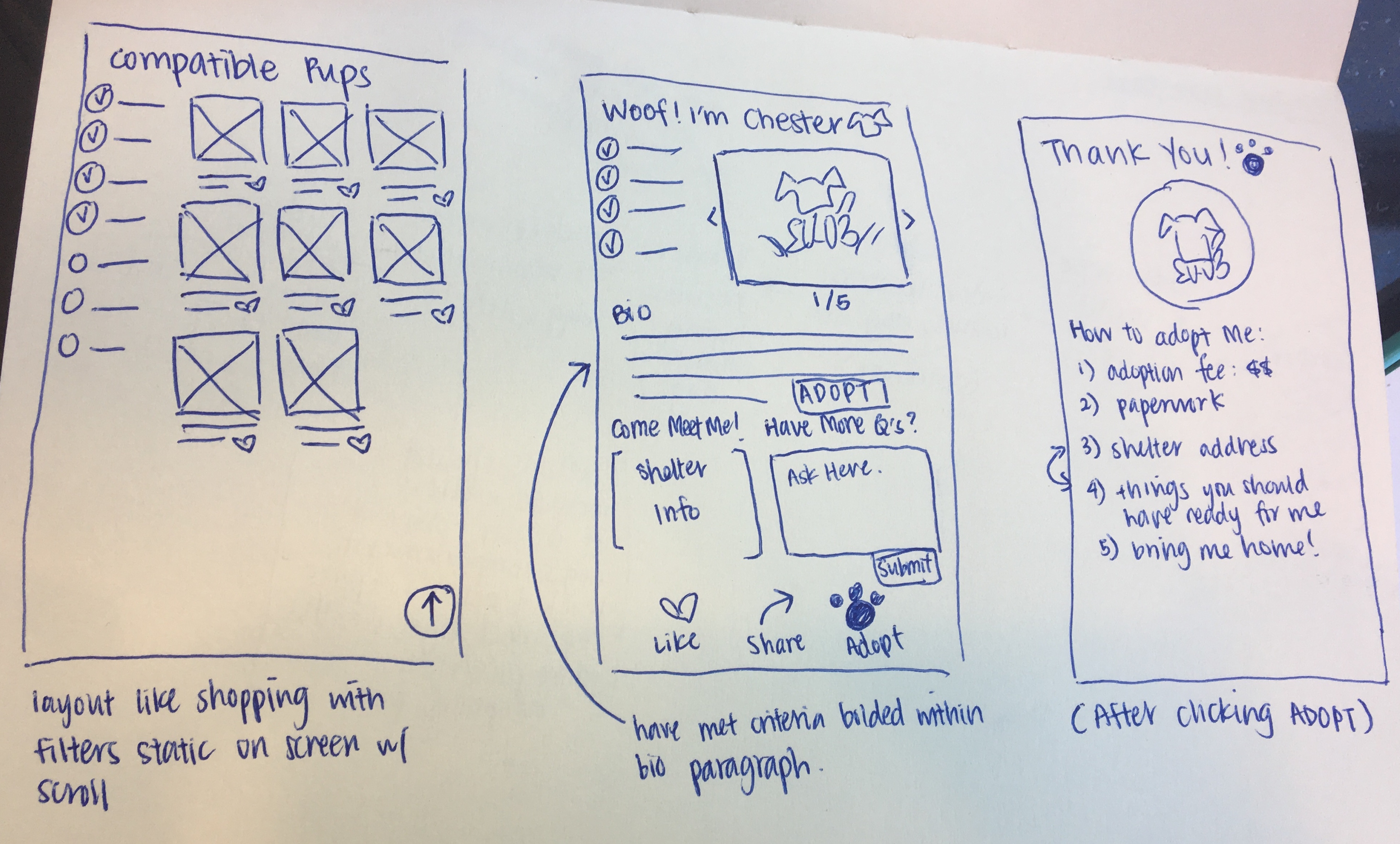
Day 3 was for storyboarding! I drew some lofi sketches of each screen of the user flow from beginning to end starting from the home page to the adoption information page. The sequence goes from left to right, top to bottom. Each screen will be described in more detail in the next section when I present the prototype and high fidelity screens.
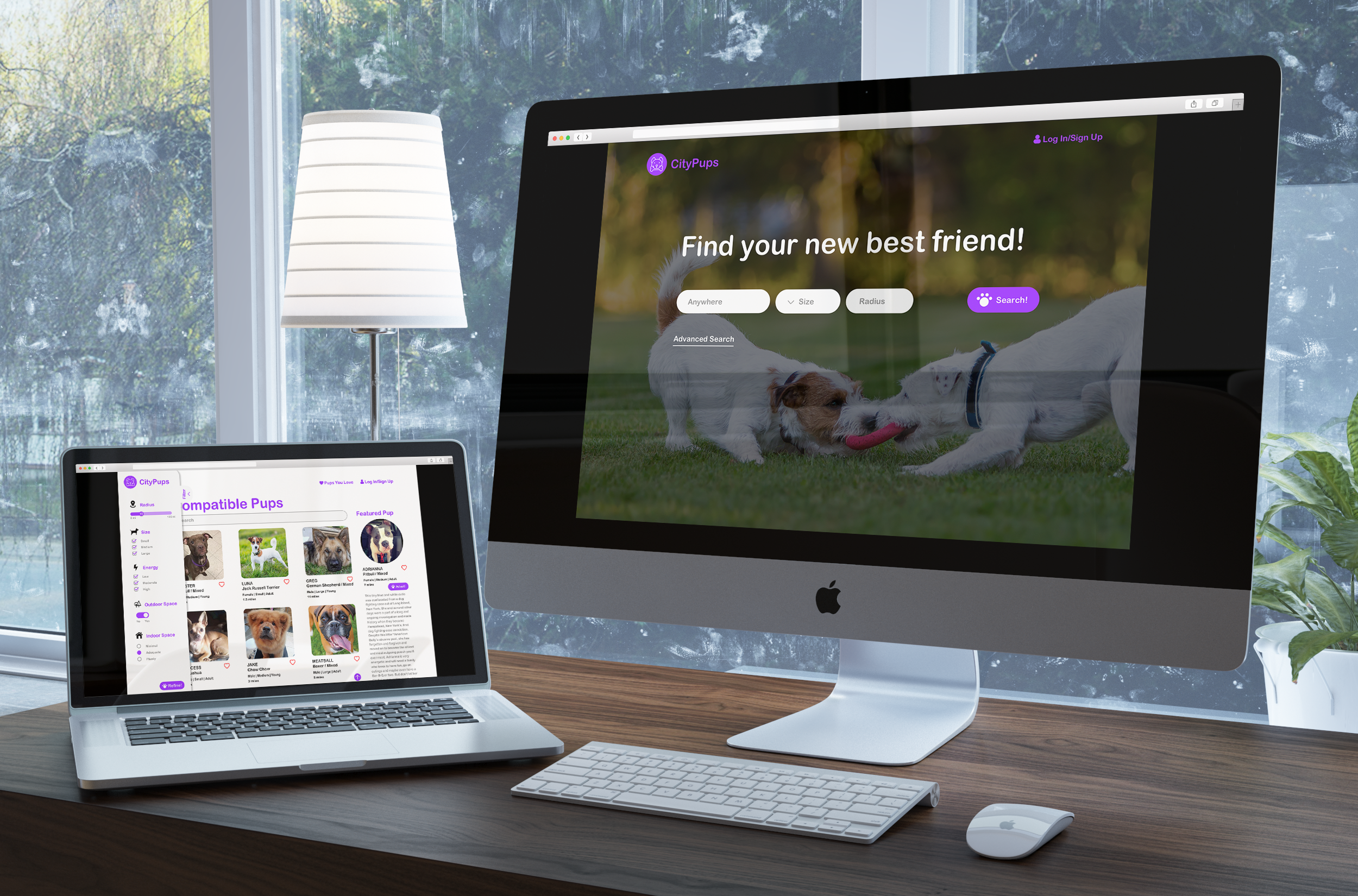
Homepage of CityPups where user can search for a dog by entering in different requirements.
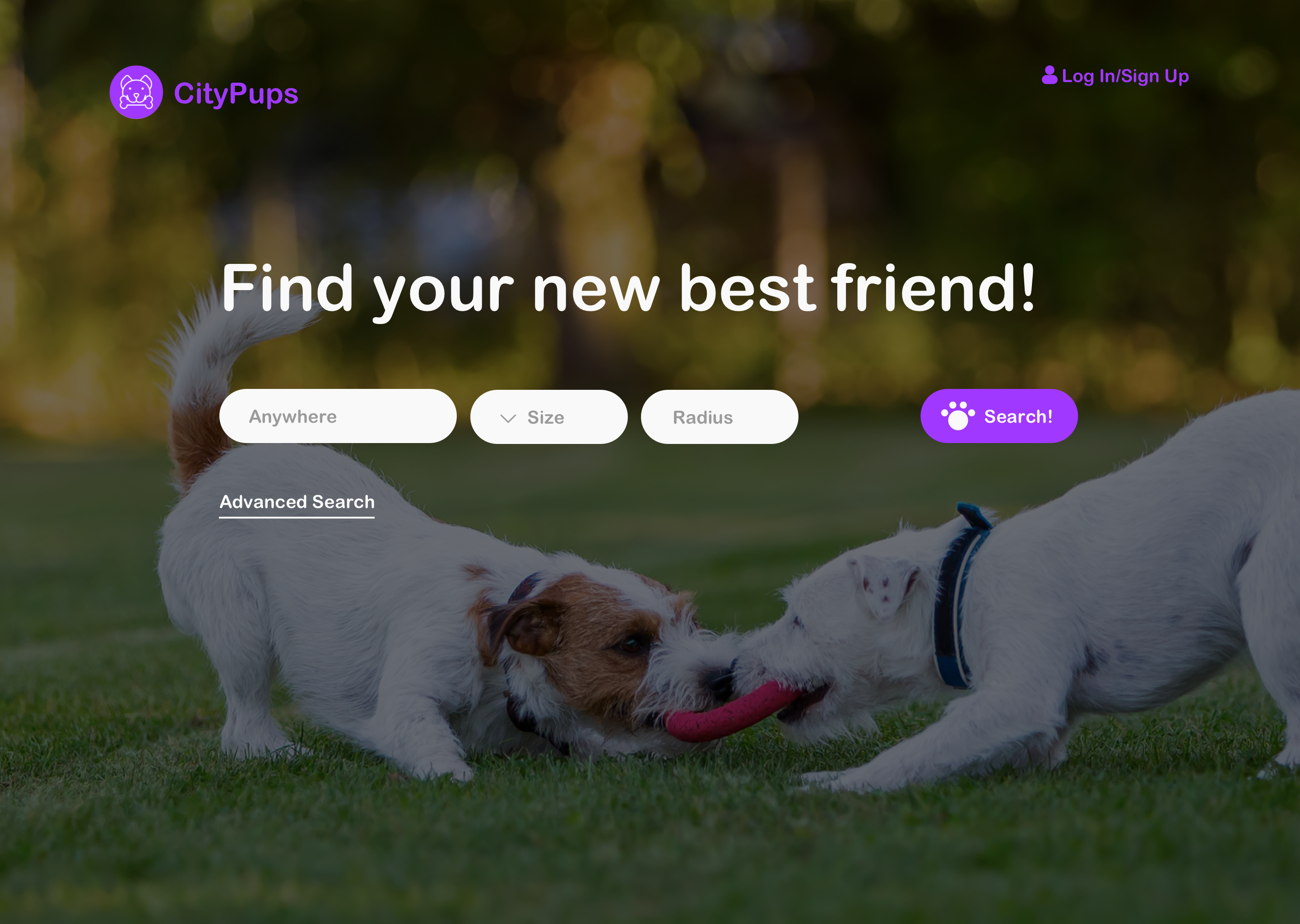
These are the search results based on the the filters you entered on the homepage.
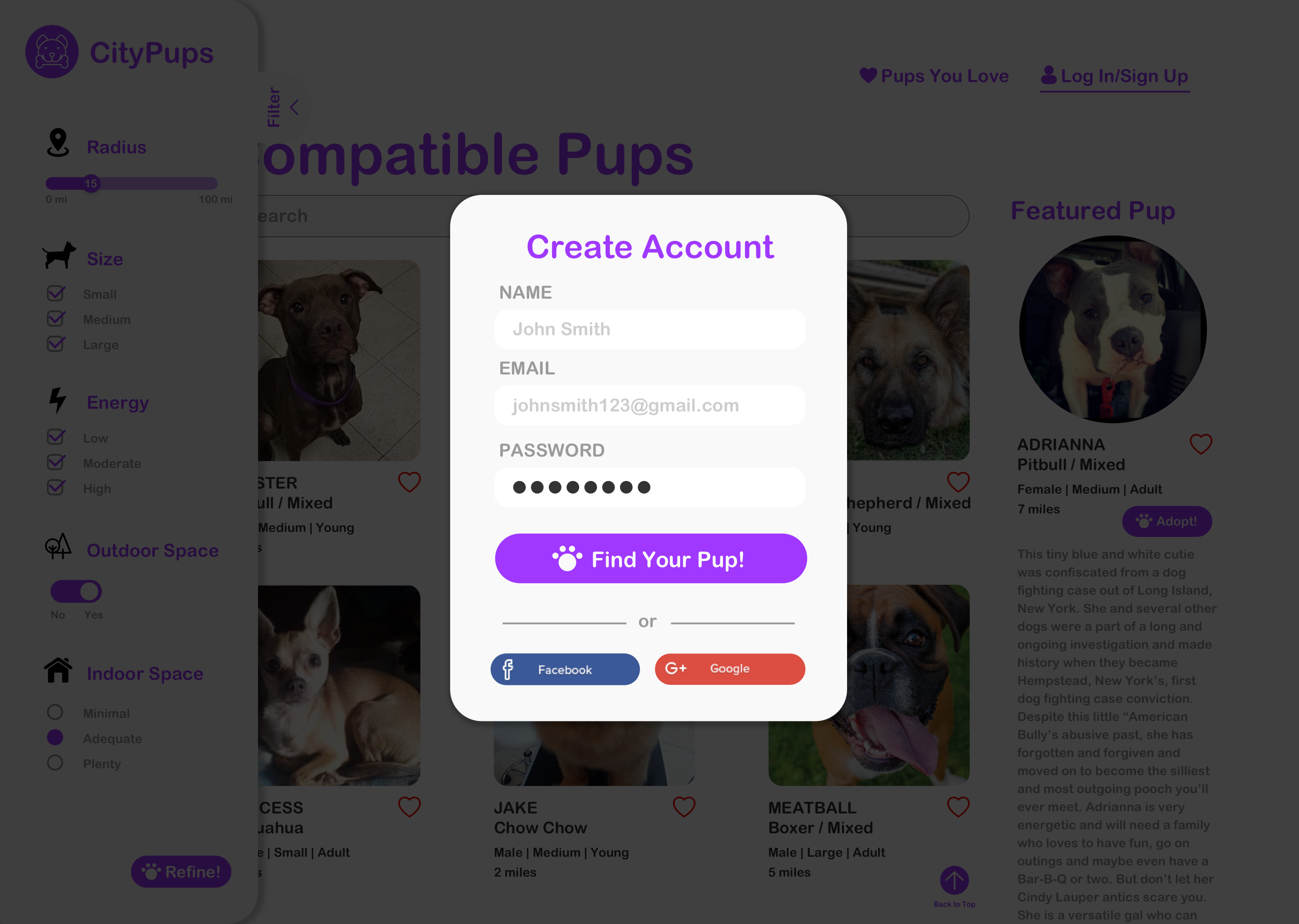
If you try to favorite a pup by clicking on the heart icon, you will be prompted to create an account in order for the site to save this info.
An example of an individual dog's profile. Here you can find the dog's basic info, a short bio and pictures to showcase the dog's personality, information about the shelter, a question form if you would like to learn more about the dog, a "favorite" and "share" button, and an "adopt" button if you decide this is the dog you want.
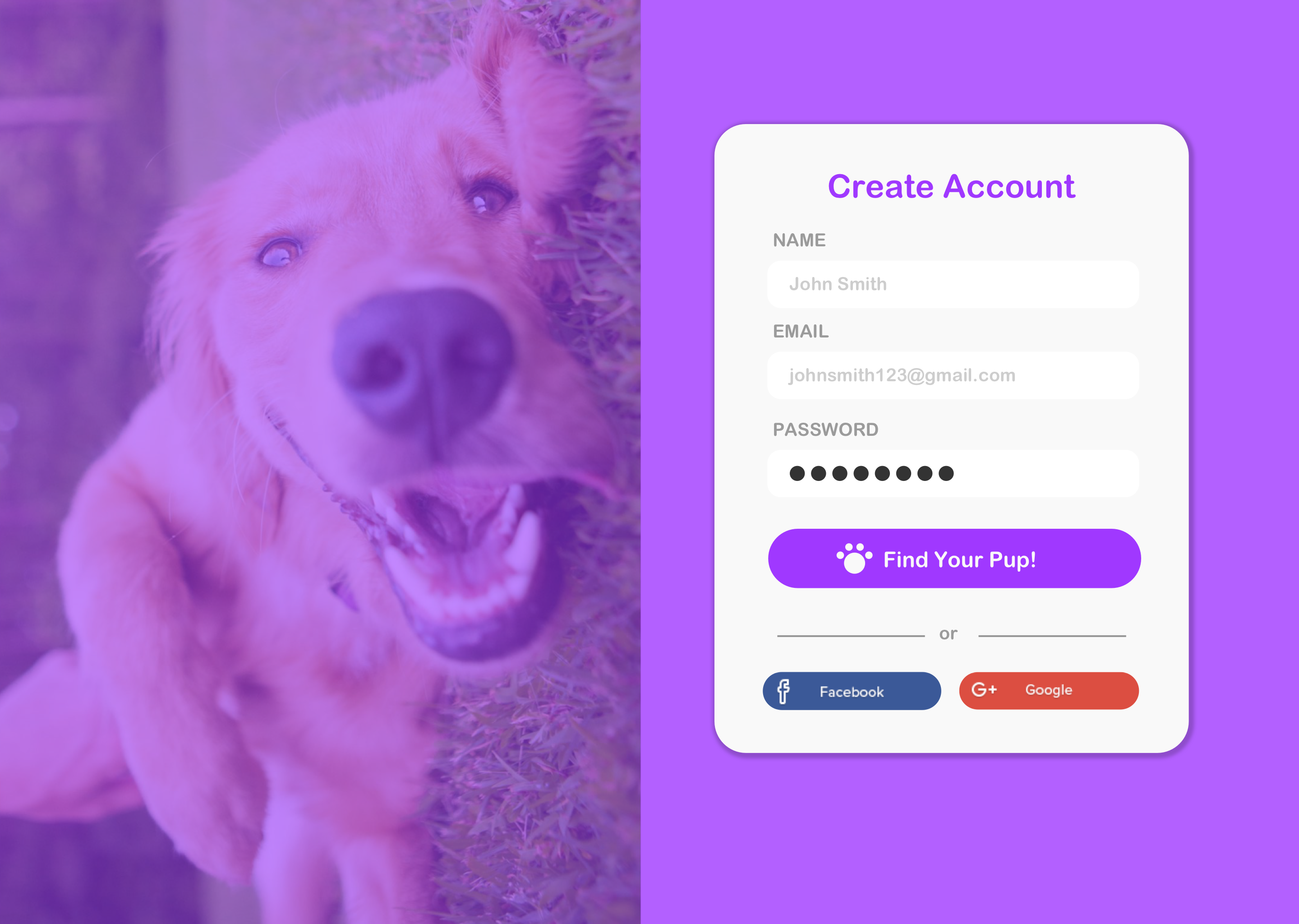
Create an account if you are a new user and would like to save information about your searches.
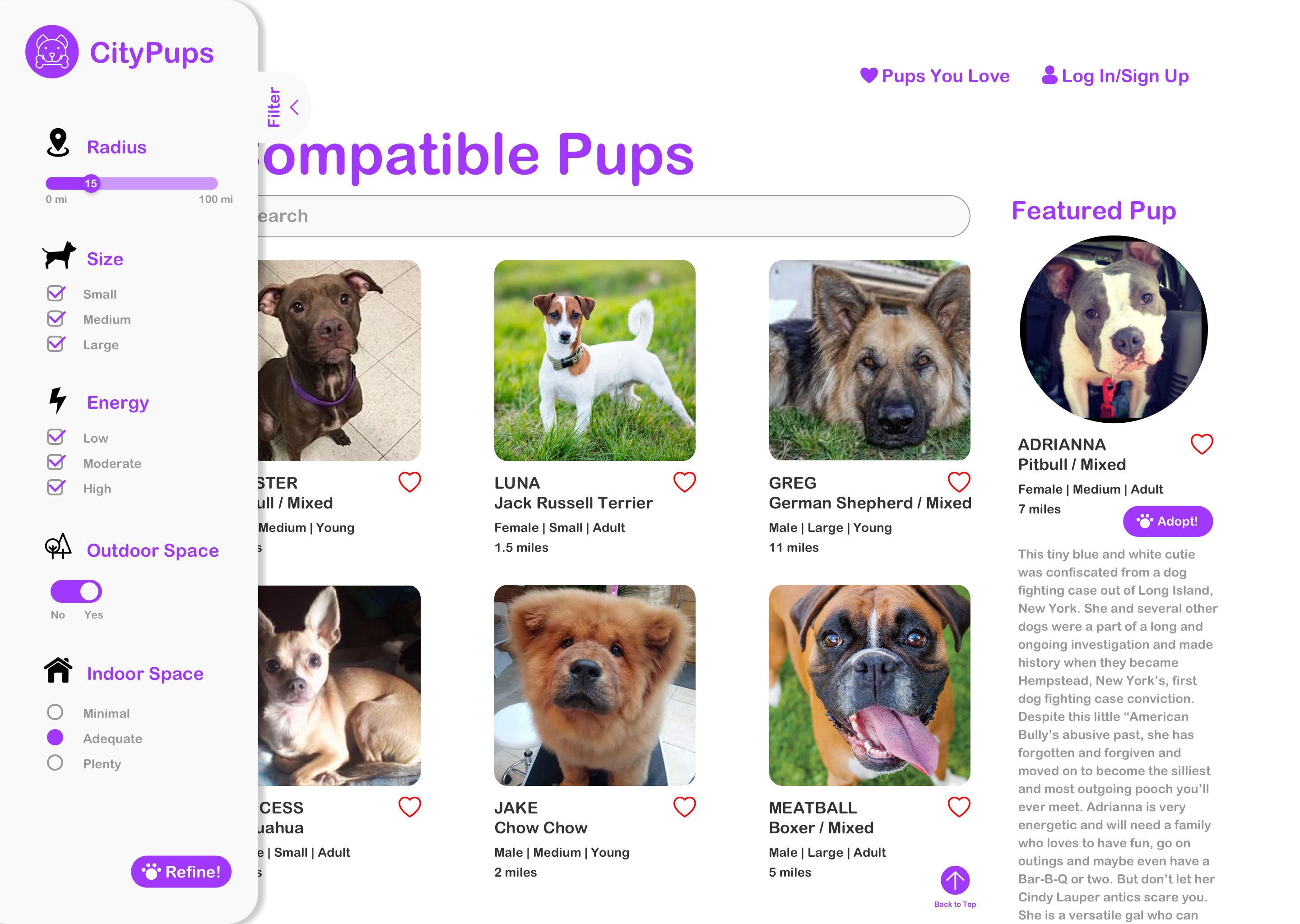
The filter tab expanded to show which filters have been checked. This is also where you can refine your search.
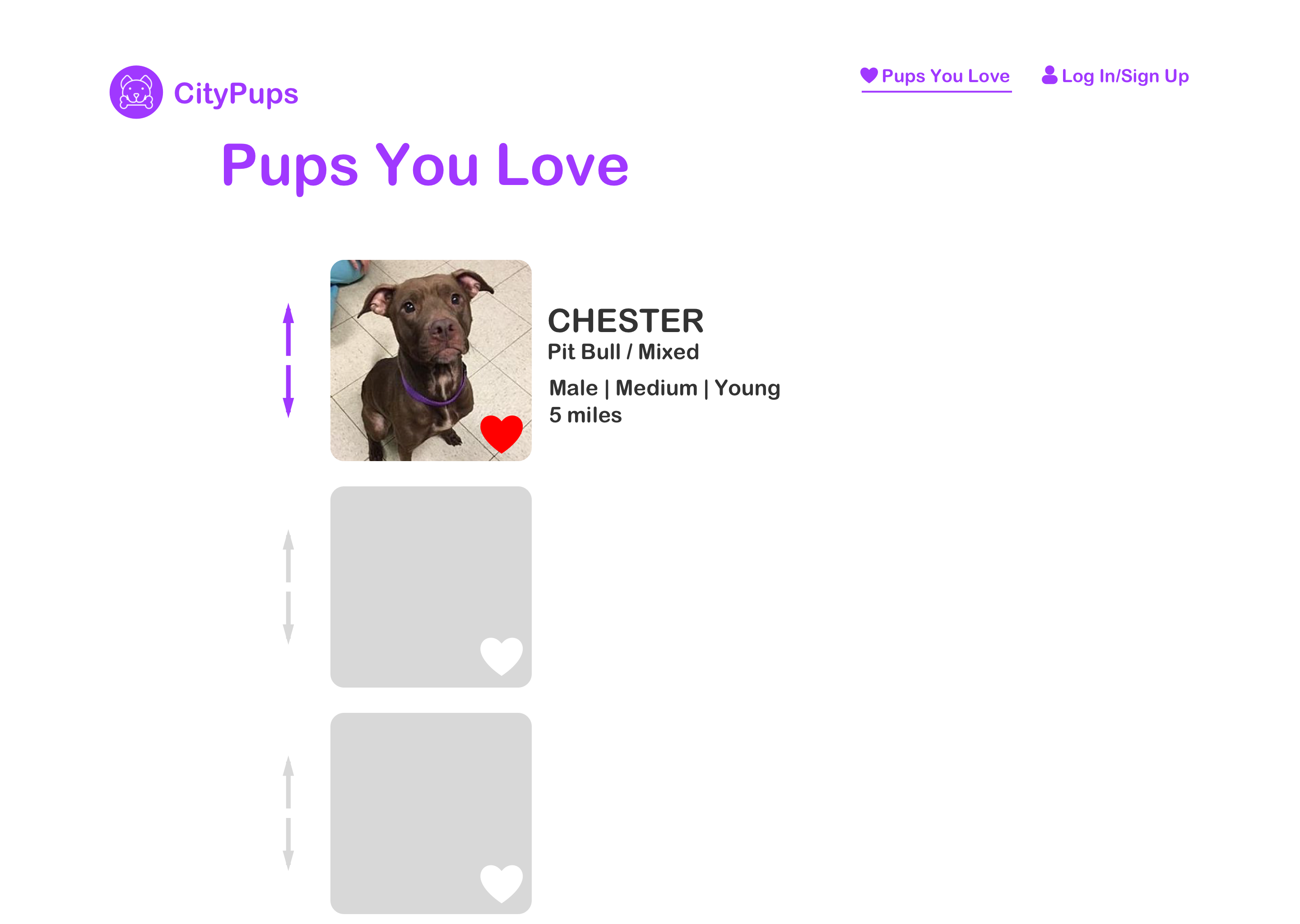
Here you can see which pups you favorited and reorder the pups based on which one fits your criteria the most.
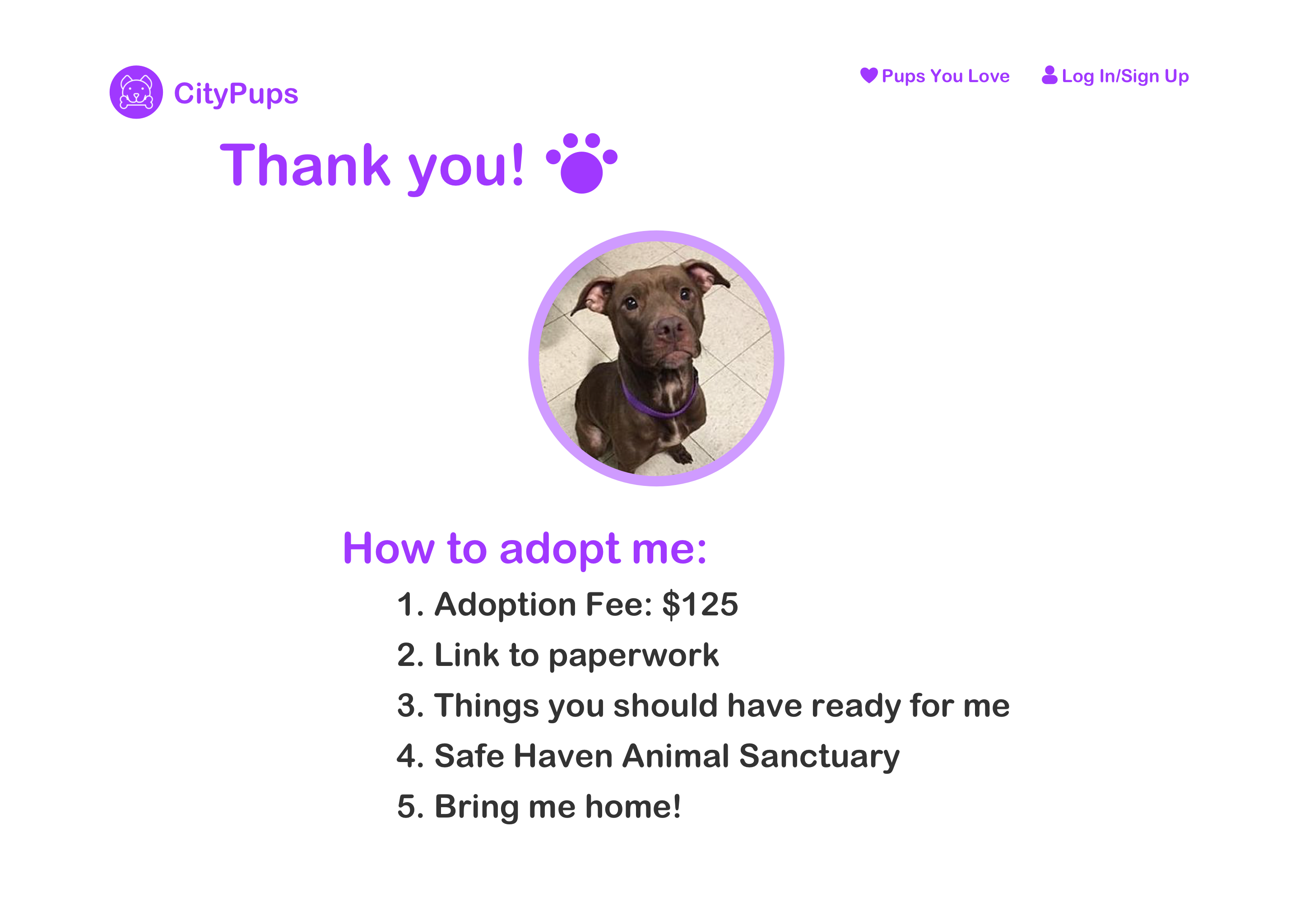
After clicking on the "adopt" button, this screen gives you straightforward instructions and what you would need to do in order to complete the adoption process and bring home your new best friend!
On the last day of the design sprint, I tested five people who would be interested in adopting a dog. The purpose of this usability test was to test the ease-of-use of the web app design and to see if the user is able to successfully complete the task of finding their “ideal dog” without frustration.
Issues with advanced search feature
Filter tab difficult to find
Adopt button and thank you page
This was my first time running a design sprint, so I learned a lot about the process and what tasks should be completed by the end of each day. This project also really pushed me to think fast and design fast. Also, because I would already be conducting usability tests and getting feedback by the fifth day, I didn’t spend too much time second guessing my designs. I would soon know whether or not something works, and if something doesn’t work, I can start trying out a new solution.