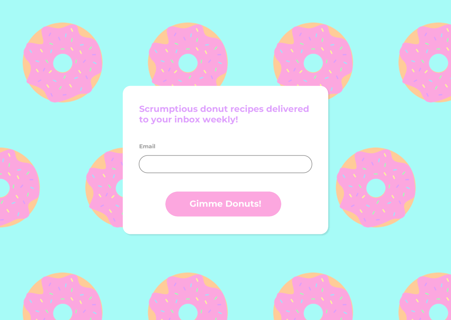
Made a sign up page for a completely made up weekly donut recipe newsletter because I was craving donuts.
I'm not sure why the transitions are wonky. I will try to fix it when I have time. The idea was to have an actual image of a credit card while you’re filling out the payment information so the user has a more direct mental model (I remember I used to be confused where to find the CVV and what it even was so this would have helped without needing to click on an additional help/more info icon). After looking on Dribbble though, turns out this idea actually isn’t that unique, but it's okay. Here is my version. Also the “success” screen at the end is super ugly. Also something I will try to fix in the next iteration.
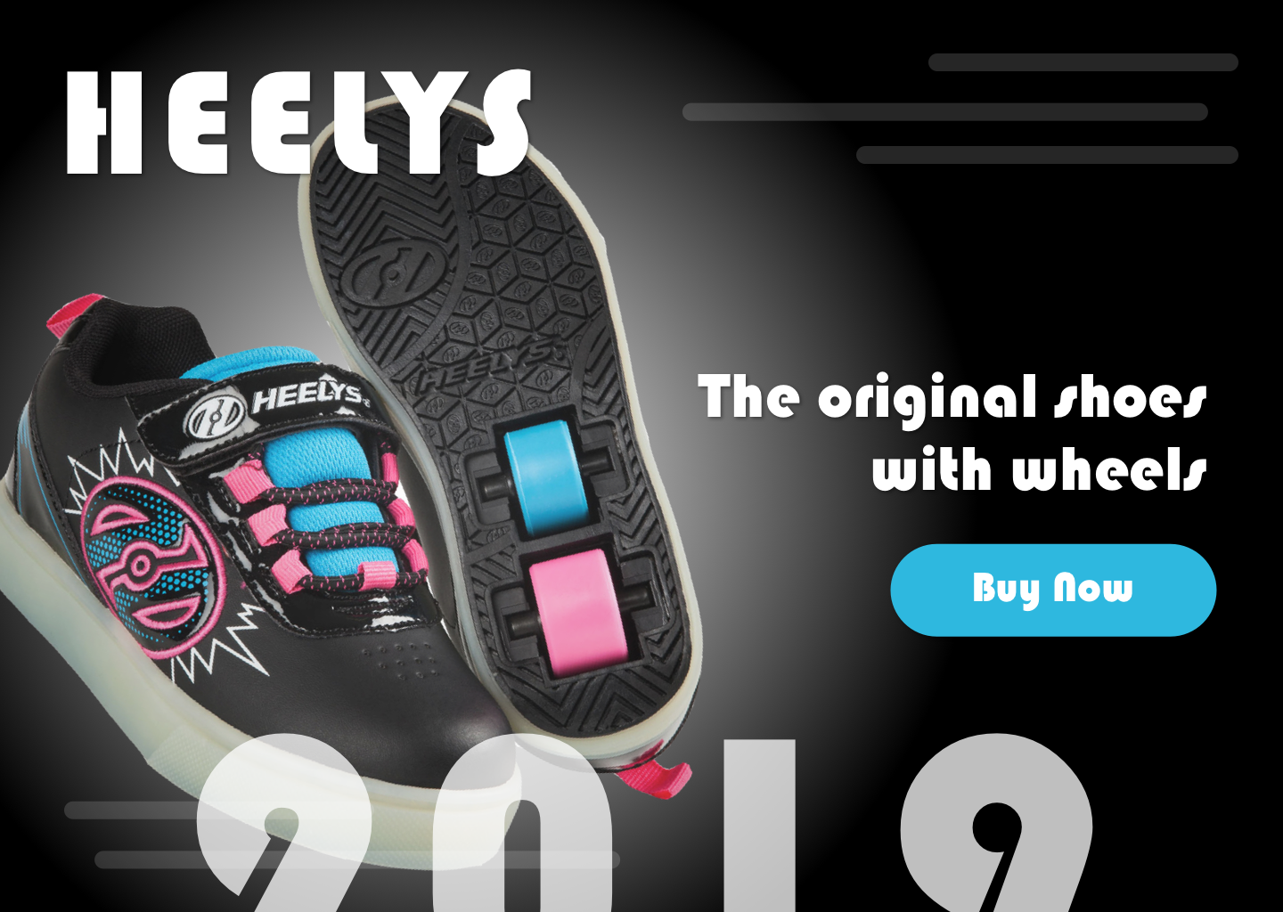
The third prompt was for a landing page for literally anything, and I had to come up with something myself. The first thing that came to mind were Heelys so I just ran with it LOL. I apologize for the tackiness.