Currently, scheduling is done by hand by the stage managers where they have to account for the actors’ external availabilities and make their rehearsal schedules as efficient as possible. This task can take a few hours to complete and is very tedious.
MultiMeet tackles this pain point by being able to generate an optimized schedule in minutes, however, users have expressed the desire to be able to edit a schedule manually after the optimized schedule has already been generated.
I will be coming up with a user friendly design that allows users to be able to manually edit a MultiMeet generated schedule that allows them to view how efficiently everyone’s time is being used in order to make smart adjustments.

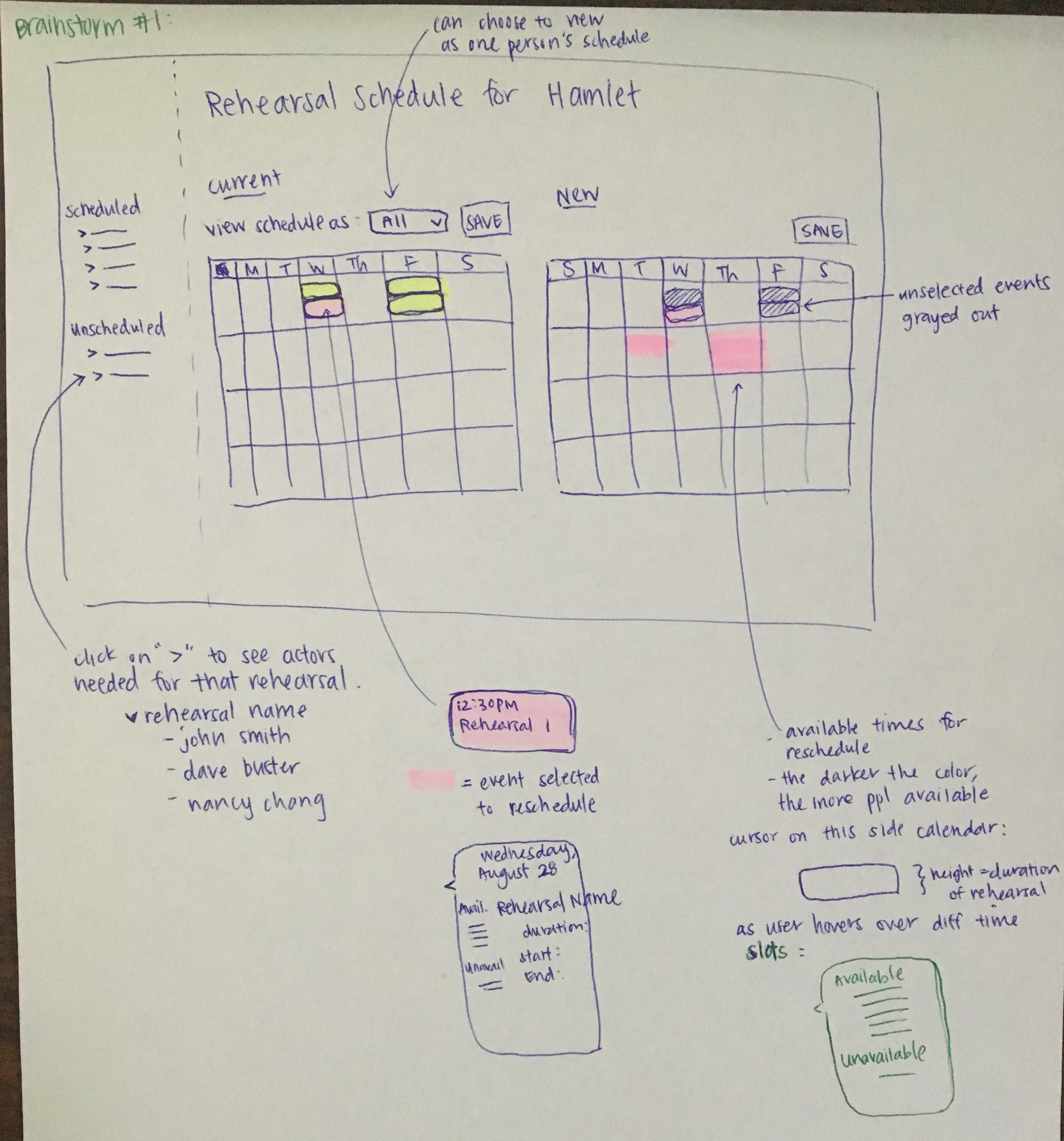
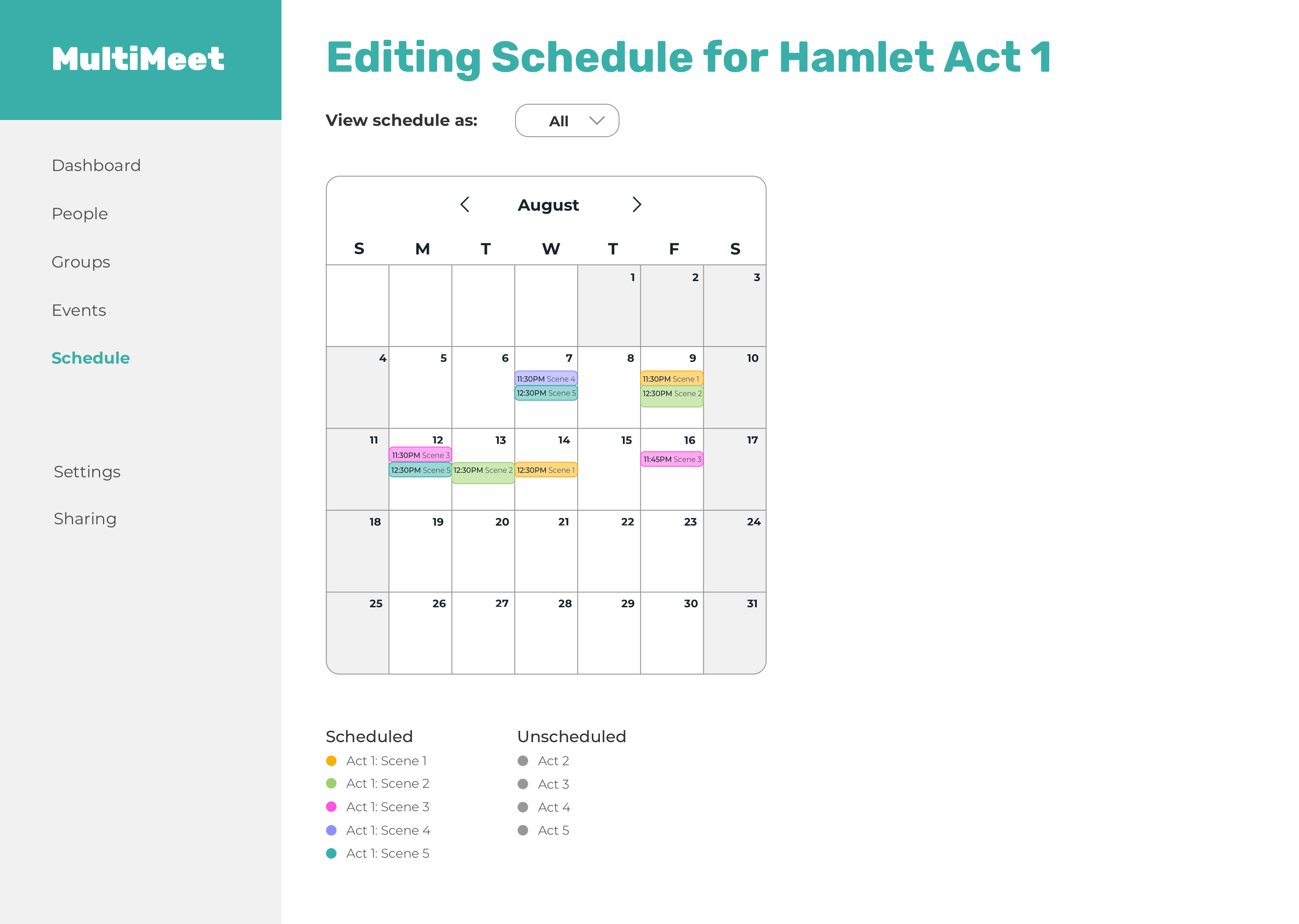
Design #1 sketch
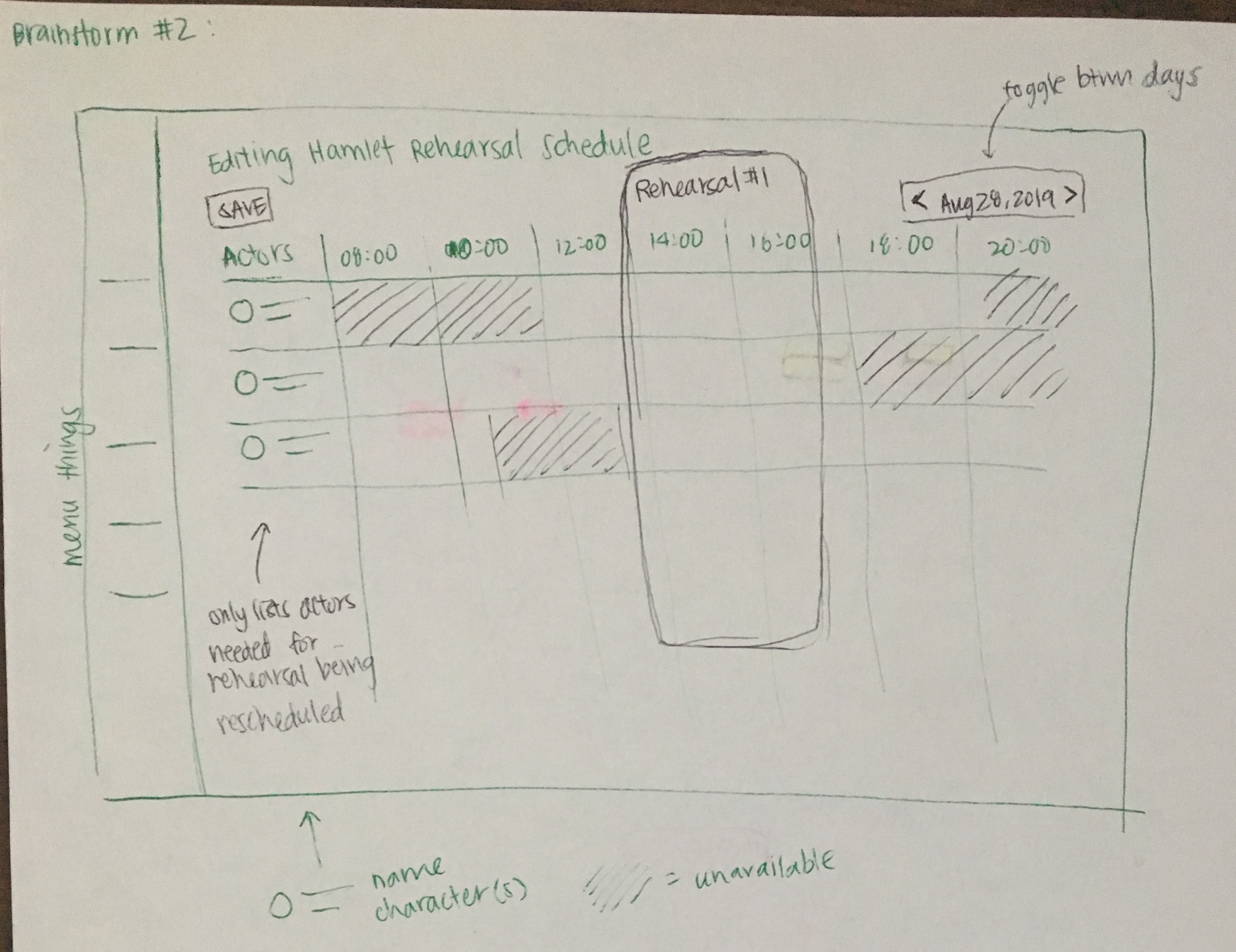
Design #2 sketch
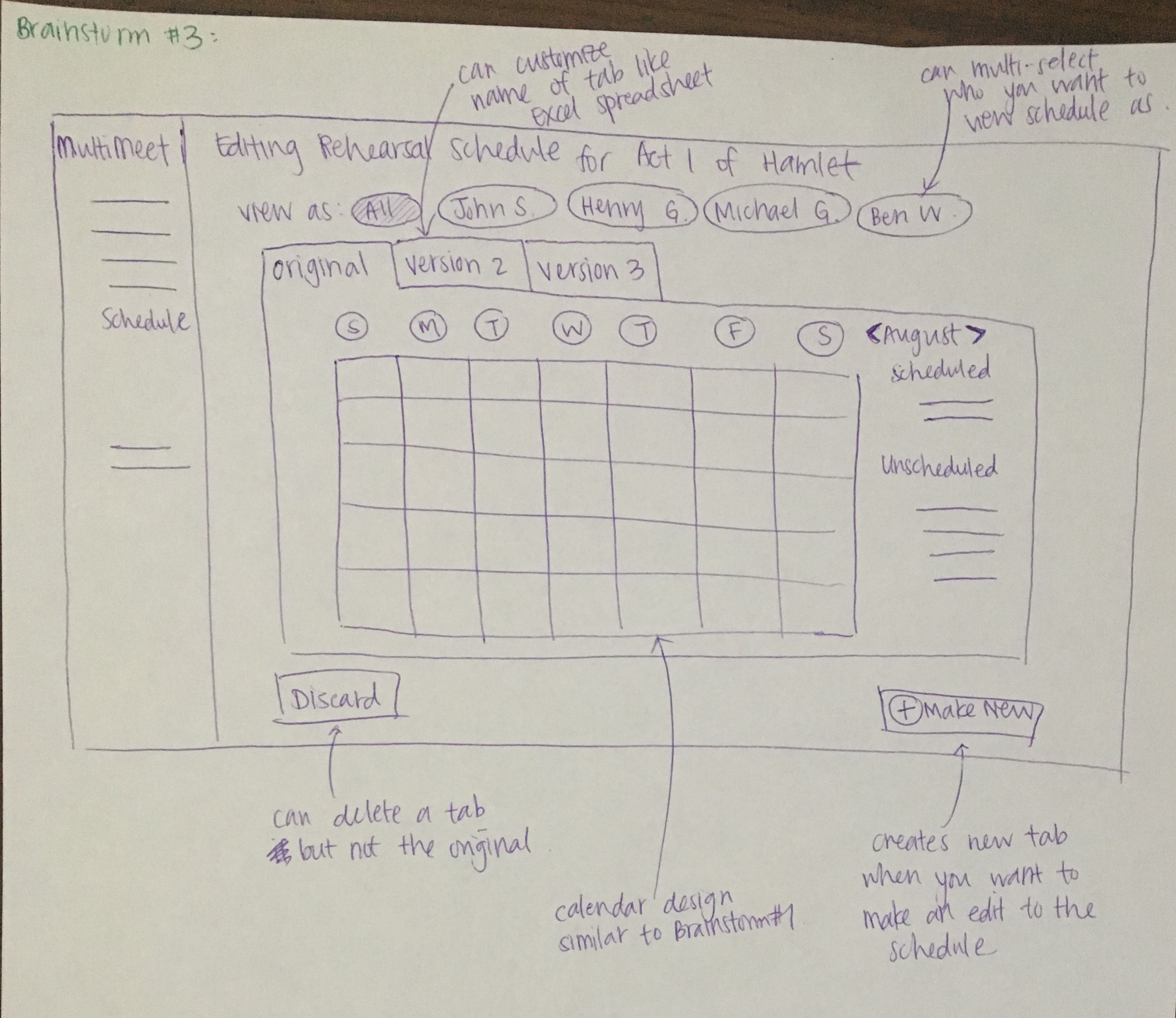
Design #3 sketch
Design #1 low fidelity mockup
Design #2 low fidelity mockup
Design #3 low fidelity mockup
Video of low fidelity interactive prototype
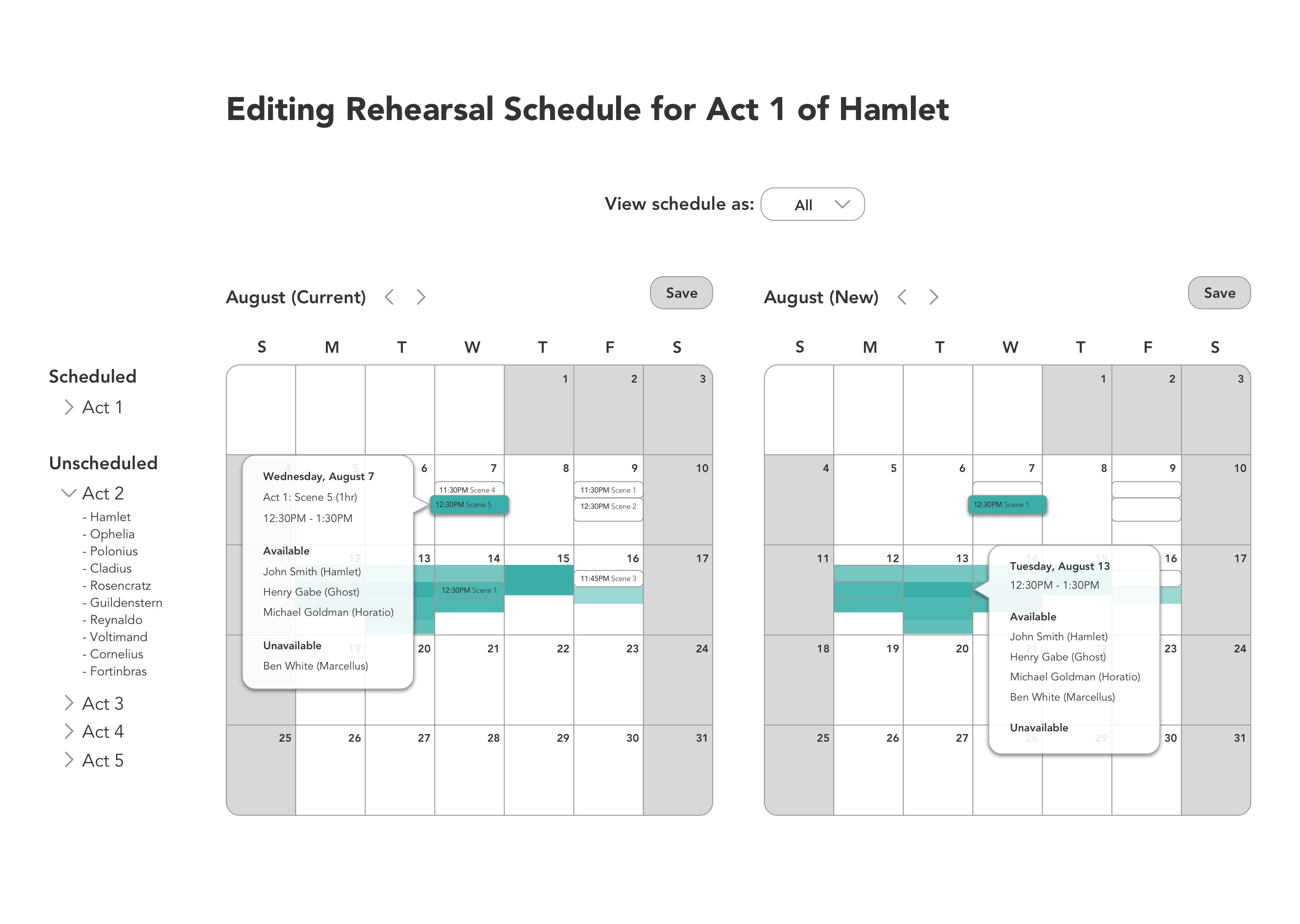
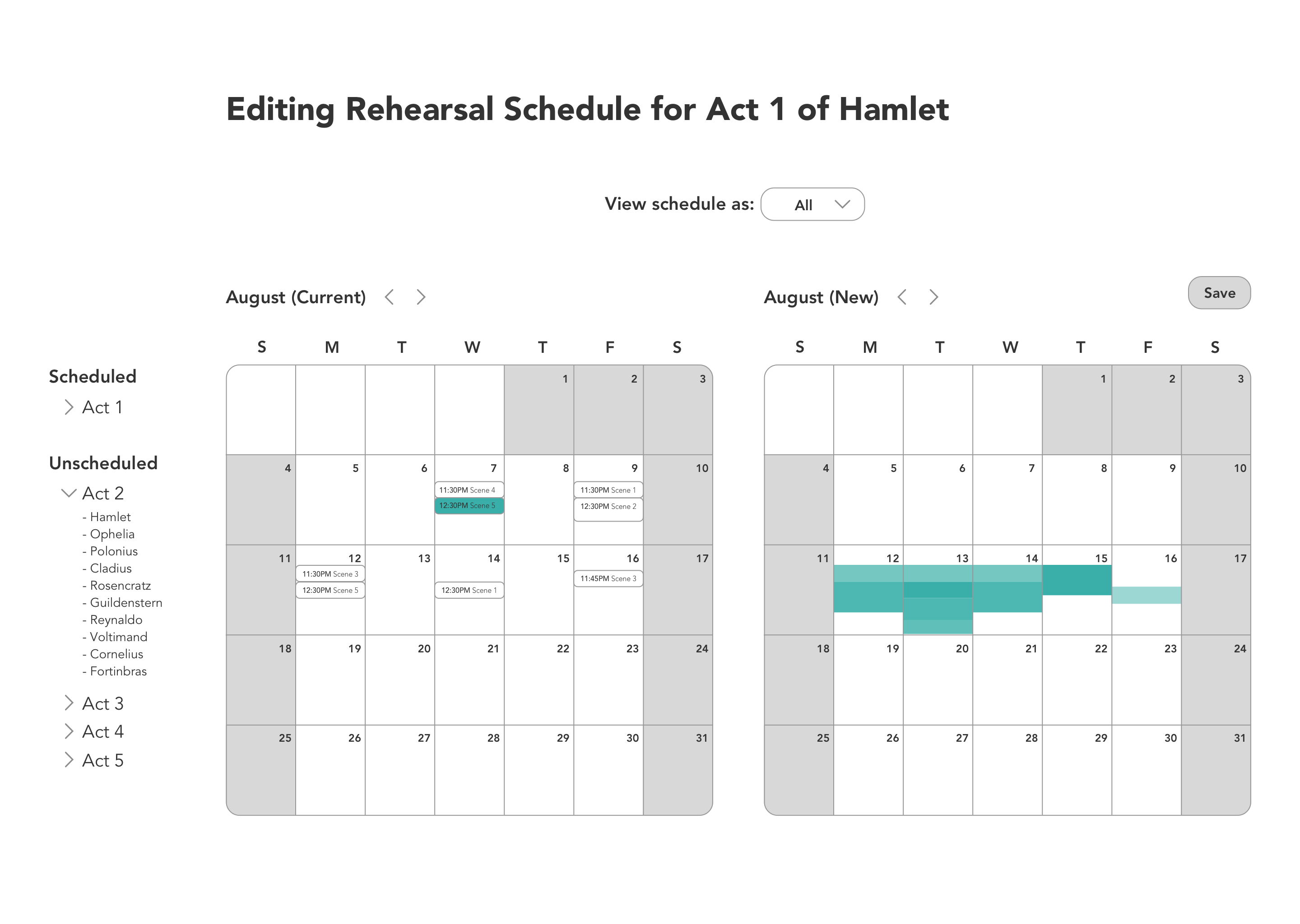
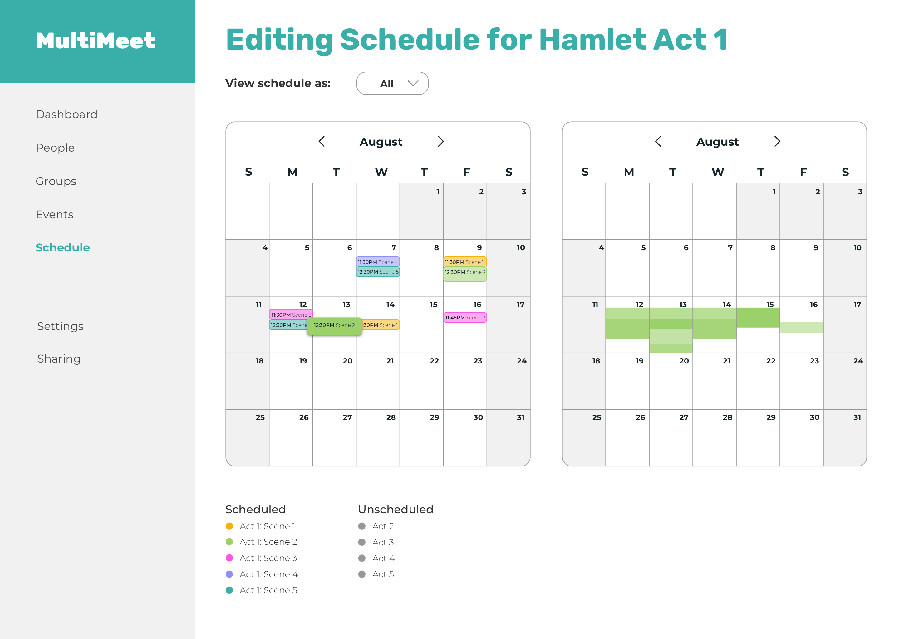
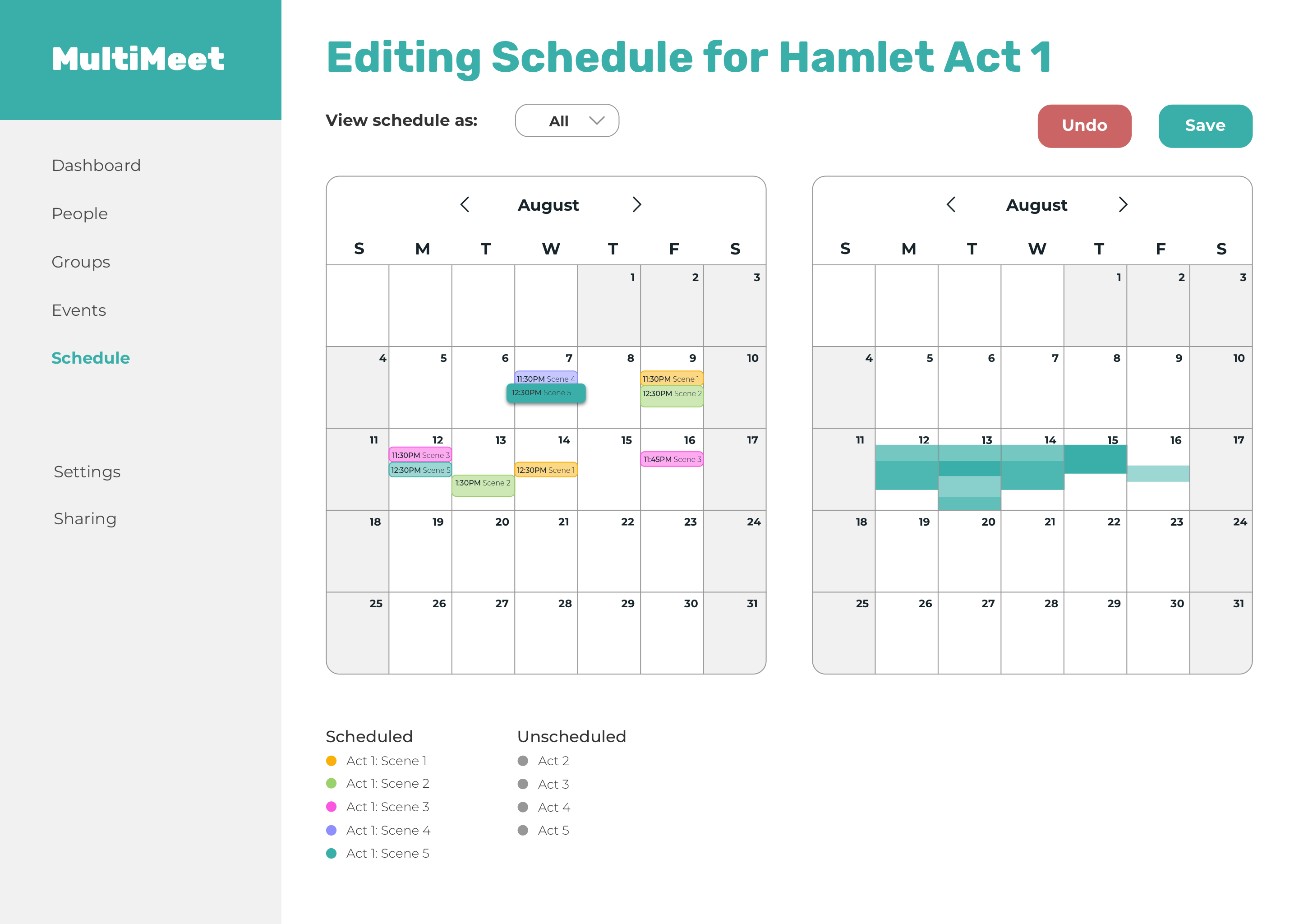
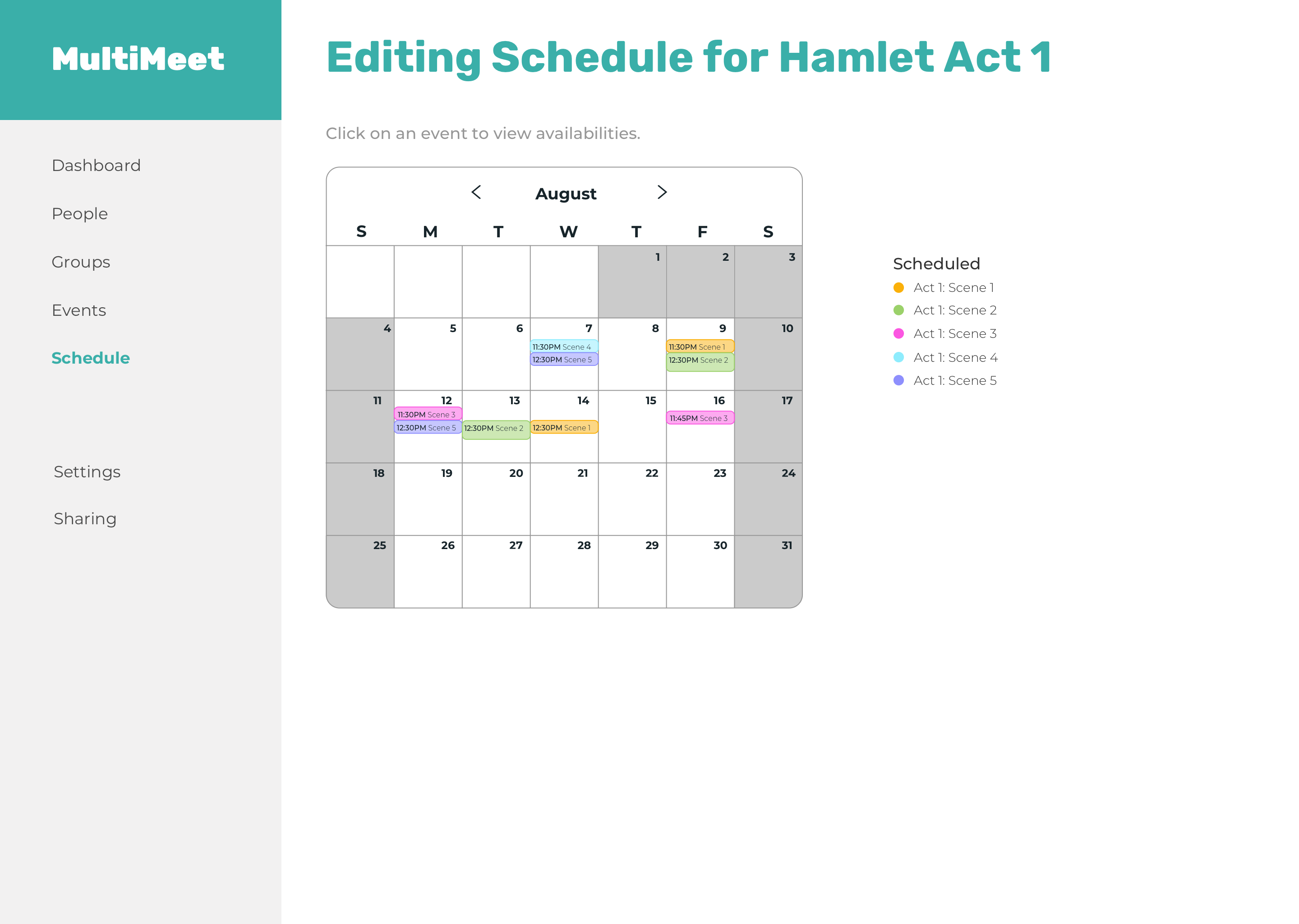
Side by side calendars of current schedule and new schedule before any edits are made.
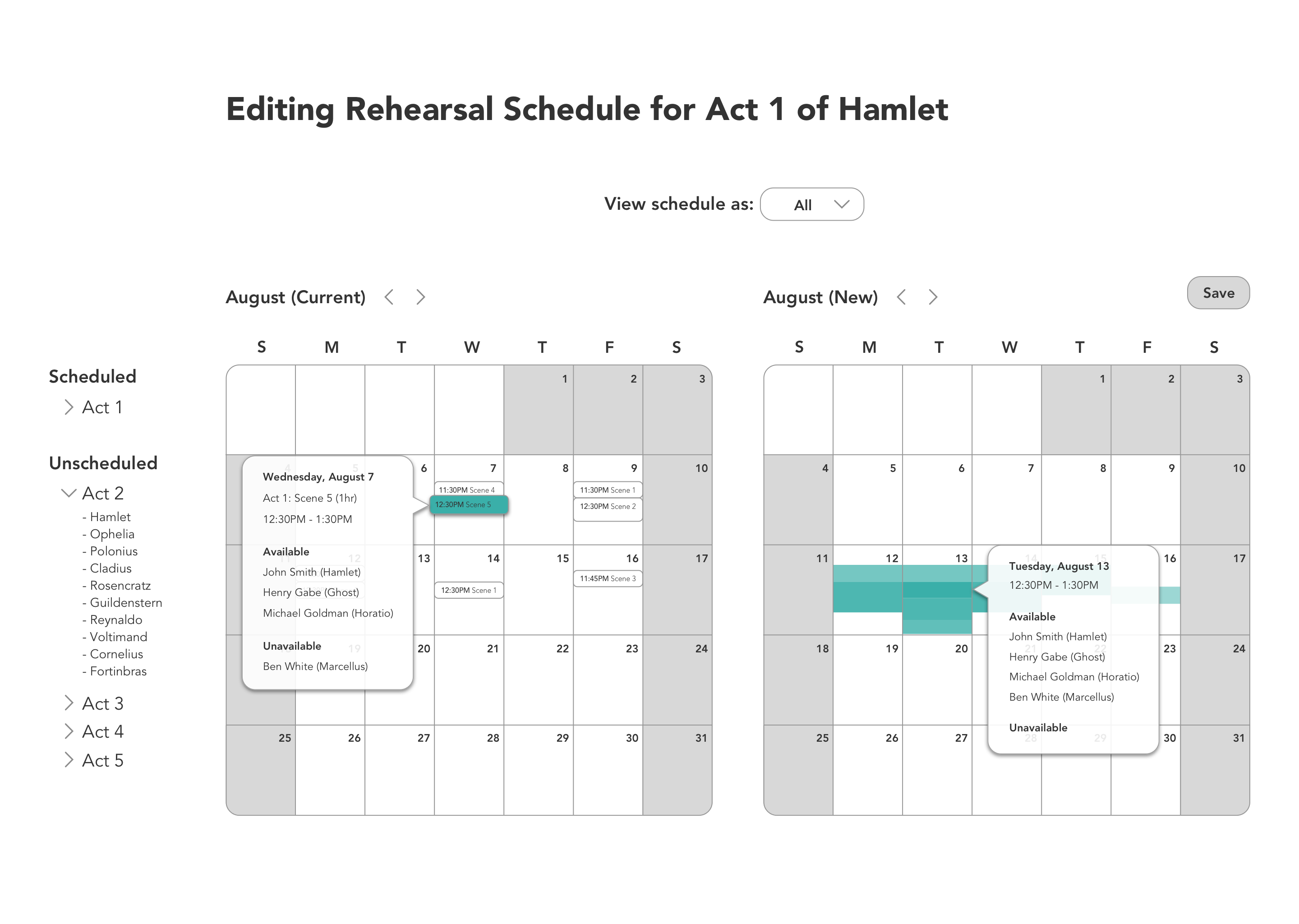
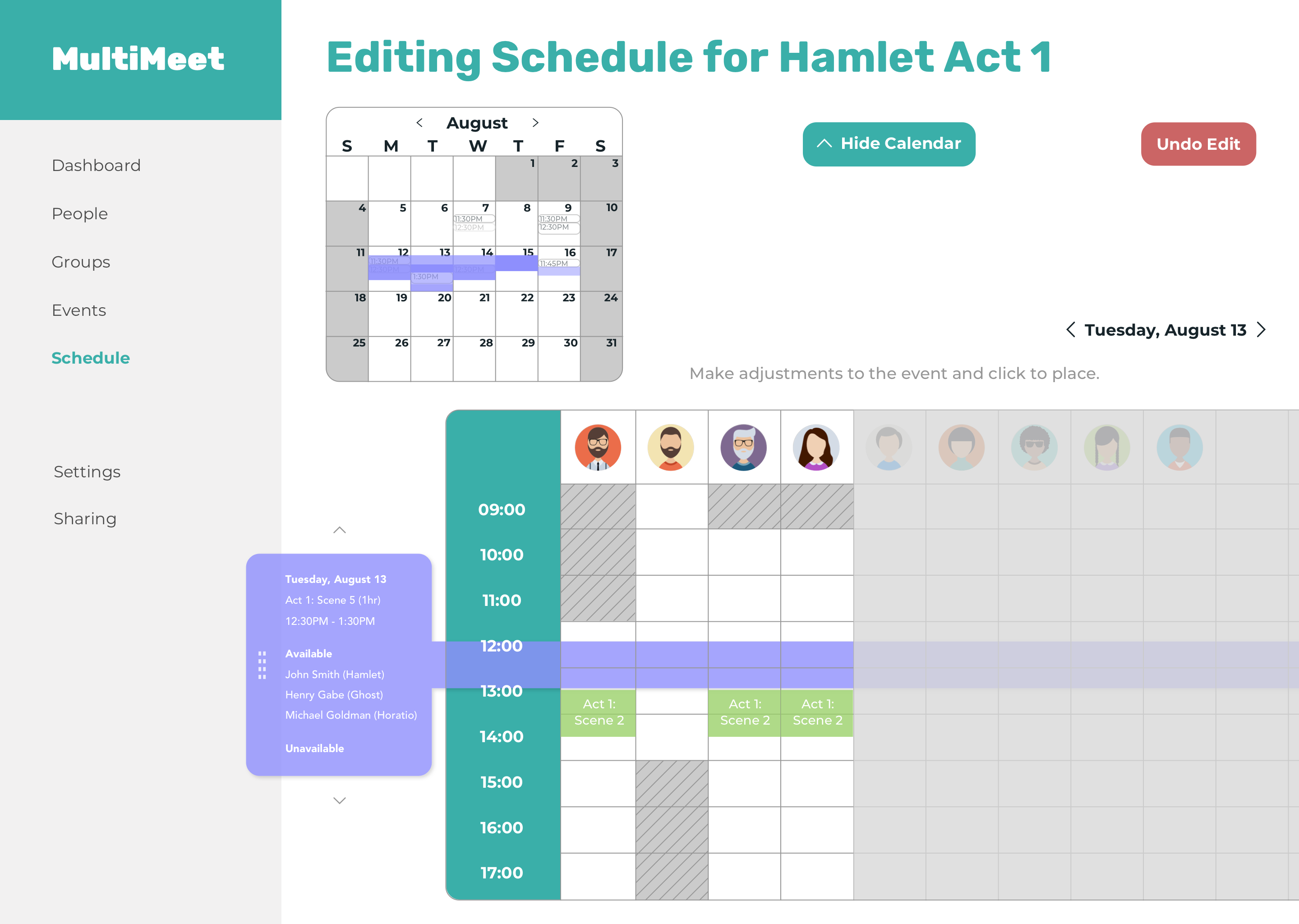
You can view rehearsal details and see who's available and who's not by hovering over the rehearsal or available time slot.
Availabilities are shown for the rehearsal that is selected.
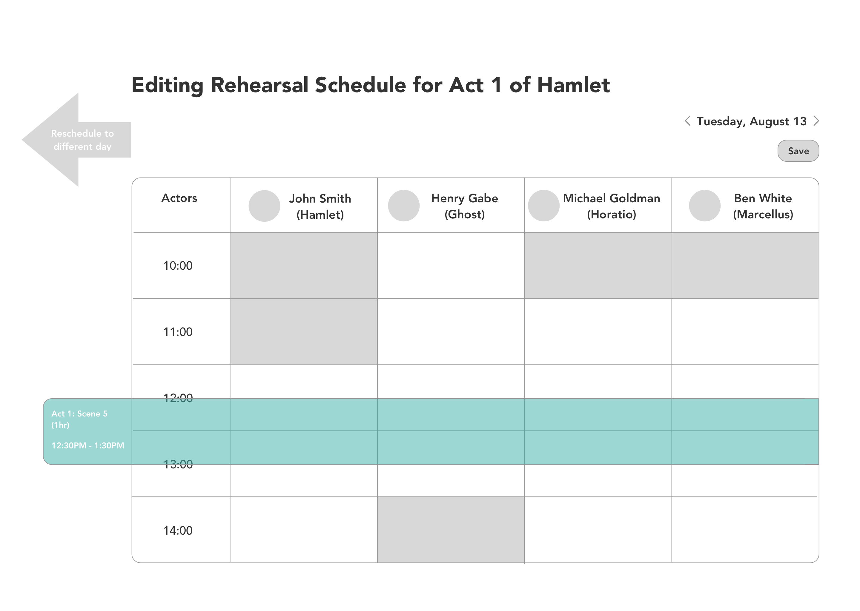
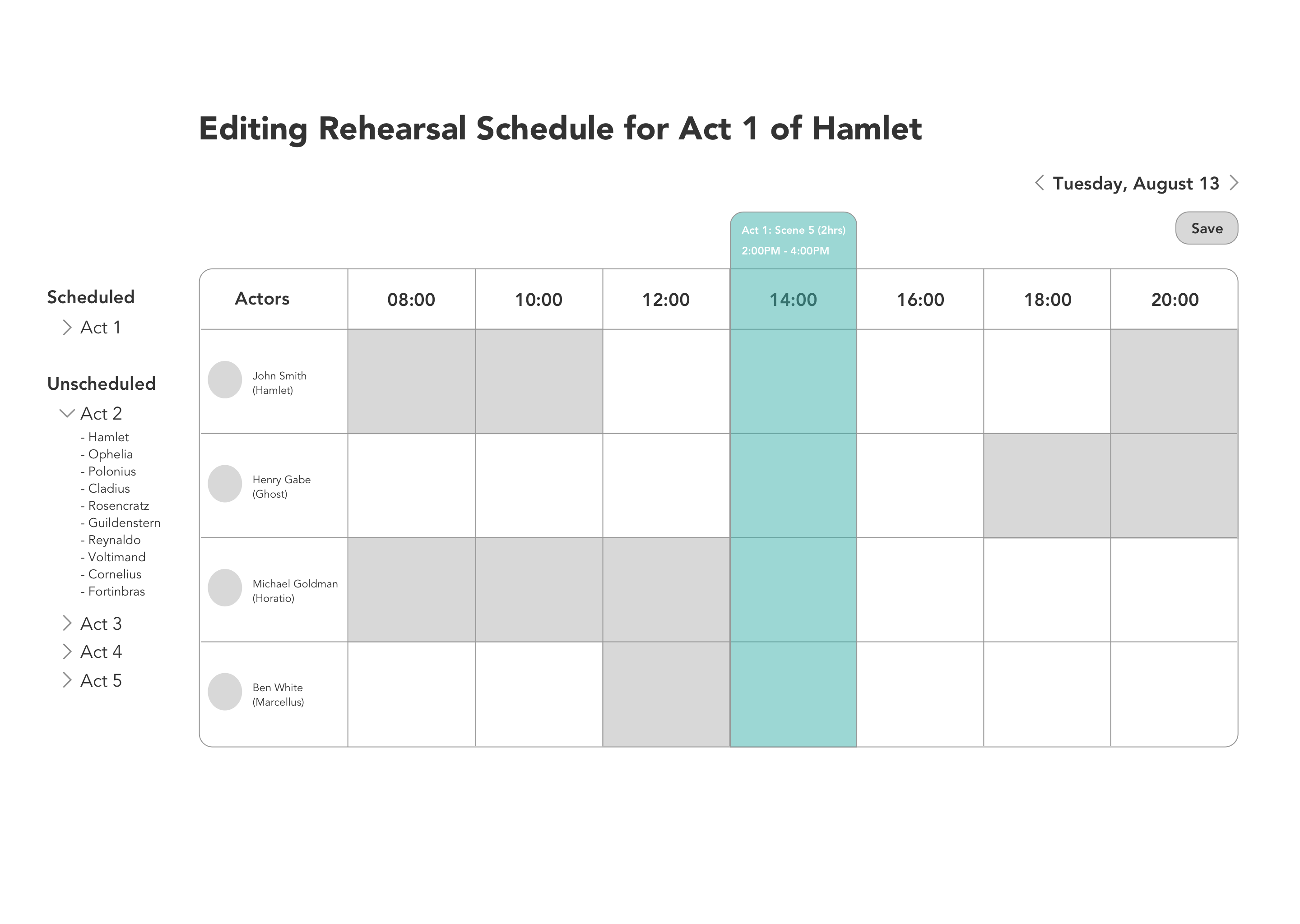
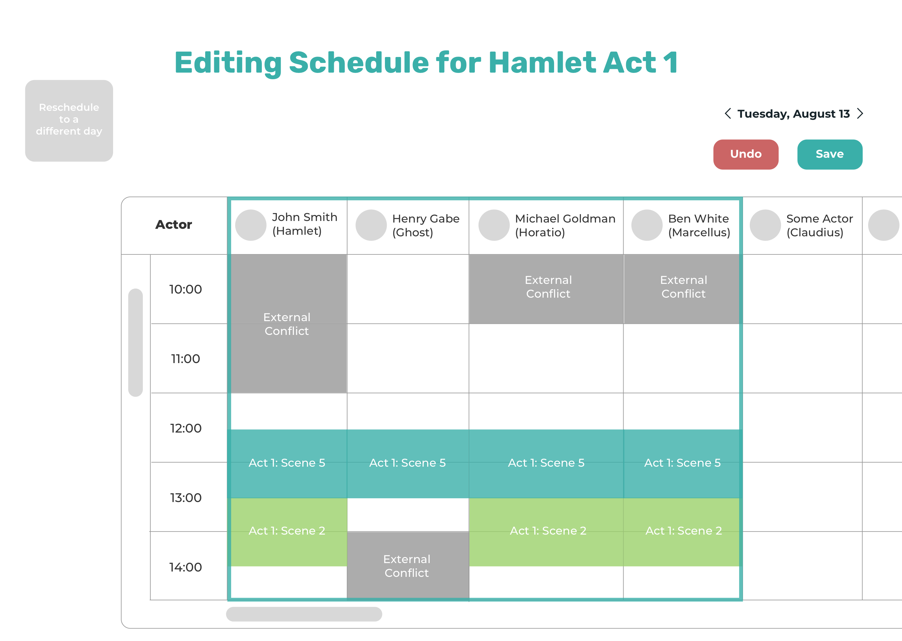
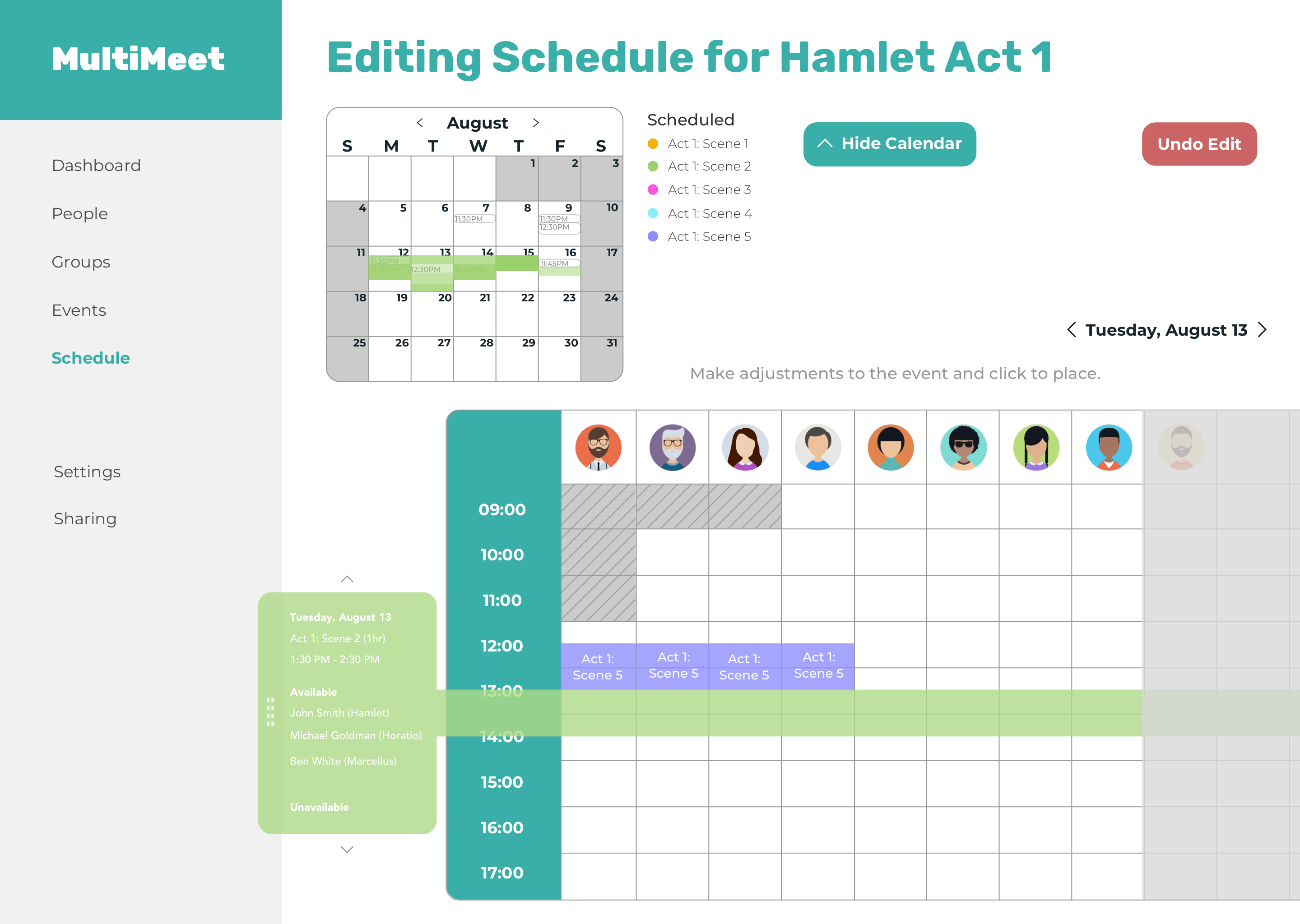
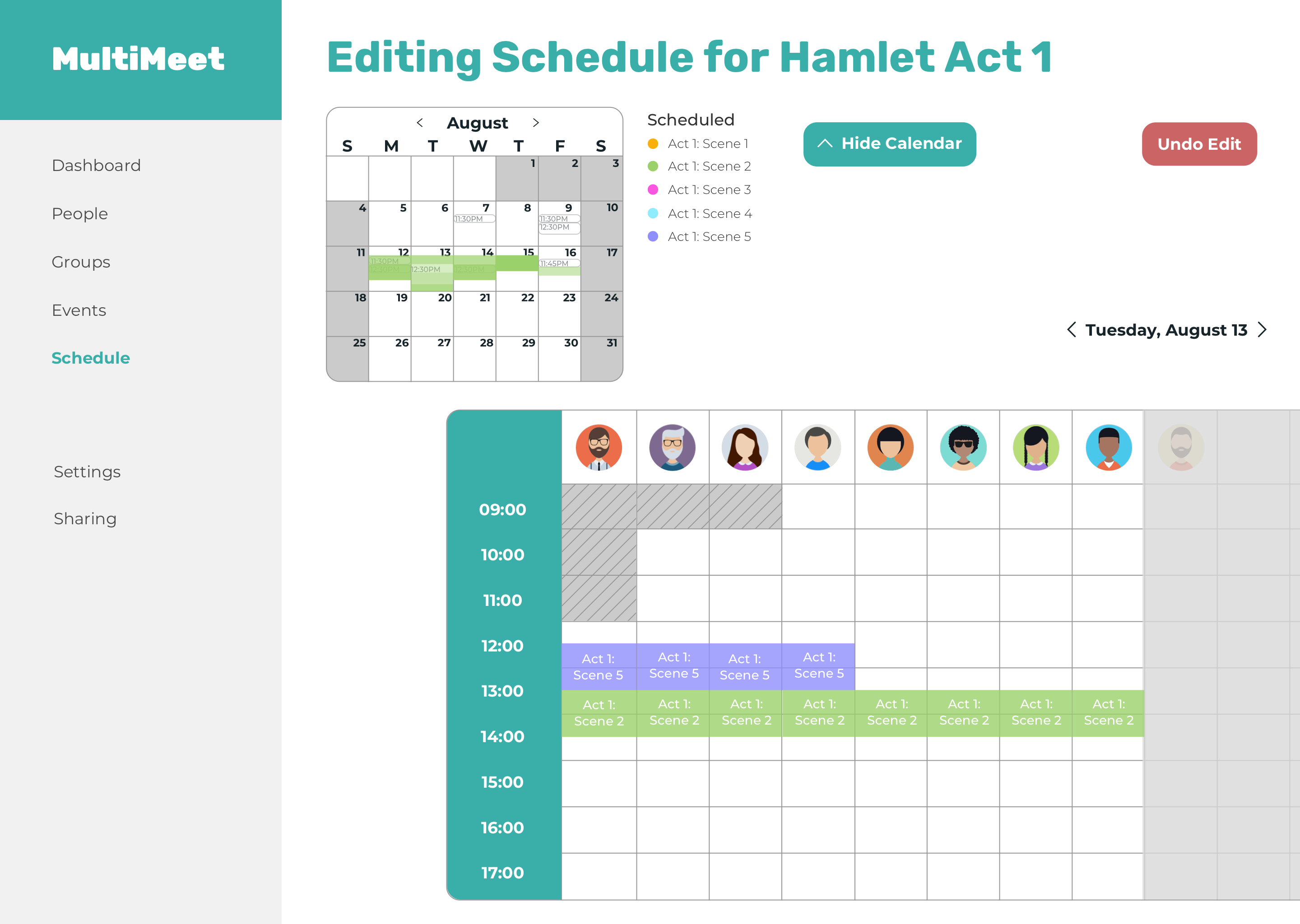
After dragging a rehearsal into a particular day, you can see the schedules of each rehearsal participant. You can drag the colored tab to further adjust the rehearsal.
Video of interactive prototype in higher fidelity with relevant rehearsal participants highlighted by surrounding with teal box.
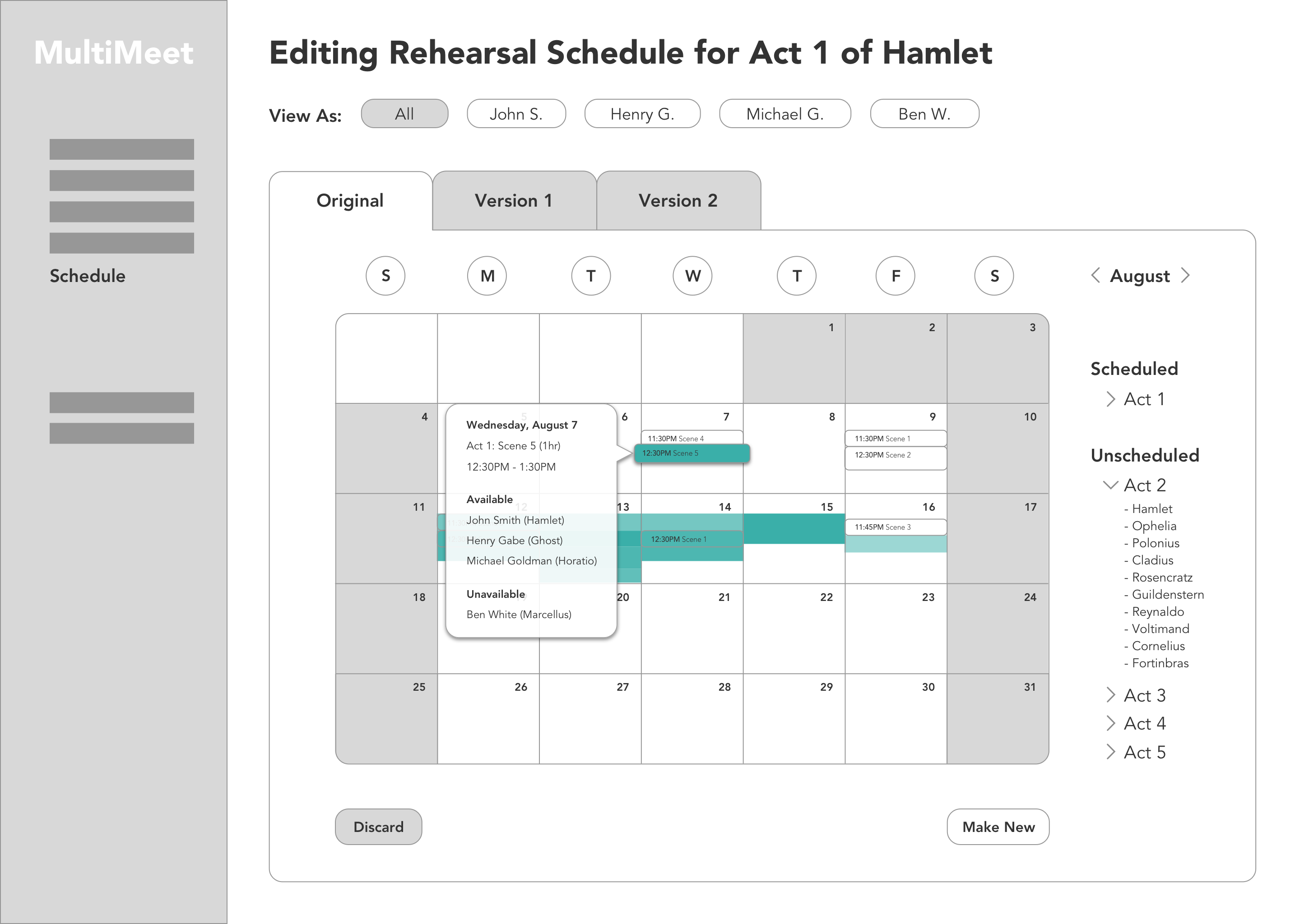
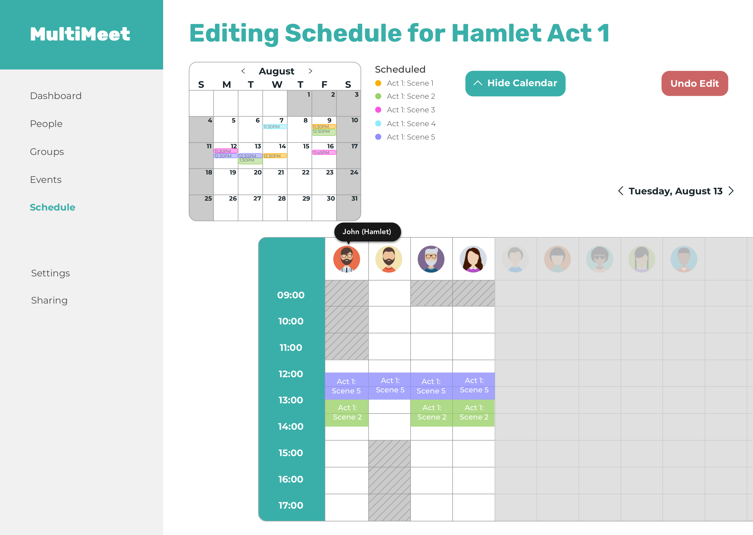
Initial edit mode screen only shows one calendar (the current schedule).
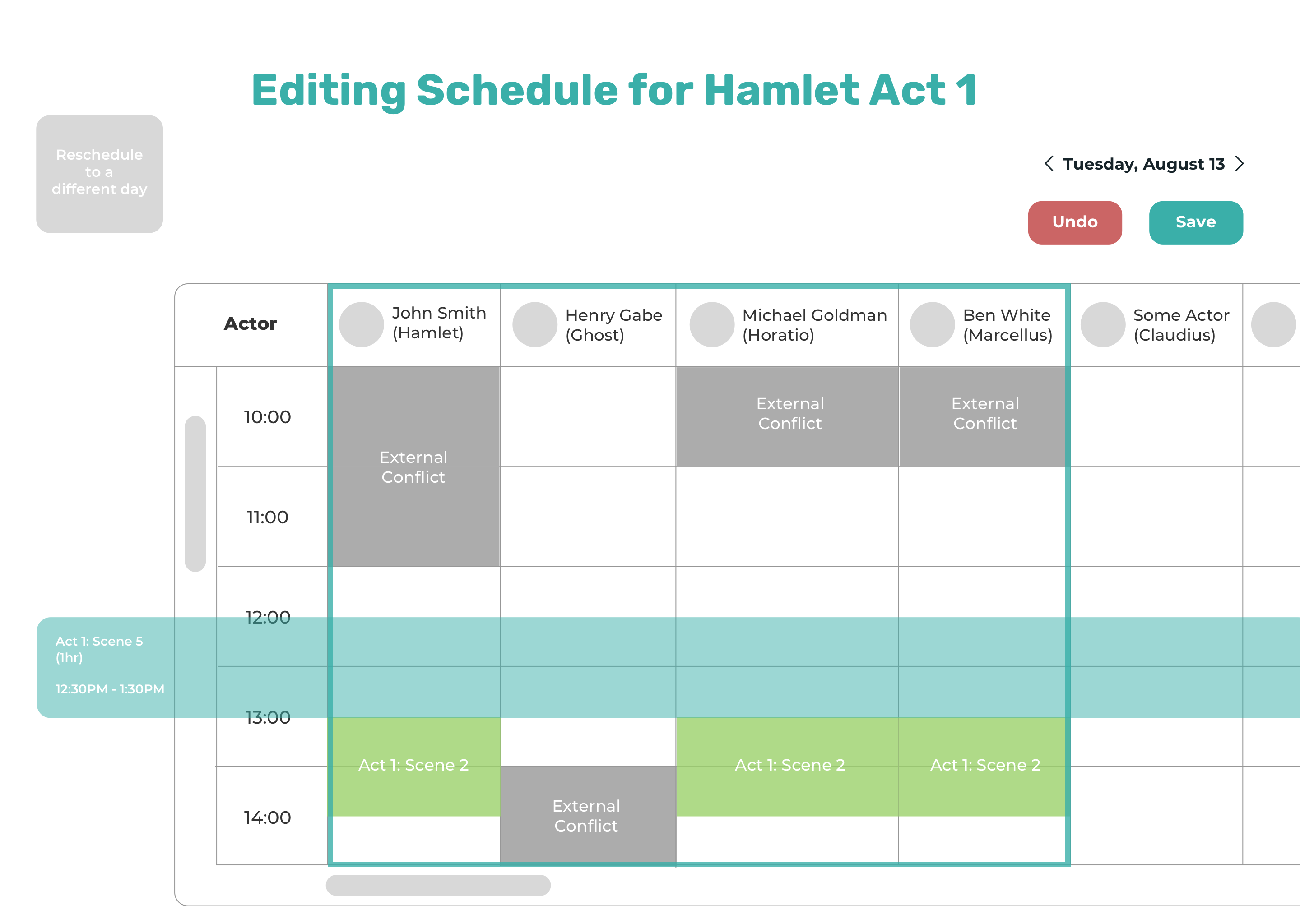
Once a rehearsal is dragged into a specific day, you are shown the schedule of that day with the relevant participants highlighted by surrounding their schedules with a teal box.
If you want to keep editing other rehearsals, just click on them to drag.
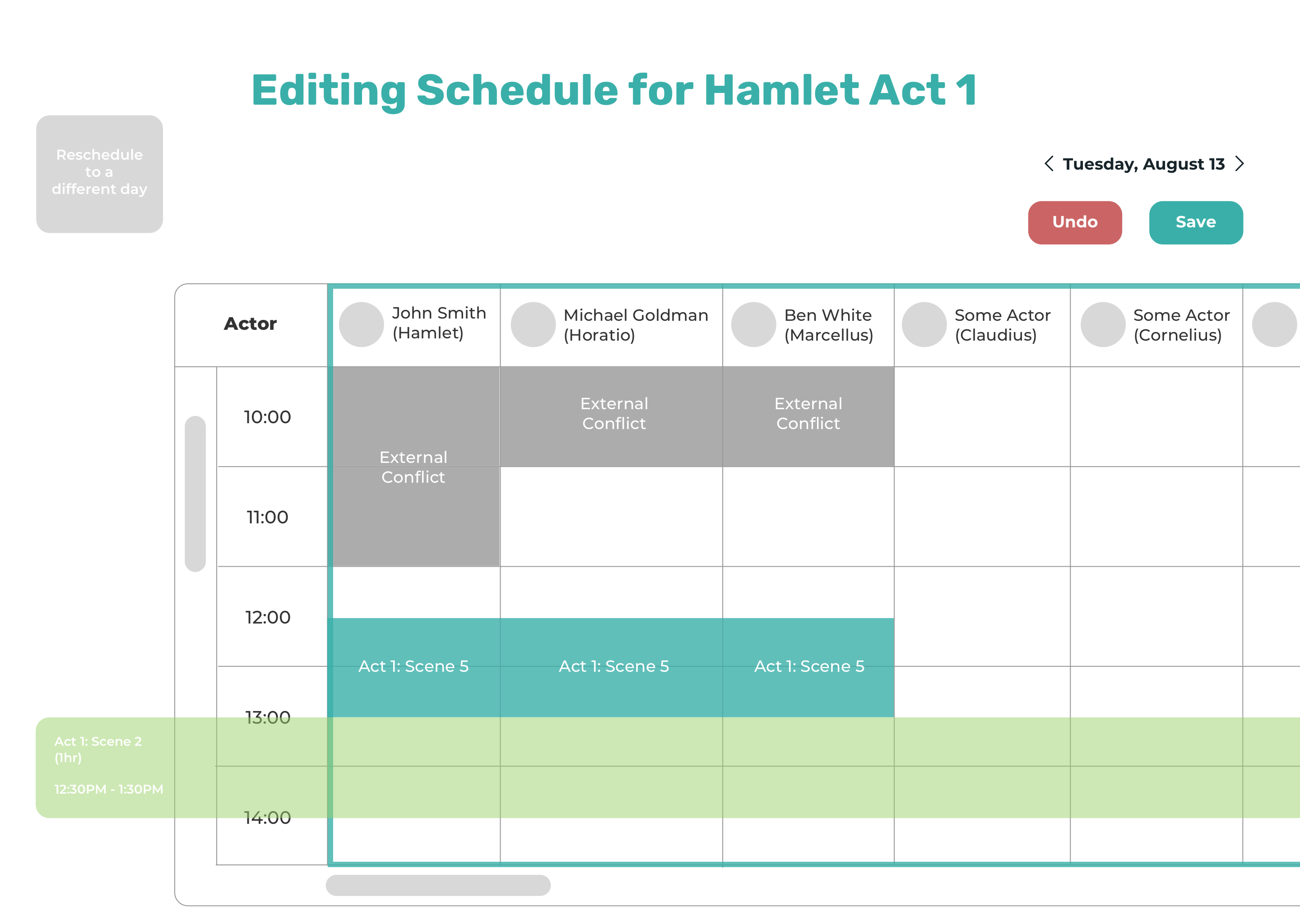
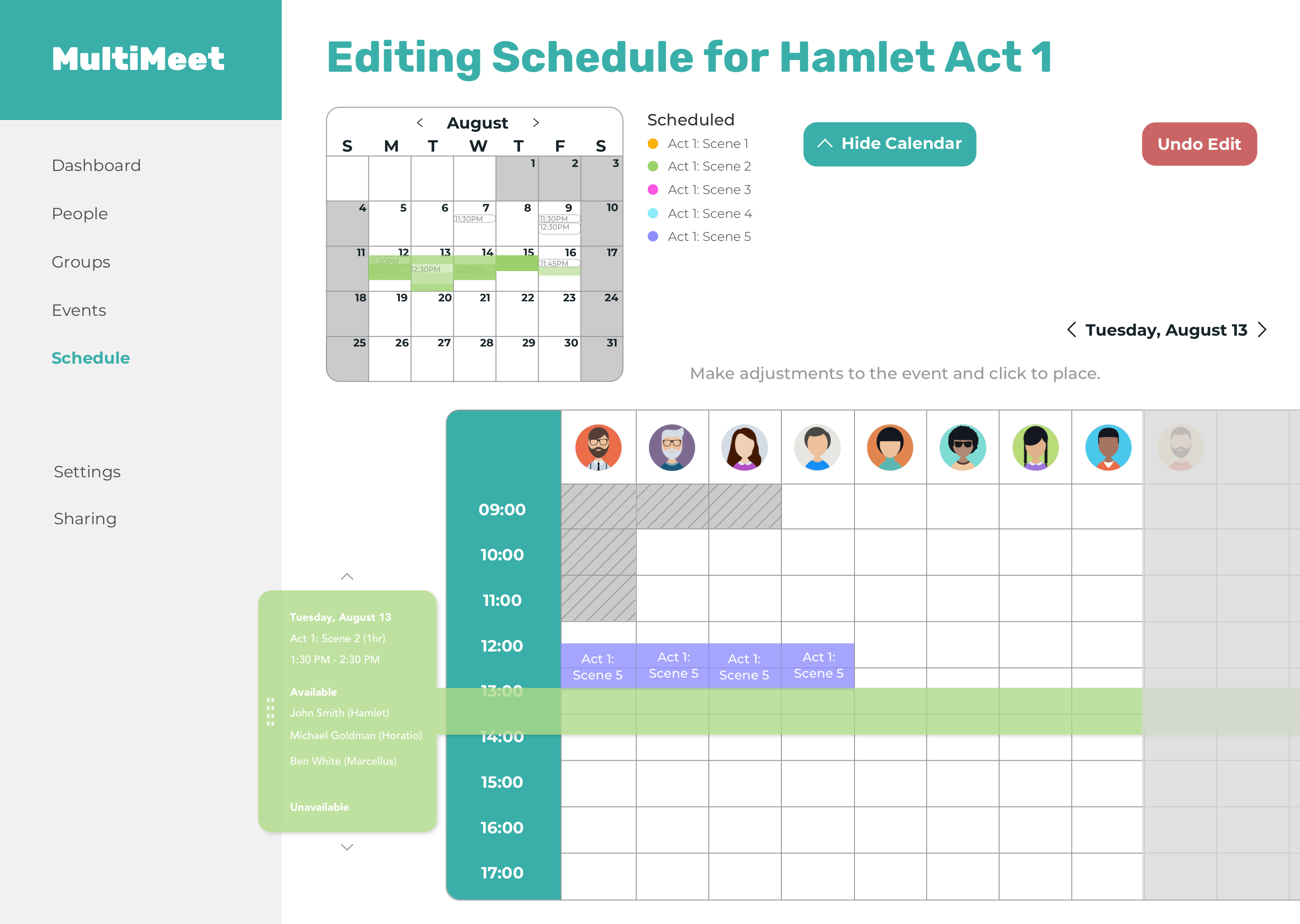
You will be shown side by side calendars again with the availabilities for this rehearsal.
Calendar with availabilities shows up when you click on a rehearsal to reschedule.
Once you decide when you want to reschedule the rehearsal to, drop it into the desired time slot and the rehearsal will be added to the schedules of all participants needed for that rehearsal.
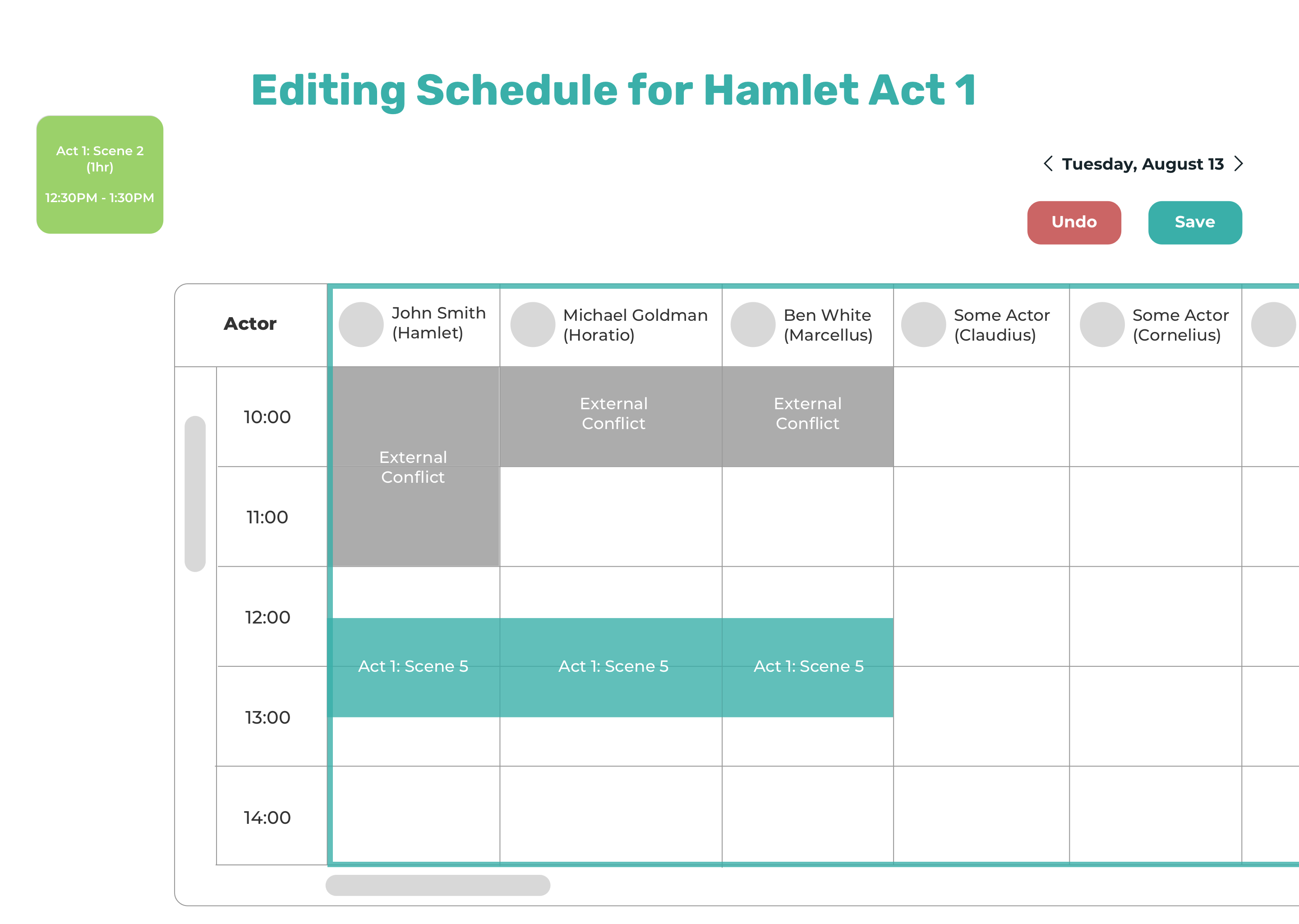
Drag to the square in the upper left corner if you want to reschedule it to a different day.
About the user:
She has worked as a stage manager on several Shakespeare productions (Hamlet, The Taming of the Shrew, King John) and shares the pain points of having to tediously construct schedules manually using Excel spreadsheets. She is also familiar with the early stages of MultiMeet.
Video of high fidelity interactive prototype. Helper text added on screens to further clarify what action is expected of the user.
Initial edit mode screen. In retrospect, I could have made the calendar dimensions larger to fill up the extra white space on the screen, which would have also let me increase the text size for better accessibility. I also added helper text on this screen and others to clarify what action the user should perform.

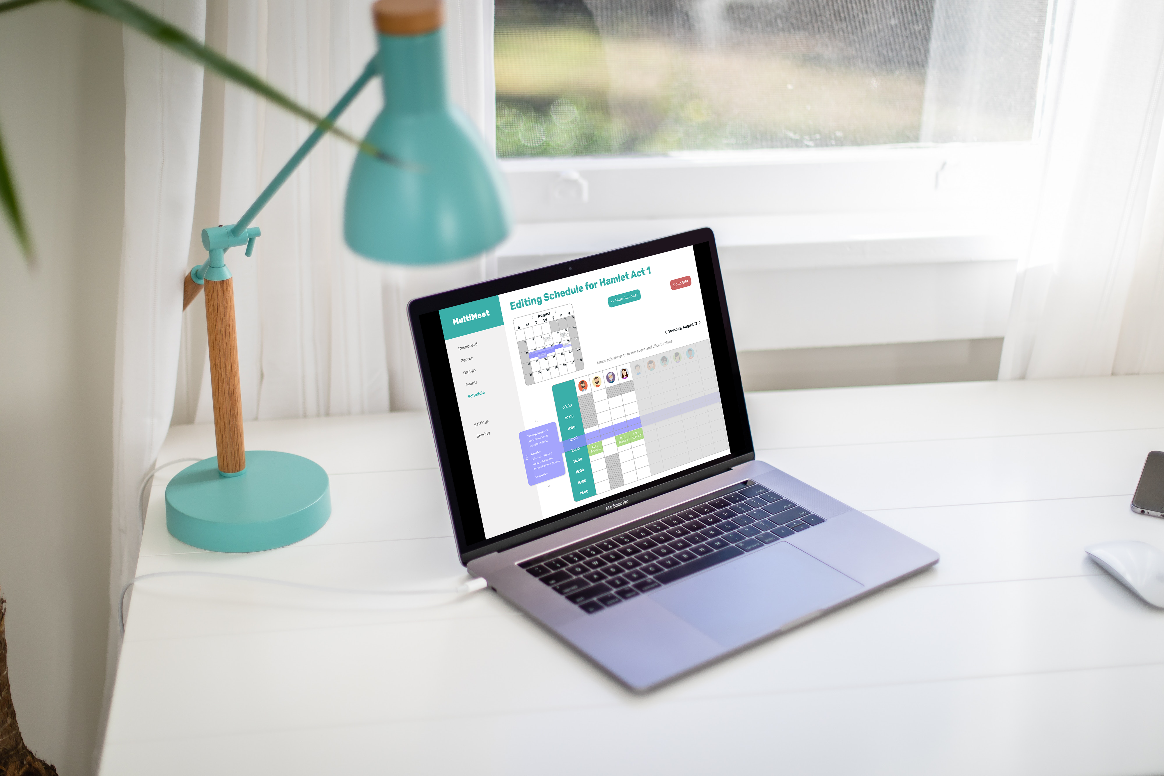
Added more detail about the rehearsal being rescheduled in the rescheduling tab (when, for what, for how long, and who is and isn't available during that time). I also added a handle using a cluster of eight small squares and arrows pointing up and down to really emphasize that the rescheduling tab is something you can drag vertically.
Each rehearsal participant was reduced to just their avatars. If you want to be reminded who the avatar represents, you can hover over it to reveal a tooltip with their names/characters.
You can click on and drag another rehearsal to reschedule.
You can see the rehearsal's availabilities in the calendar above. If you want to reschedule it to a different day, just simply drag it to the day you prefer in the calendar. I've also removed the "Save & Invite" button to avoid confusion because you shouldn't be able to save or invite anyone to an invite before you have finalized your edits.
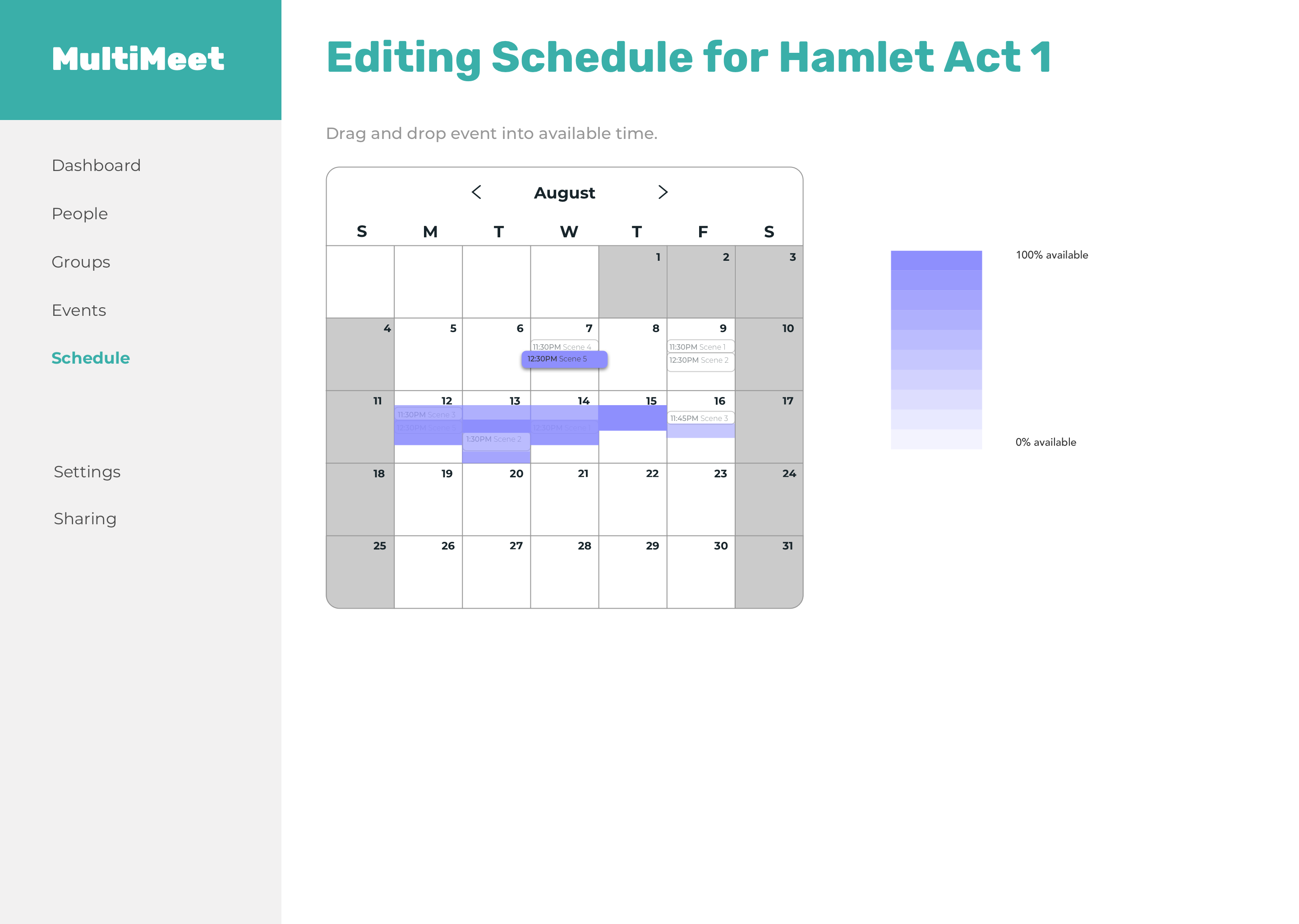
Clicking on a rehearsal shows its availabilities on the same calendar rather than another calendar side by side and grays out all the other rehearsals. I added a legend that specifies the darker shading to mean more people are available during that time slot and lighter shading to mean fewer people are available since there was confusion.
If you try to click on the rescheduling tab instead of dragging it, the rescheduling tab will shift slightly to the left and up and have a drop shadow to further emphasize that this is an element that is separate from other elements on the screen and can be moved around.
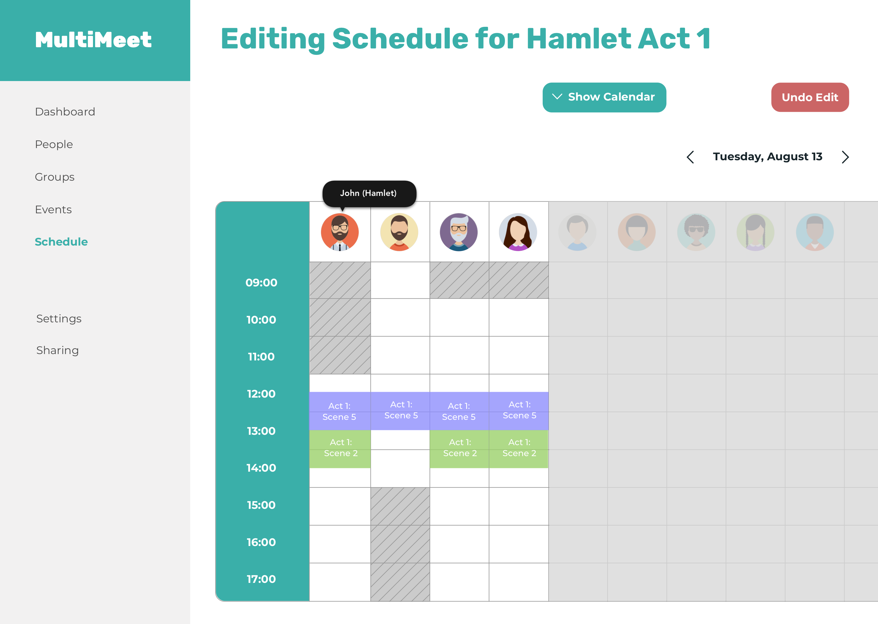
You can also click on the button "Hide Calendar" to hide the calendar and have the schedule of that particular day fill up more of the screen. The "Hide Calendar" button becomes a "Show Calendar" button.
As you can see, the relevant participants of this rehearsal have been shifted to the front of the table, and the particpants who aren't needed for this rehearsal are grayed out.
About the user:
She works as a stage manager and is an existing user of MultiMeet. She specifically mentioned wanting an edit feature during the initial beta tests, which was why she was selected for this user test.
This was my first time working on a product for an unfamiliar field! I had to learn about all the little nuances and unique frustrations stage managers had to deal with while trying to create a rehearsal schedule that is suitable for all participants involved in the play. This was a very fun and educational experience for me because I really had to listen to the wants and needs of the users and figure out how to design to tackle their problem since I didn’t have personal experience with stage management to draw from.
I also had the opportunity to work with the founder of the product and learned how to balance what the founder wanted out of the redesign with what the users told me they wanted from the feedback they gave me during user tests.
I also learned a lot about the pros and cons of incorporating a disabled button in the UI. Disabled buttons are generally bad due to its low accessiblity, and they give little to no feedback when a user clicks on it and nothing happens. A disabled button could be useful to indicate that there is more work to be done on the screen and could give an informative error message if a user tries to click on it before completing all necessary actions.
In addition to learning about the design of disabled buttons, I also learned how to add indicators to my design to show that something is draggable by adding handles, arrows, shadows, and shifting the element slightly to show that it is something that can be moved around.
I hope my redesign of the MultiMeet edit feature helps the future design direction of MultiMeet and can’t wait to see how it grows!